Abstraction Introduction
Abstraction is an impractical idea something that is unrealistic but it also means the absence of something taking it away. By abstraction we pick out common features of objects. Abstraction could be totally un-related to what inspired the piece. It also applies to art that has no source at all like geometric shapes. It could be anything that doesn't represent a person or anything from the natural world therefore you can you base it off anything you see like colours,shapes and shadows.
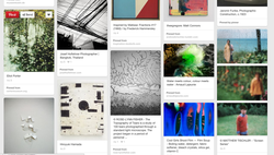
Paul Strand Louis Reith
|
|
Paul Strand worked very closely with Alfred Stieglitz which later on defined him. He is known as the the Master of modern photography we saw him as a modernist who turned humanist. He liked to use the formal elements in his work in most of his he uses a lot of line and shadow he always used very strong lines and shapes. People also said 'he had a real respect for the thing in front of him.' it showed that he maybe had a reason for all of his work and he really took care over the way it looked.
|
|
Louis Reith is from Amsterdam he wants to show tranquility in his work when he draws and takes photographs. Reith exhibited his work worldwide as a solo photographer and in duo's.
|
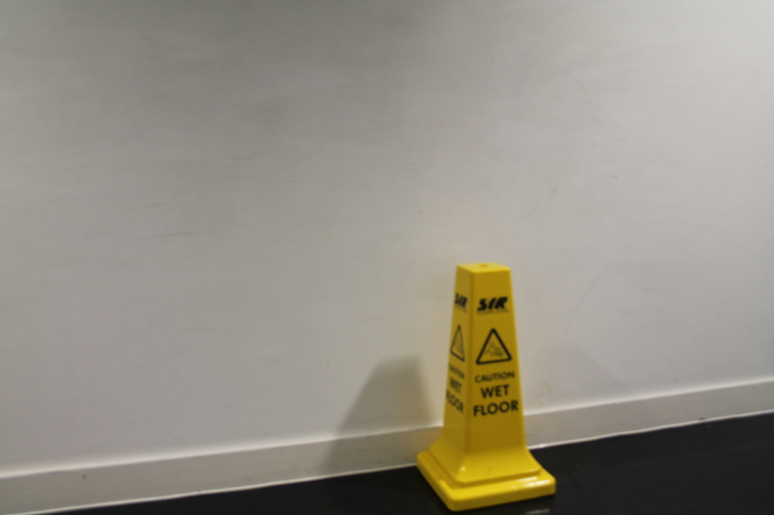
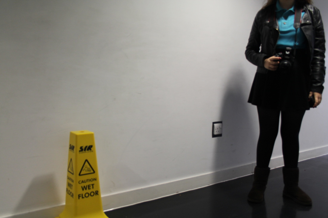
First experiment
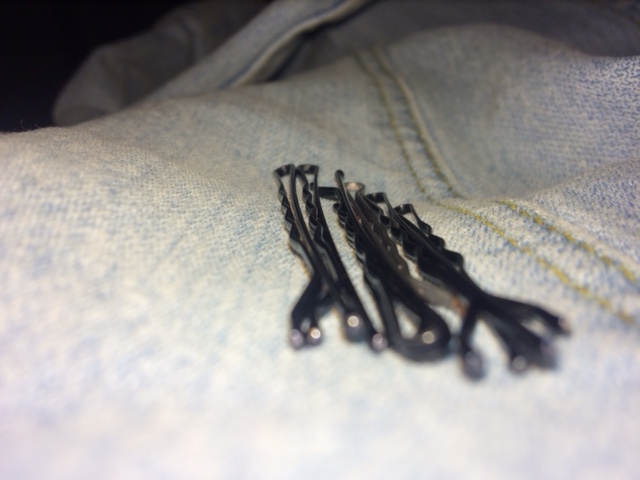
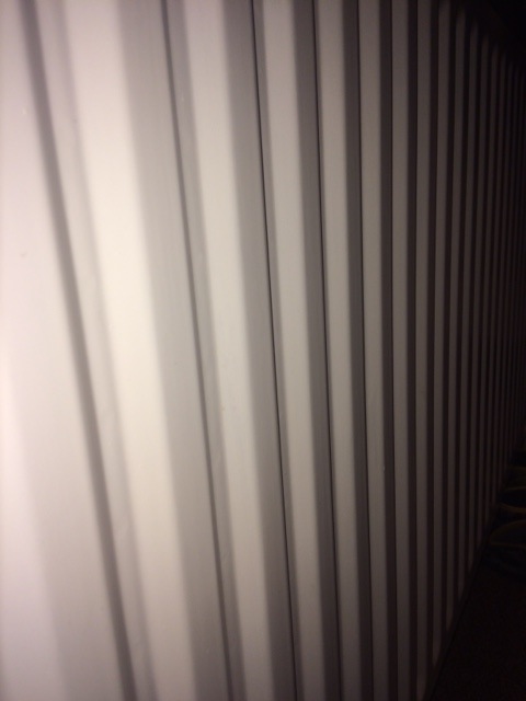
This is my first attempt at 'Abstract' photography. I tried to get the formal elements in my pictures like there's quite of lines and shapes. I didn't want to put people in my images until I figure out what I'm really interested in and what I want to do with my images.I found it quite difficult to take some of these images as I didn't really know what I was doing or how I wanted them to look. I was also not thinking about any artists work I'd seen.
|
www-I think that for my first try I have quite simple images that capture what I wanted to try and show. They also are inspired by Paul strand who uses strong line and shapes.
|
ebi- I think that I could have tried to focus more on only one formal element and captured it a lot better then how I have done already with these images.
|
Second set of images.
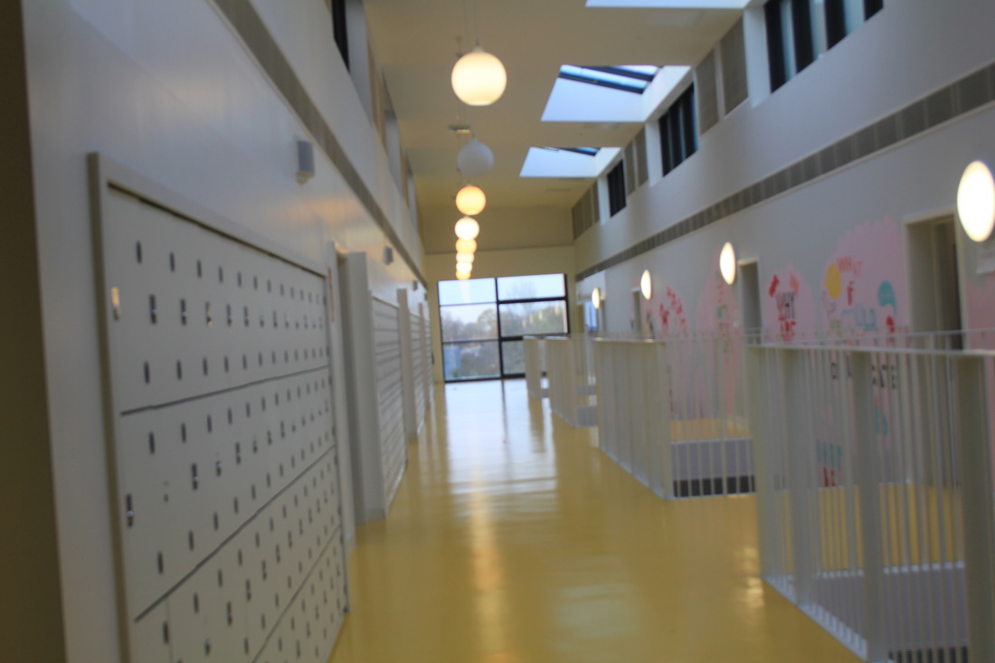


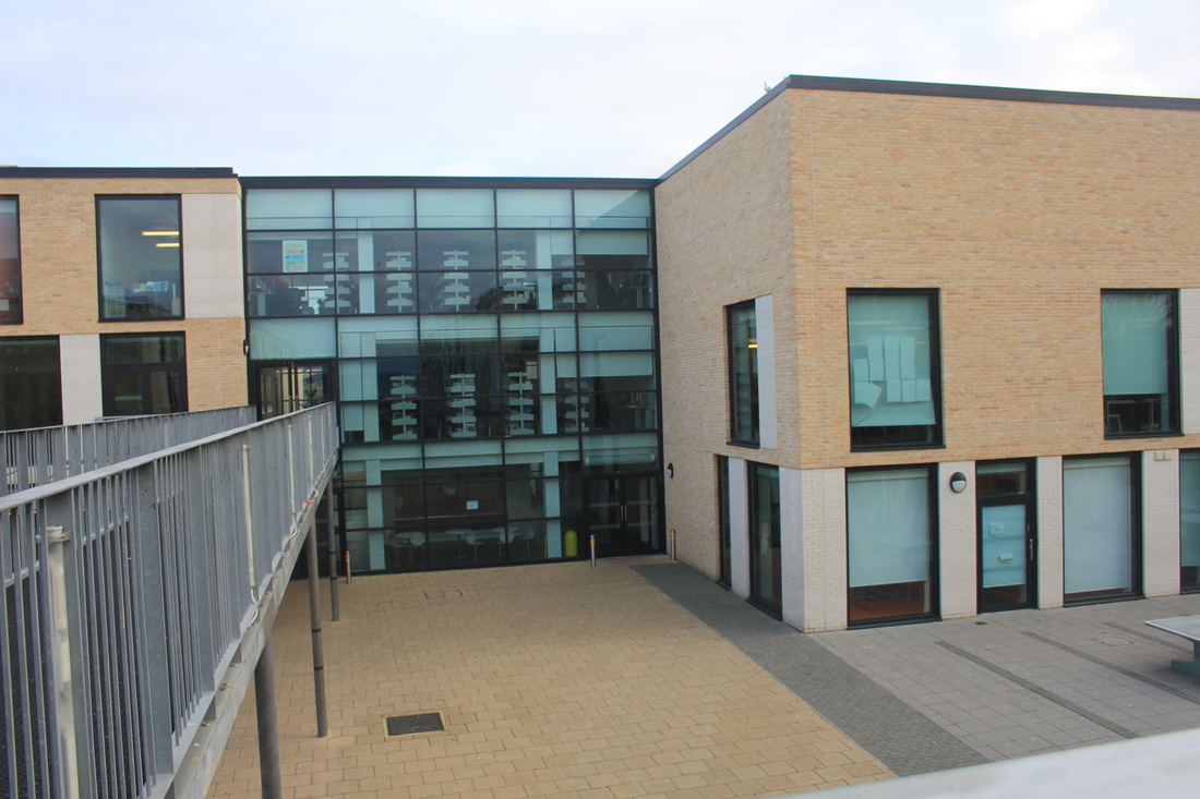
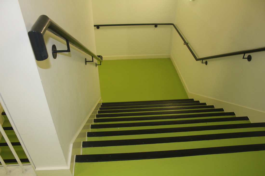


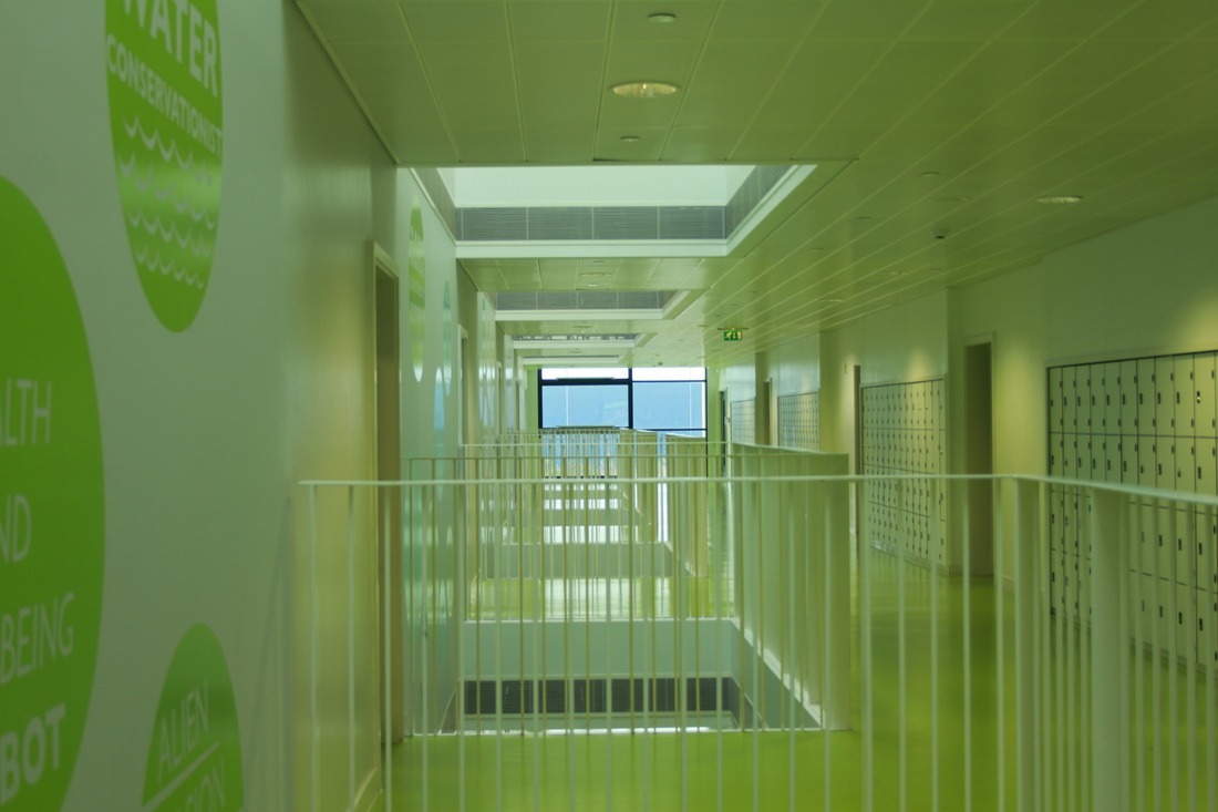
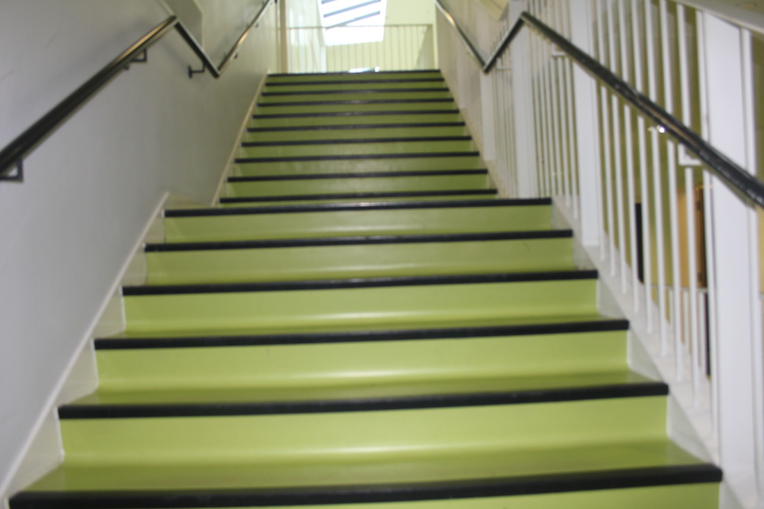
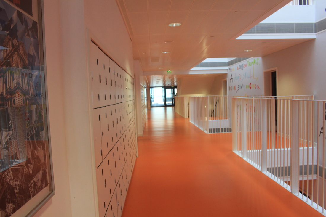
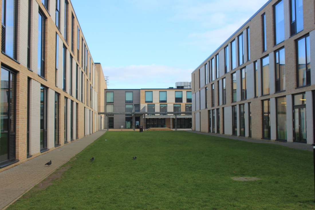
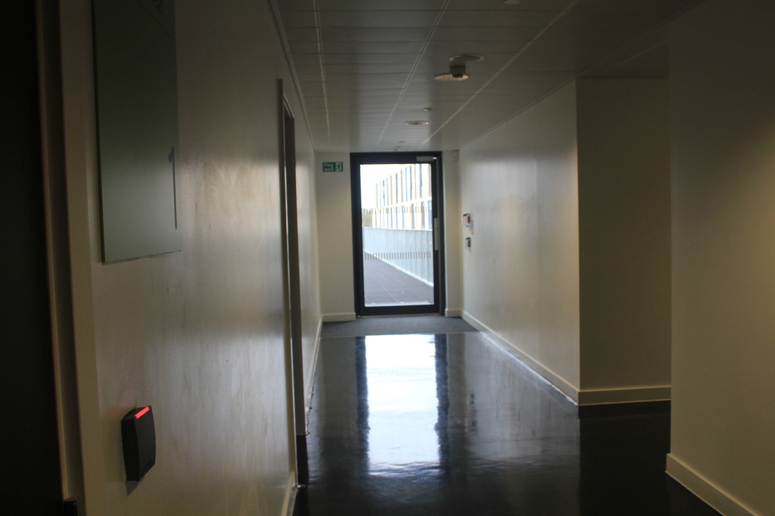

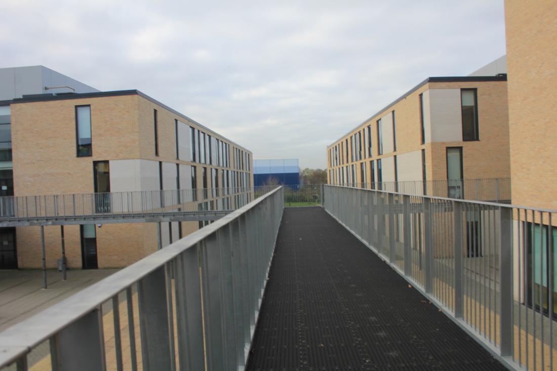
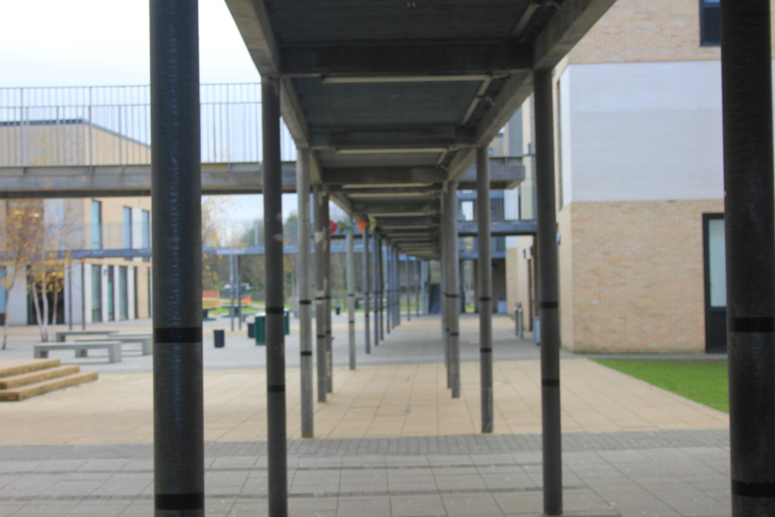

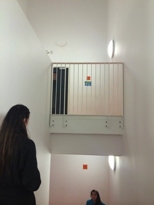
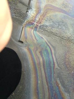
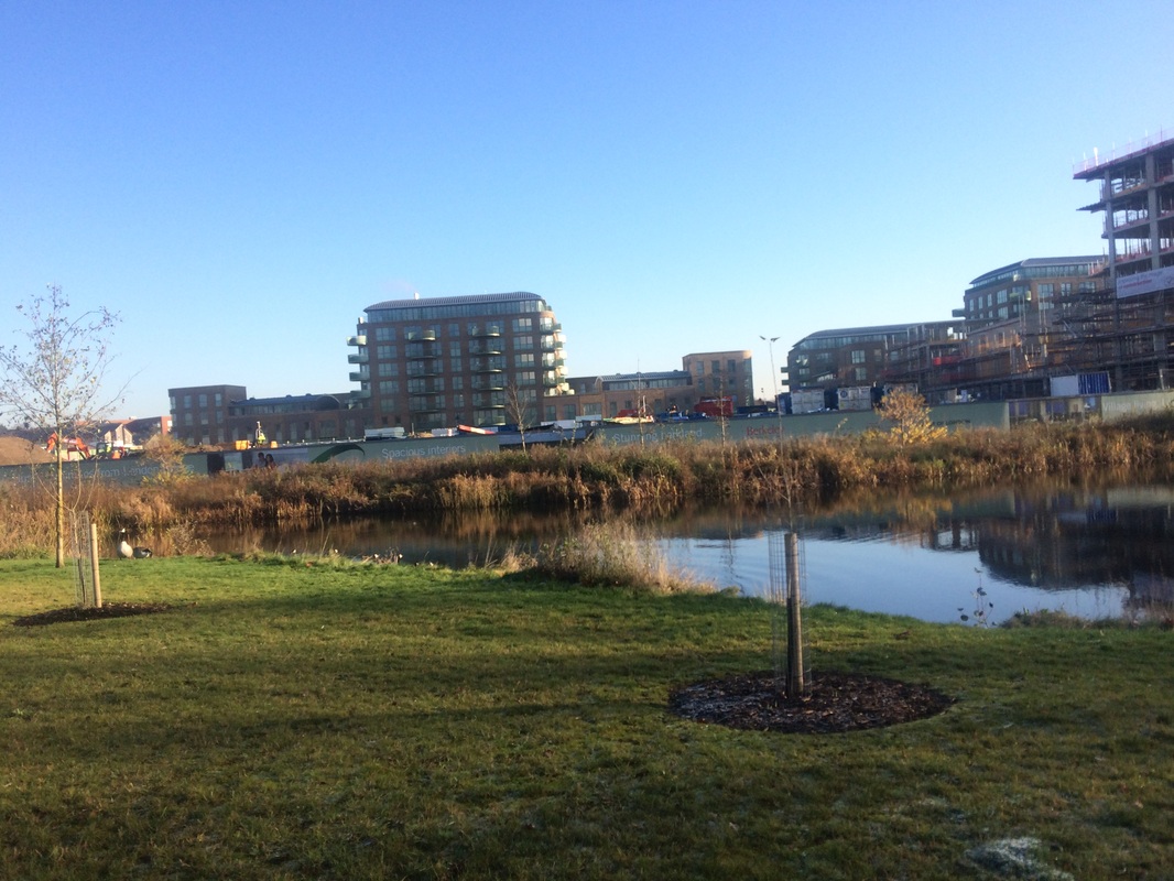
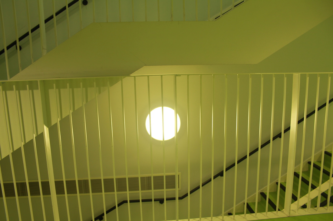
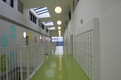
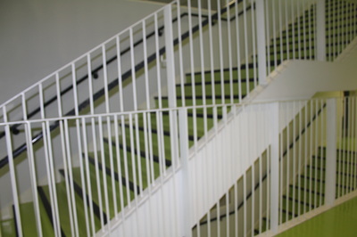
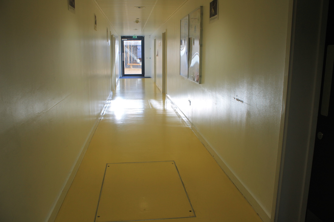
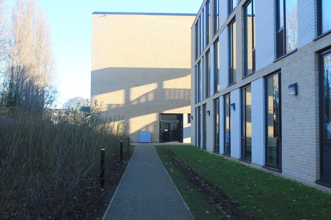
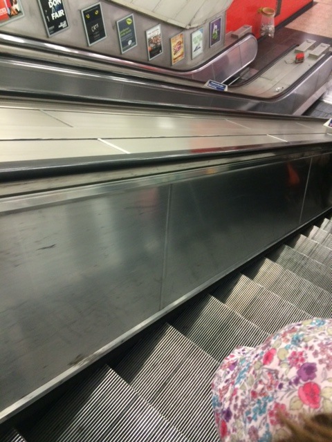
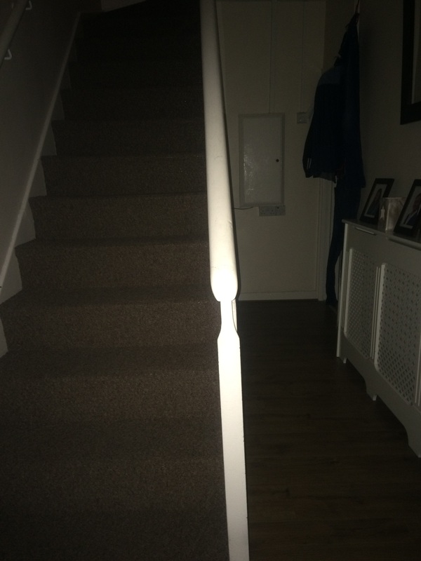
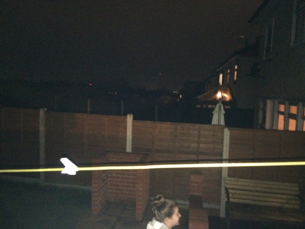
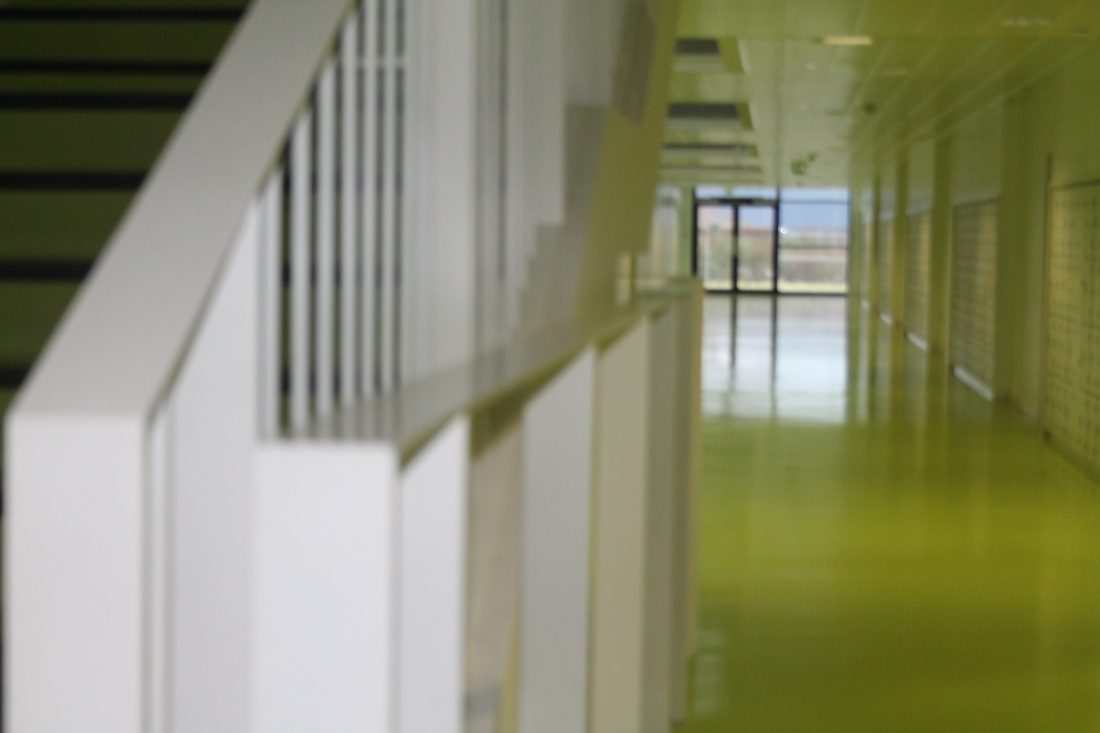
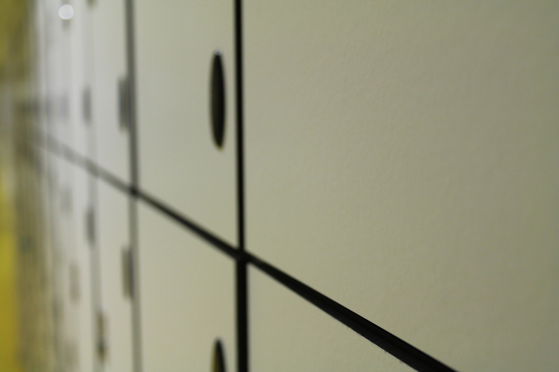
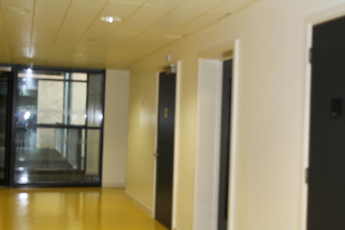
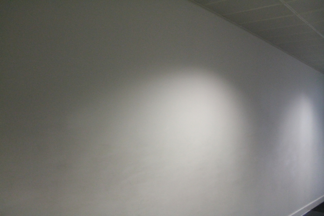
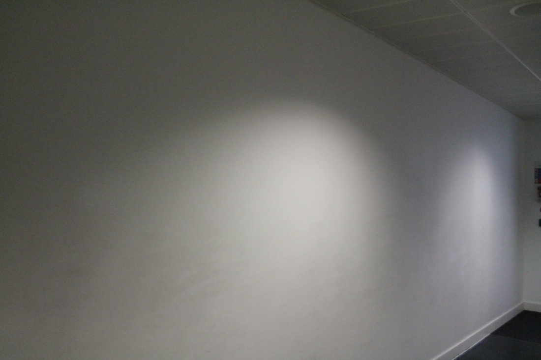
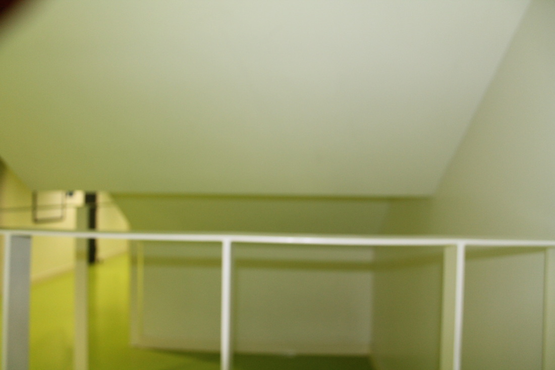
I think this is my best image it has an equal amount of light and lines which I wanted. I like that the light is coming from everywhere like the ceiling and all the windows around there was a bit of light coming from behind me which made the image look darker. Theres also lines everywhere in the images from the railings and lockers which are all quite strong and noticeable.
|

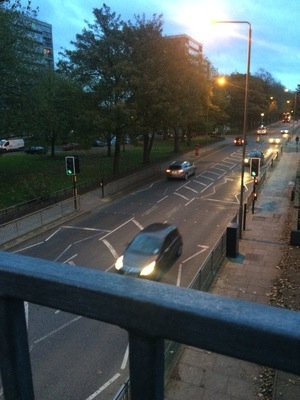
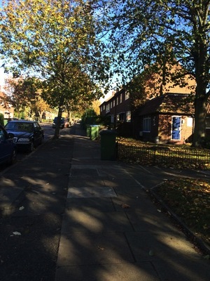
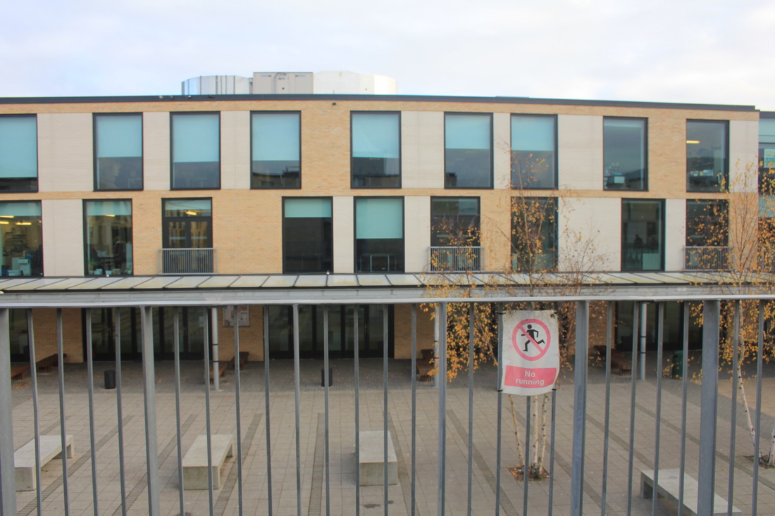
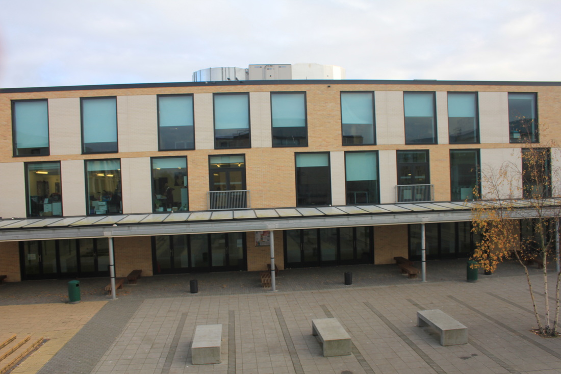
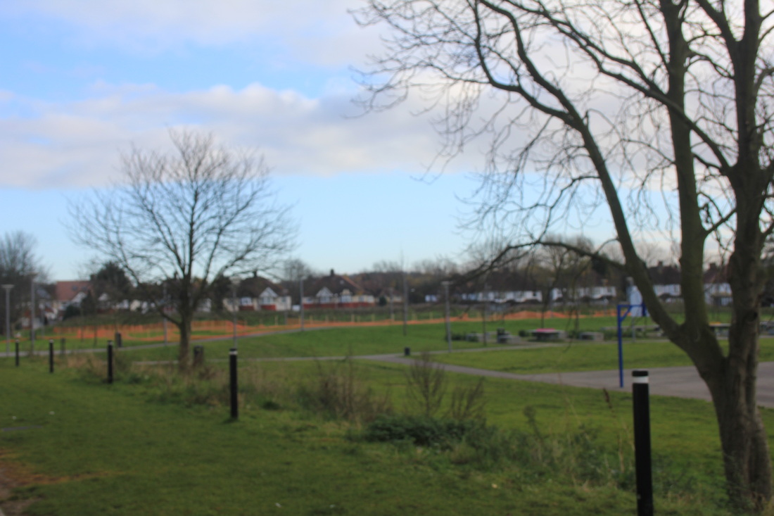
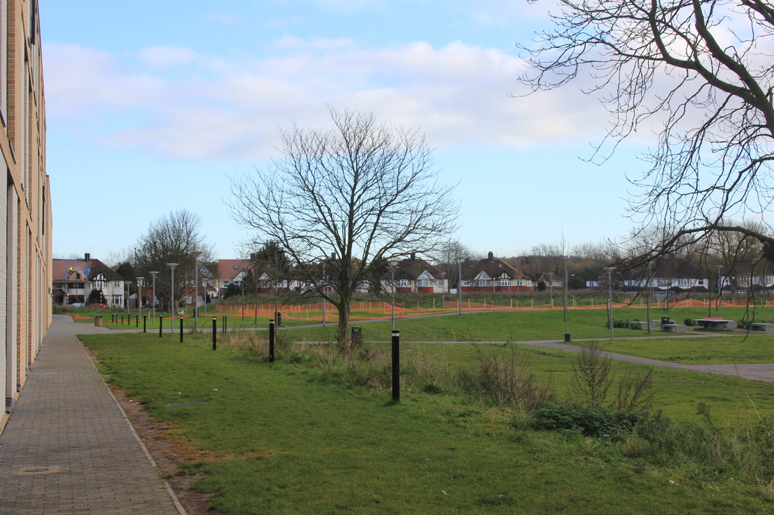
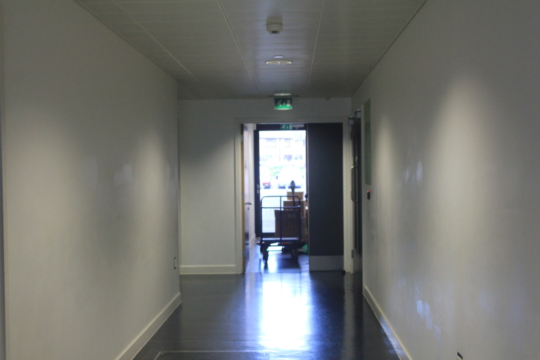
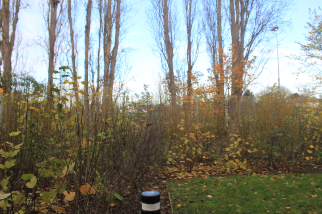
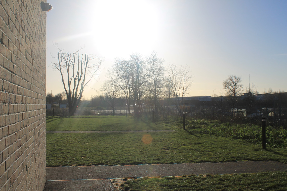
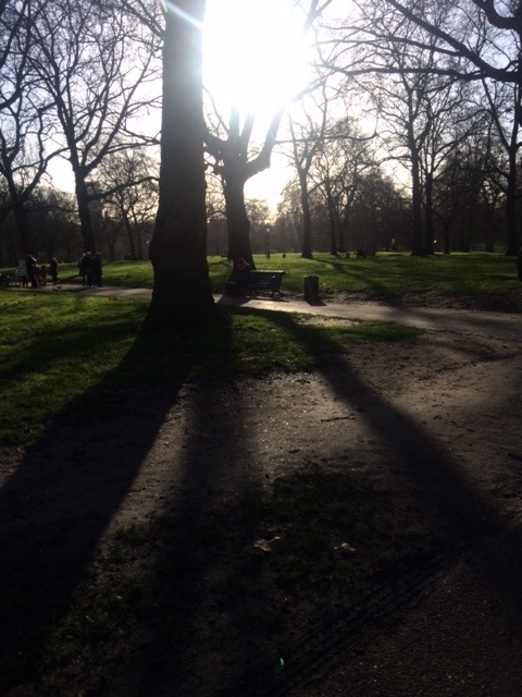
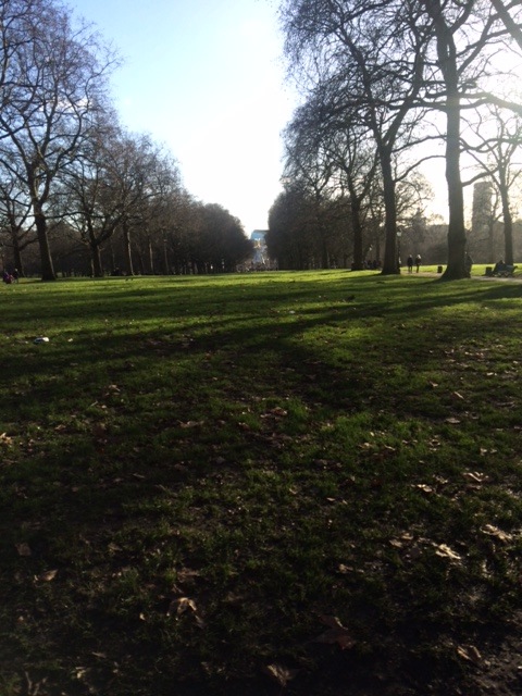
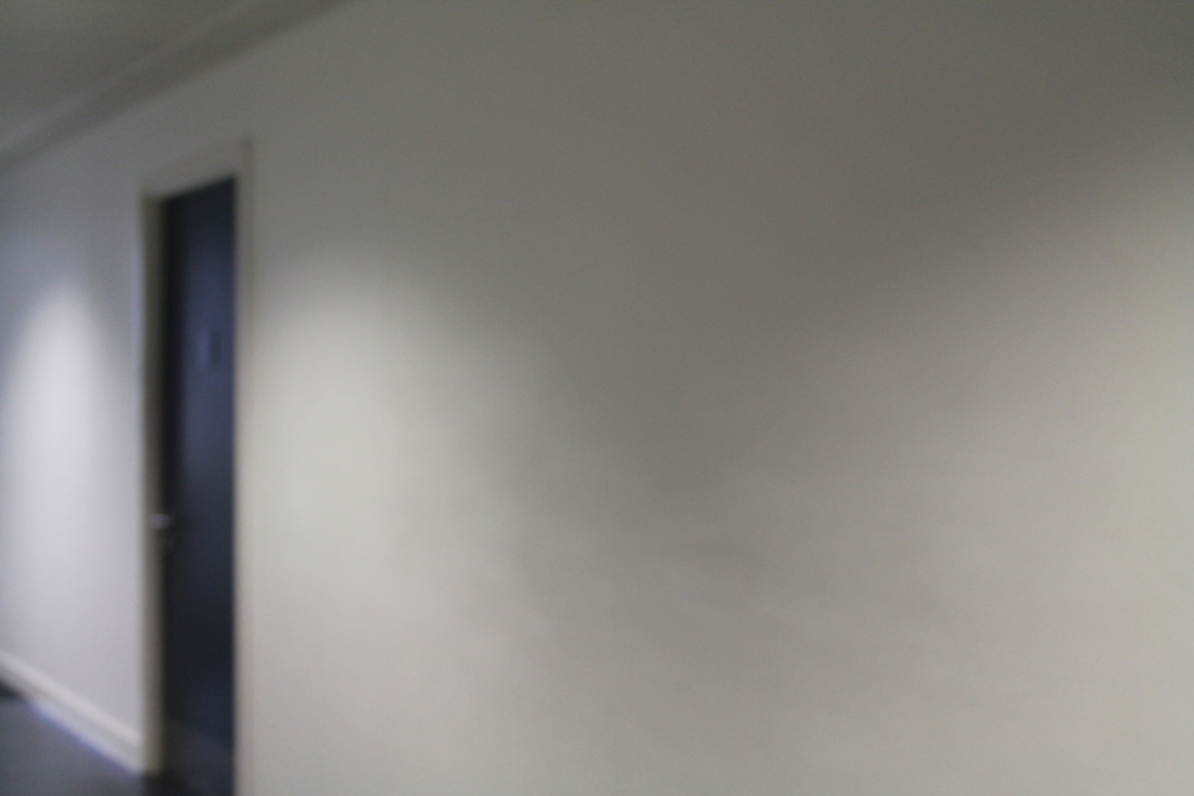
This image didn't come out as I had hoped, theres a lot of lines from the trees and branches. But theres hardly any light theres natural light coming from all around the image but other than that there isn't any main light source or something bright standing out from the image.
|
Third set of images.
|
ebi- I think that some of the images could have been more focussed and I could have tried not to get people in them I could have spent more time taking the images so they came out more how I wanted them too. I also could have tried to make them more centred on a formal element.
|
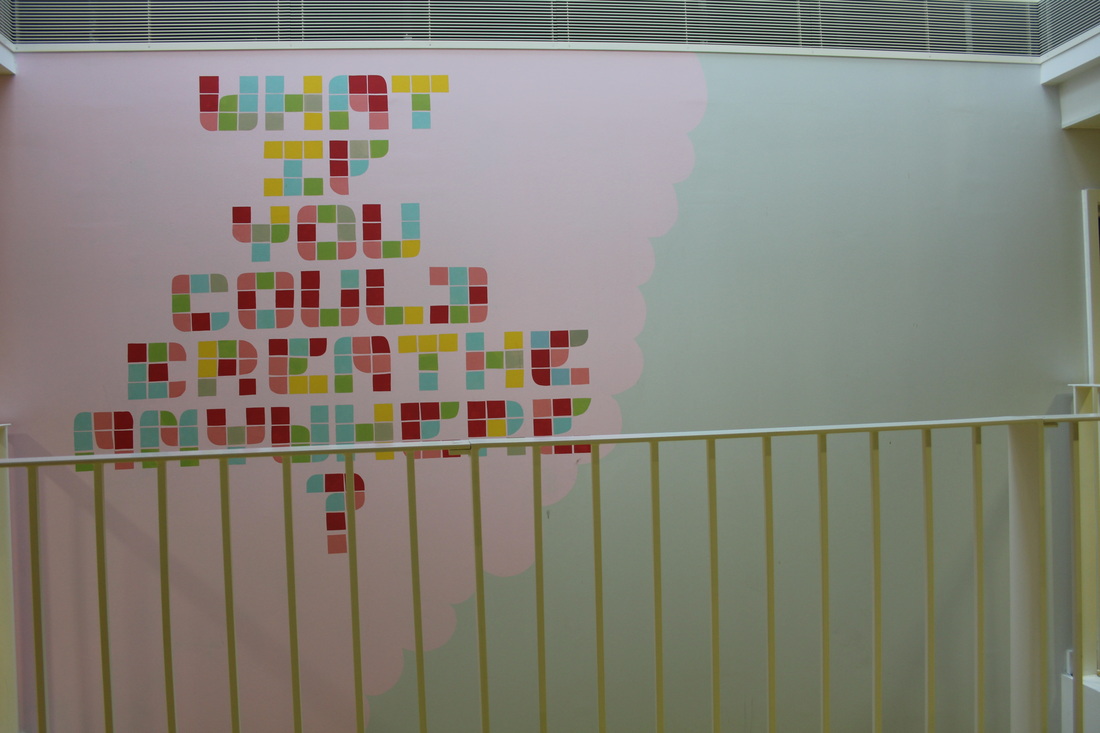
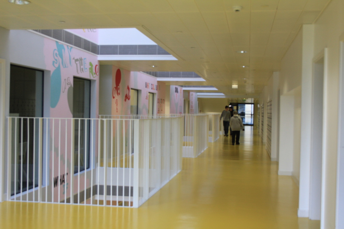
www- I think that the images are quite well composed and I like that there's quite a bit of colour and light within the images. The images also have quite a lot of lines.
|
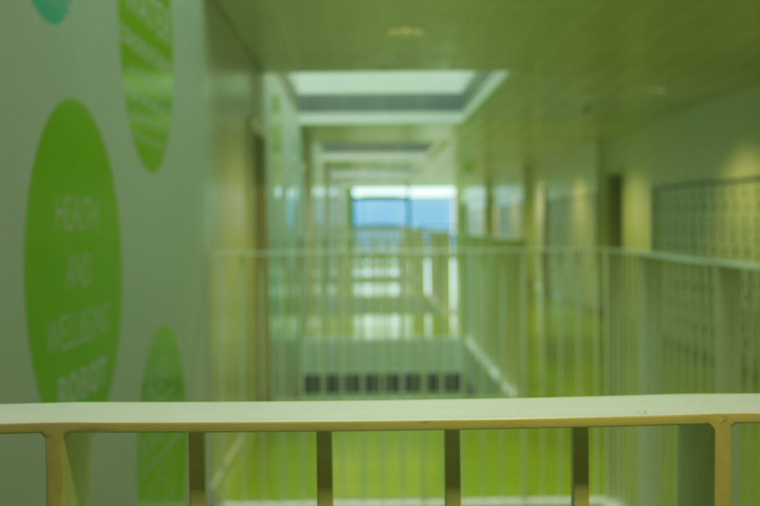
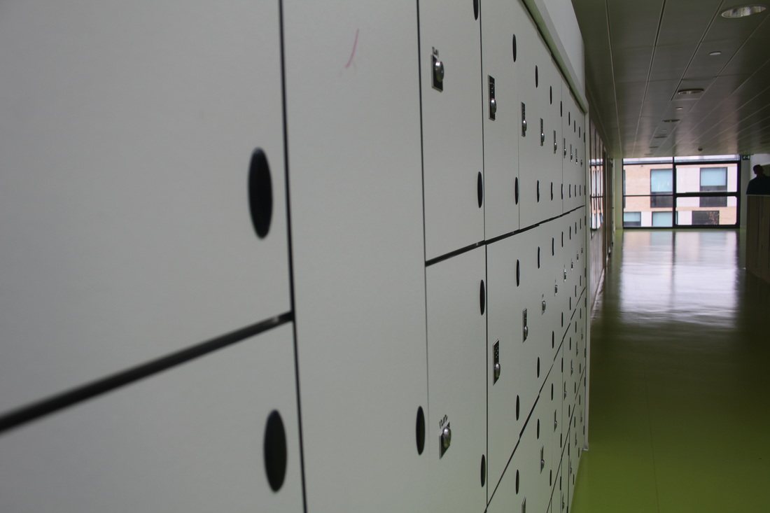
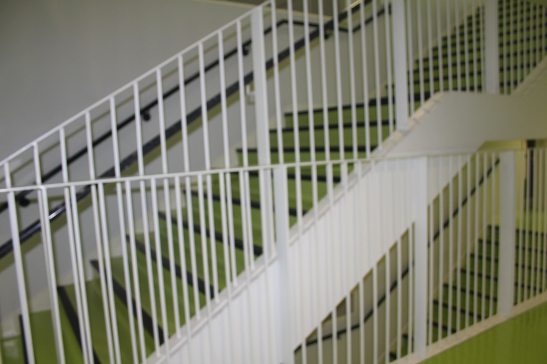
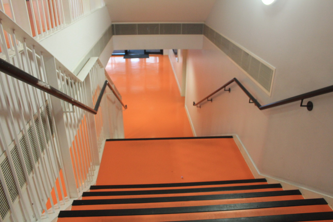
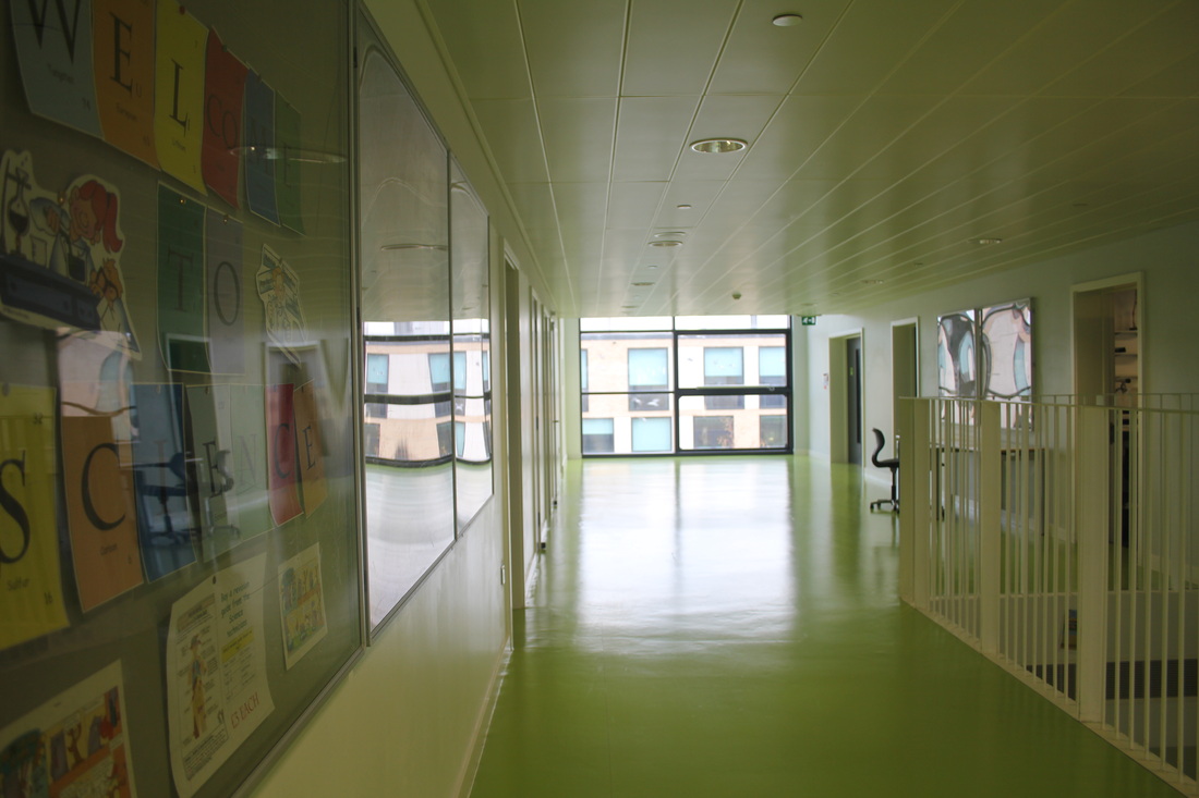
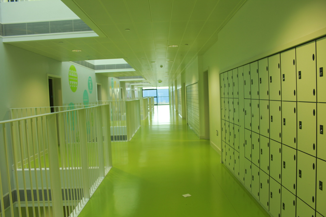
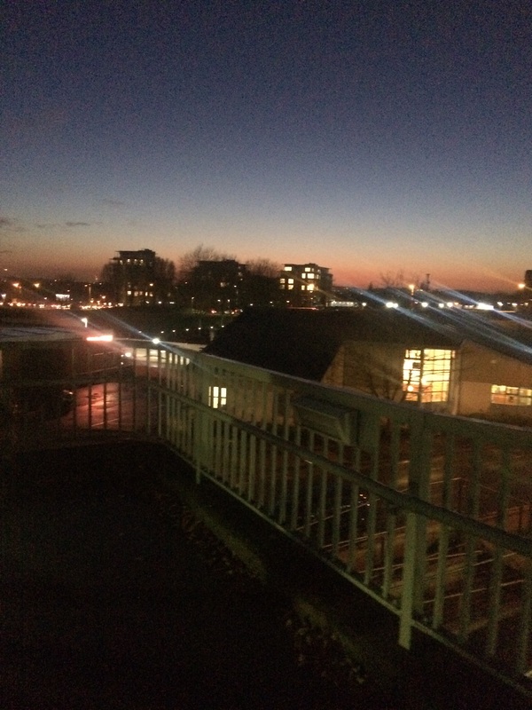
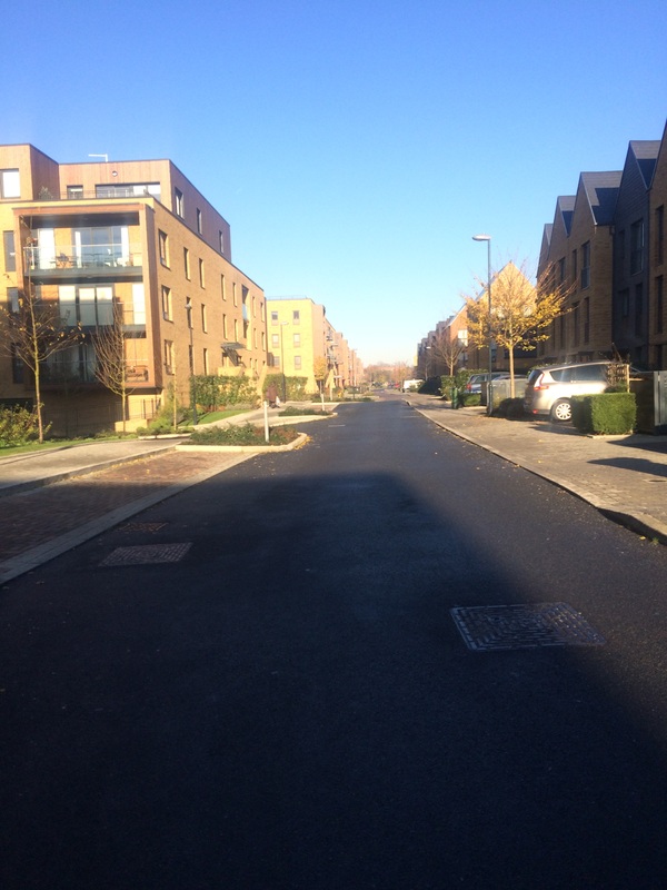
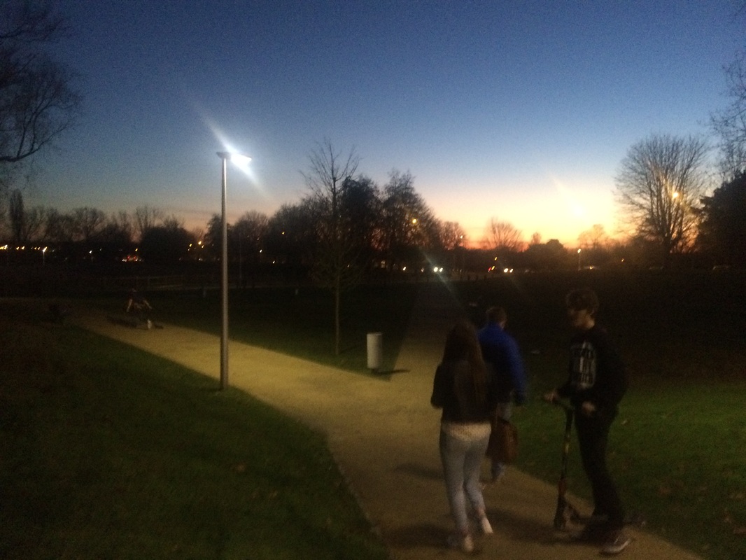
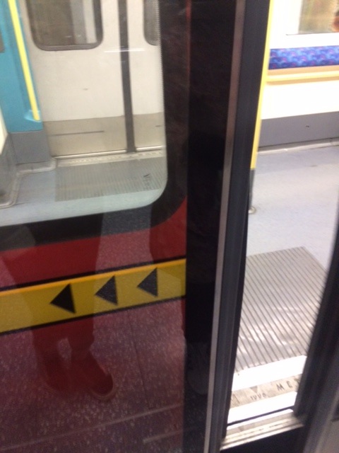
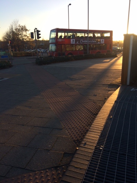
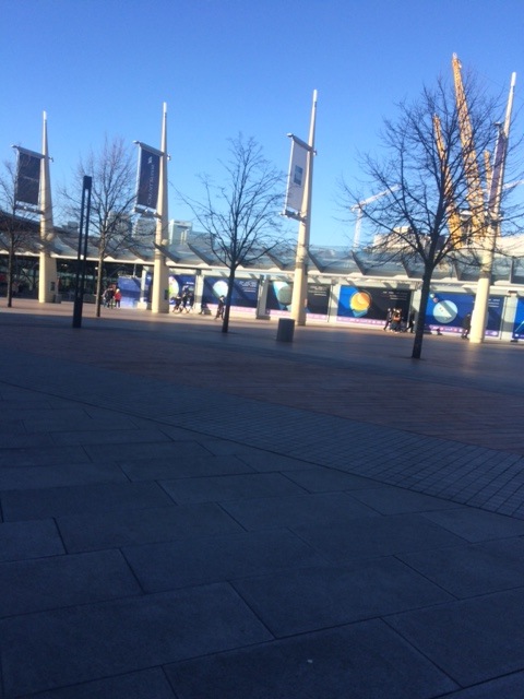
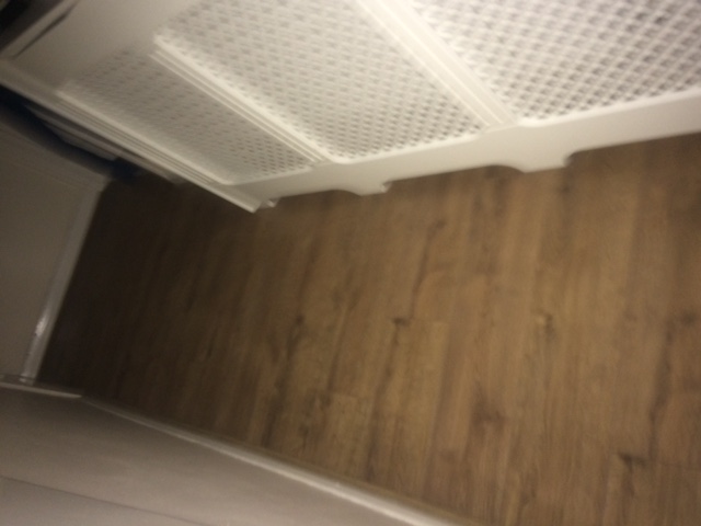
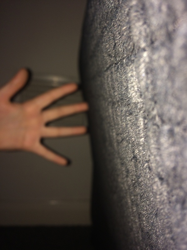
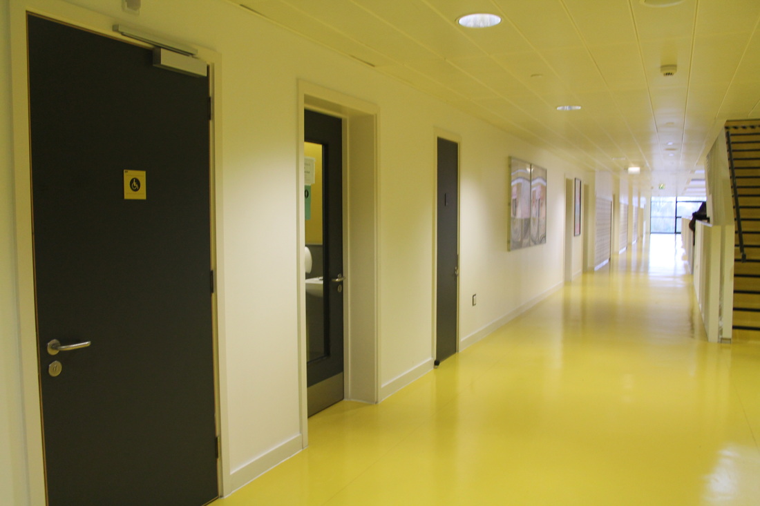
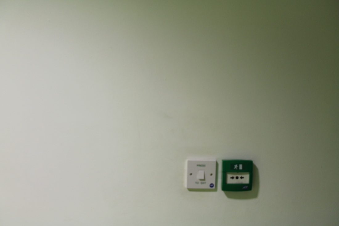
I want to focus on line and light. The first image has strong lines with quite a strong light in the background this showcases what I want to do perfectly. The second image shows more light with the ceiling, wall and the windows letting light in theres a few lines in the side of the image they aren't as strong as in other images. In the last image theres lots and lots of strong prominent lines I used the flash to have a bit of light getting in the image but there still isn't enough there.
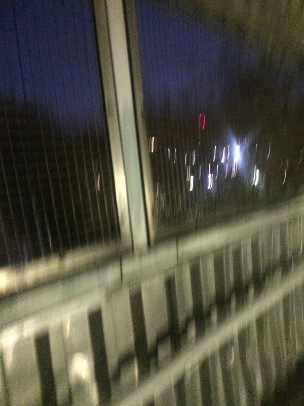
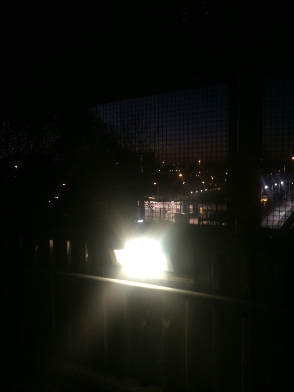
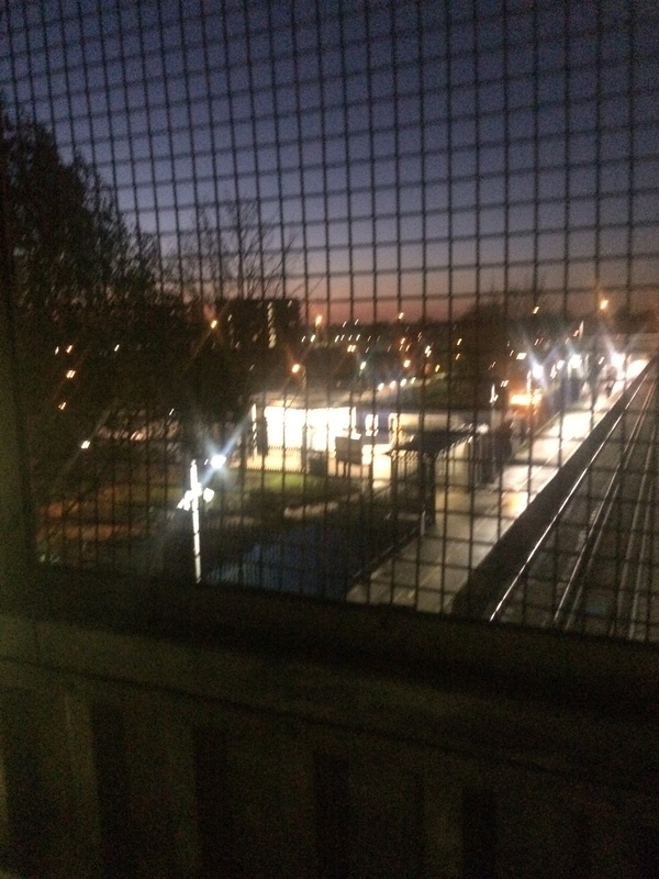
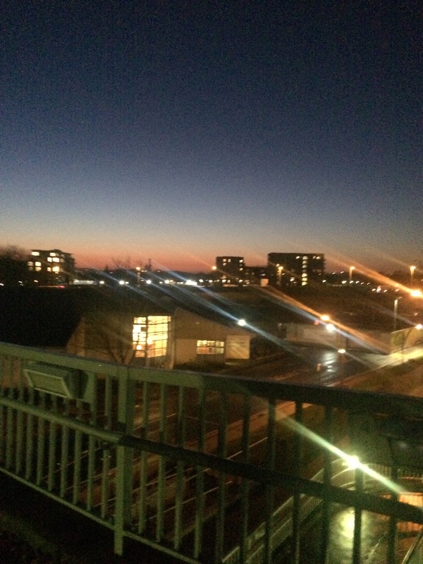
Fourth set of images.
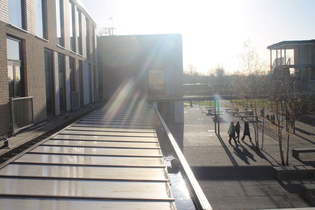
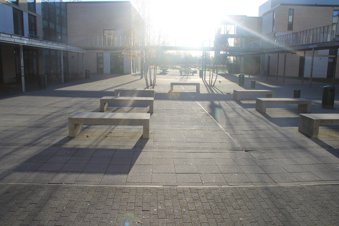
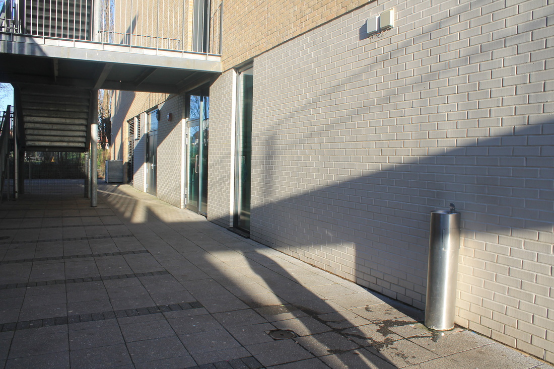

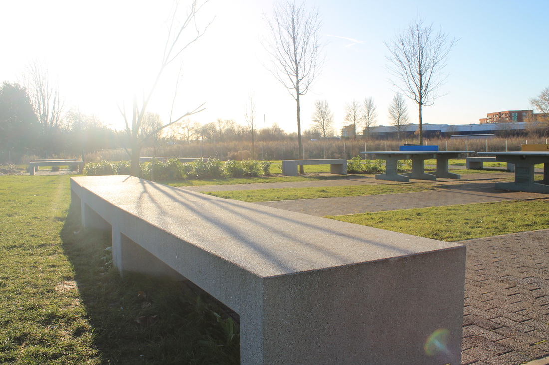

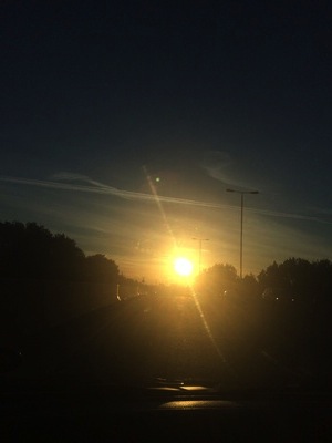
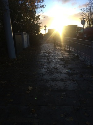
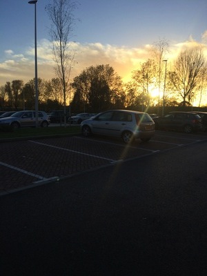
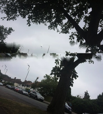
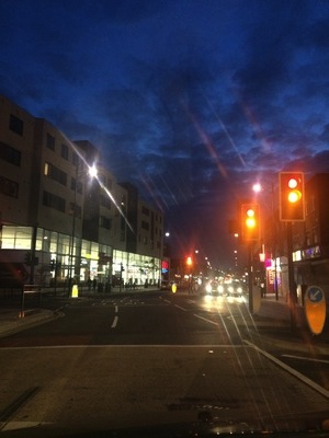
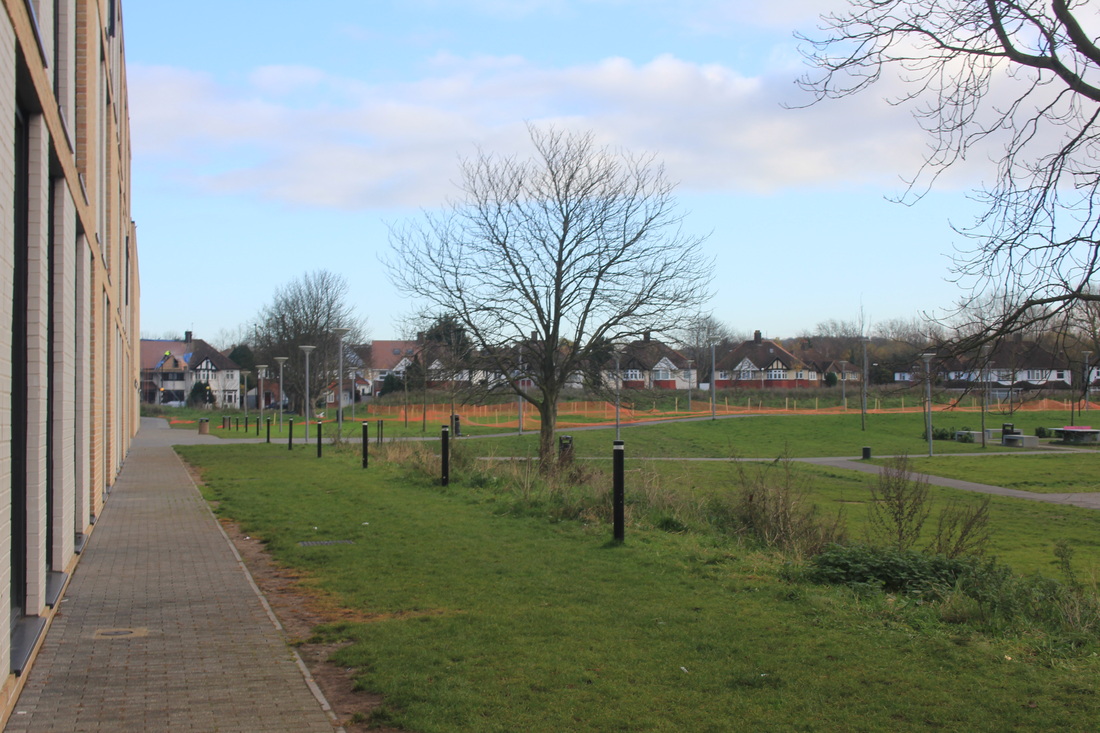
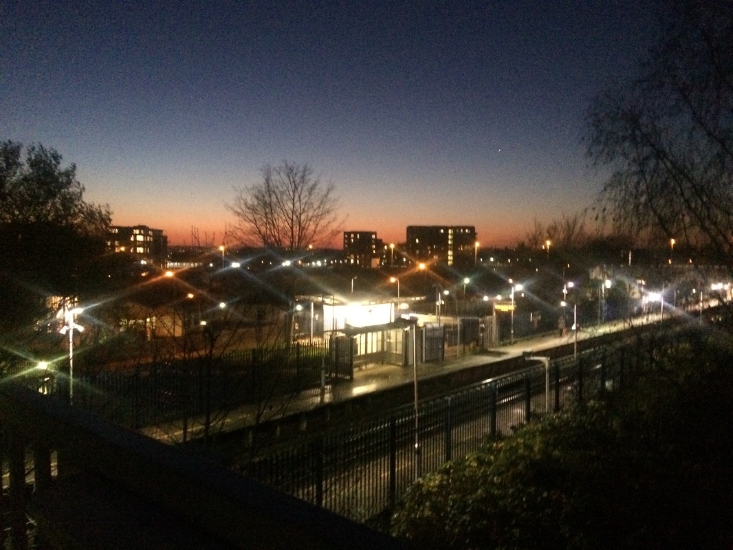
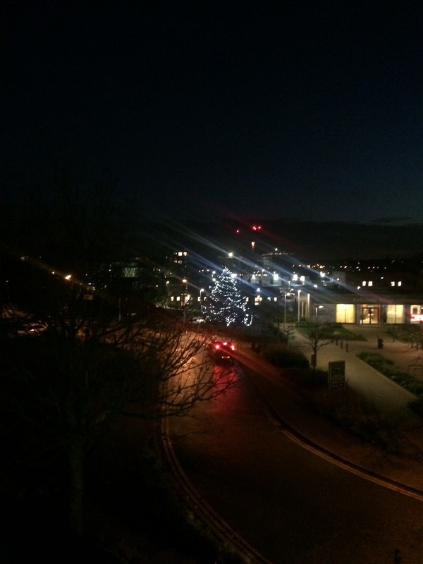
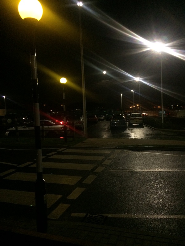
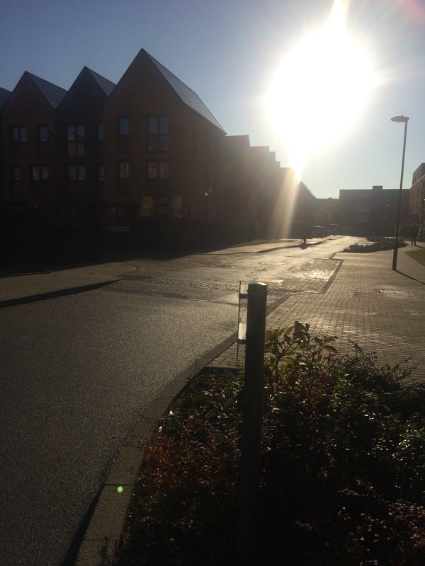
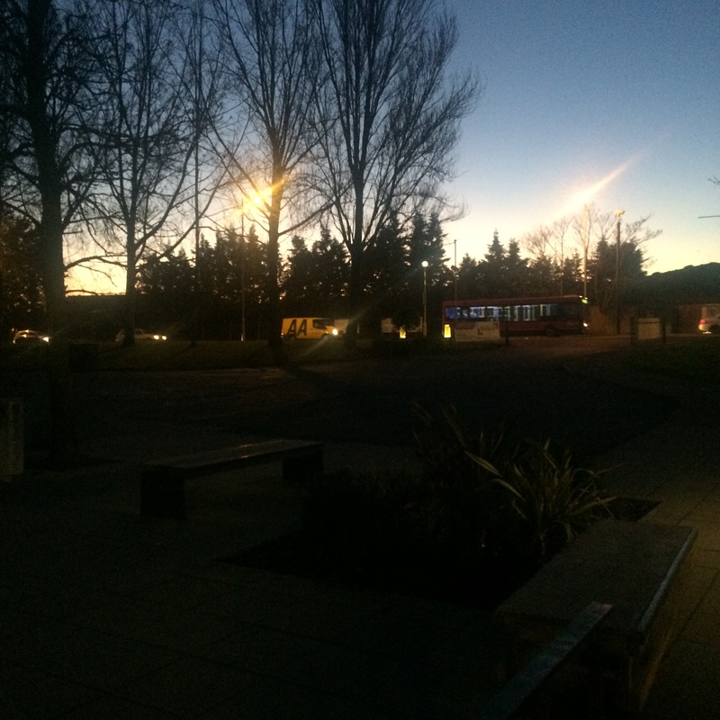
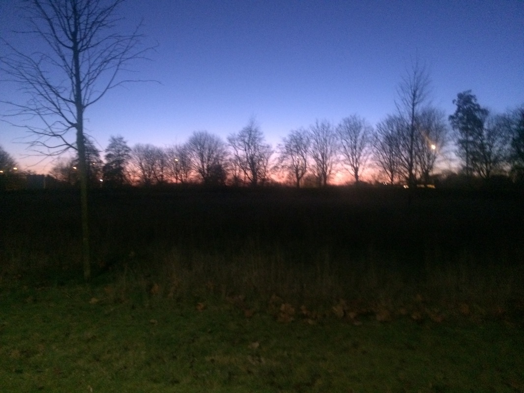
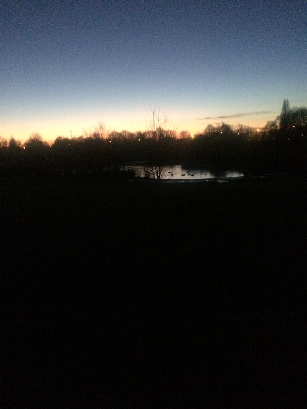
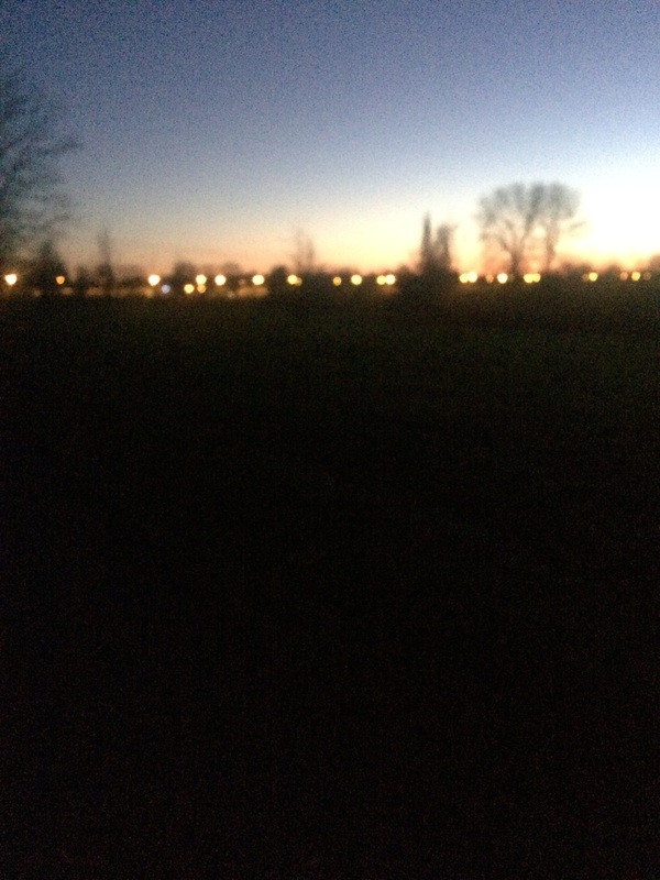
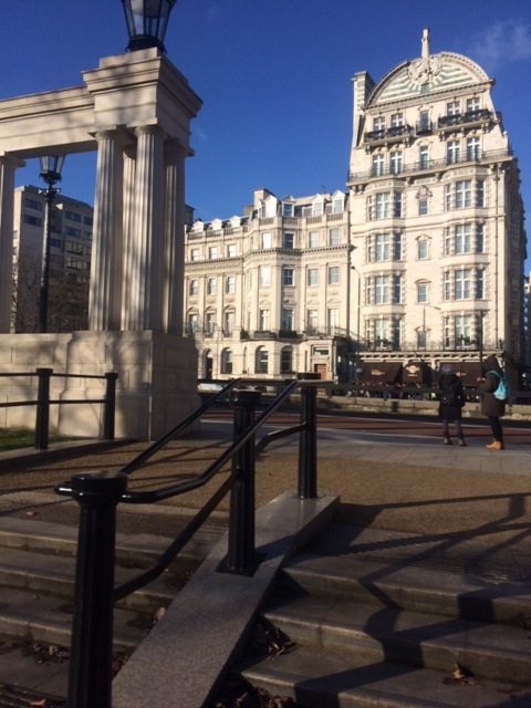
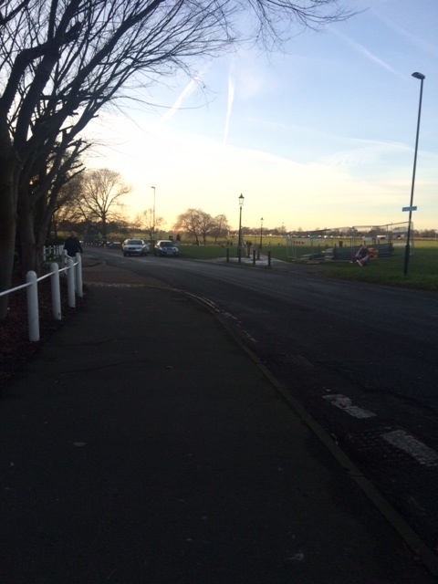
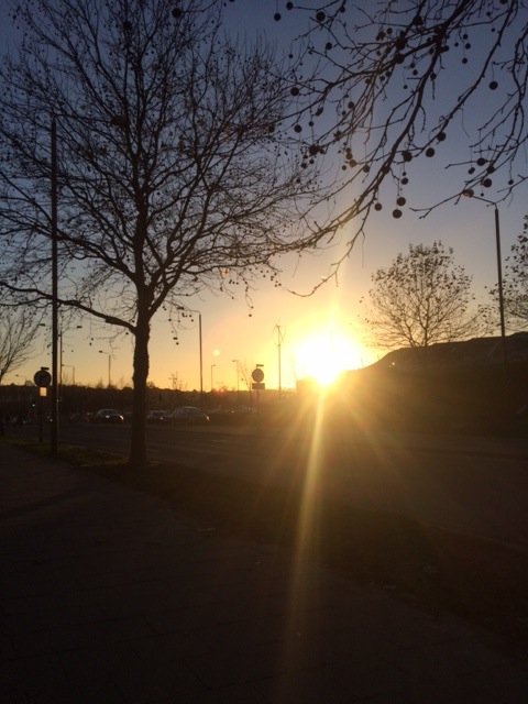
I think this is my most successful image because theres a strong light coming from the sun. Theres also lines in there they just aren't as strong as they could be. As you look further back in the image they become more and more bold which I quite like about it.
|
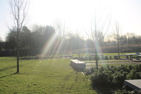
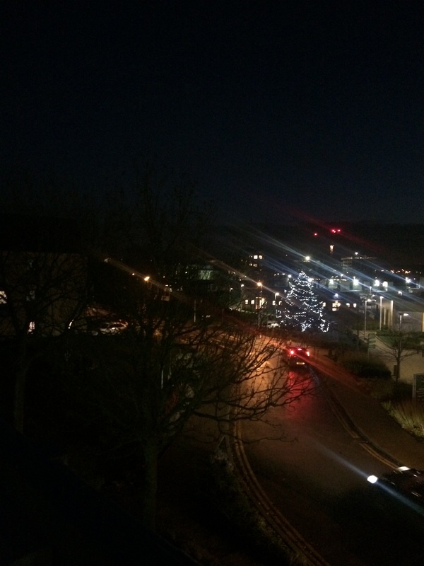
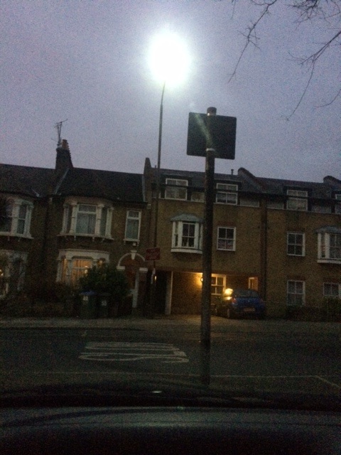
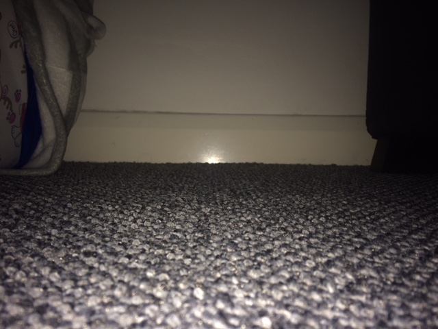
I think this is the most unsuccessful image because theres a lot of light but not a lot of line. Theres very weak lines that are coming down from the sun and it takes away some of the shadows which would be strong lines.
|
Fifth set of images


|
www- These images have my theme line and light and I think are really well composed I like the balance of light and line within each image some have more light then others and the ones with slightly less light have lots of line to contrast with.
|
ebi- I could have focussed more of images took a little bit more time to get them exactly how wanted them to look so they fit better with my theme.
|
Sixth Set Of Images
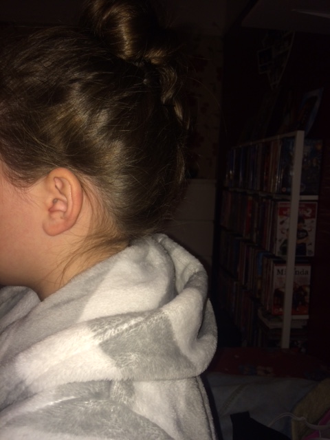
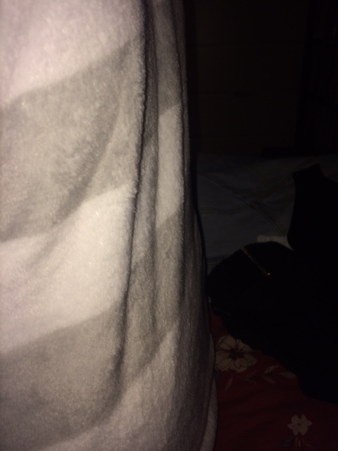
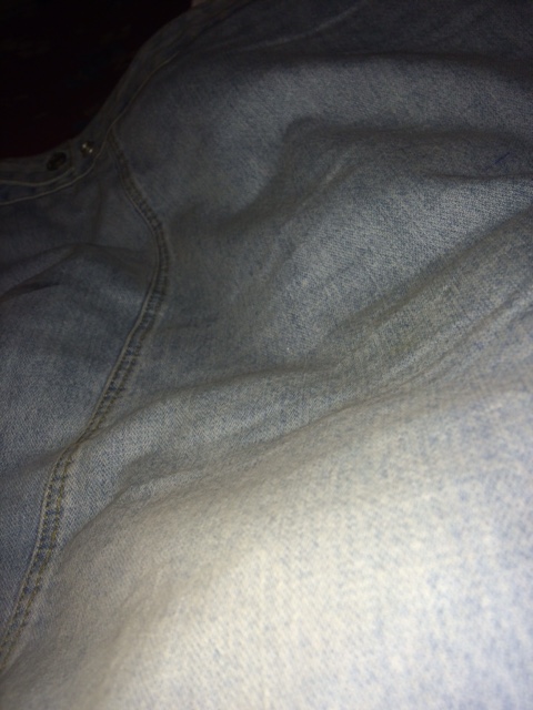

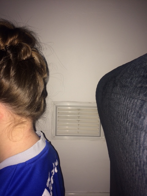


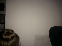
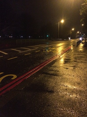
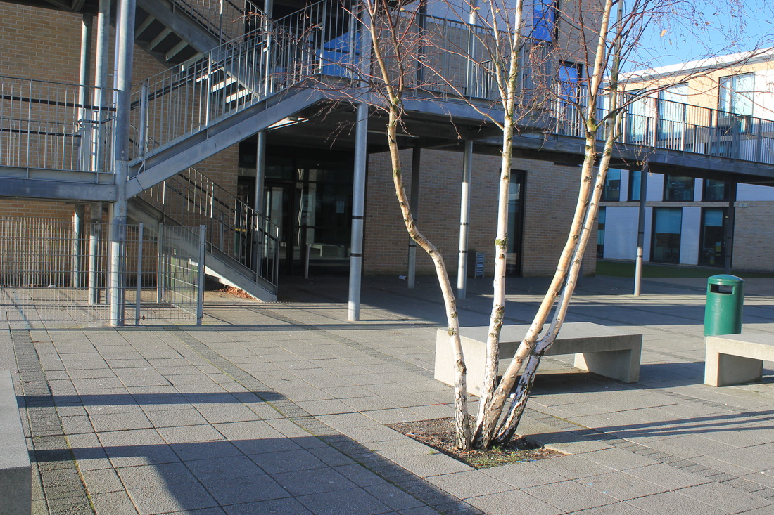
This is my favourite image I like this one because I think its quite simple but captures perfectly what I wanted to show.It has quiet a lot of line from the arm of the sofa and the hair, this image also has the rule of thirds. To make this image better I would try to get more light in the image maybe behind the camera so theres more light on what I'm actually taking photos of.
|
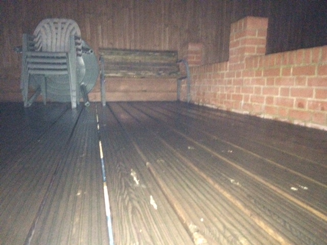
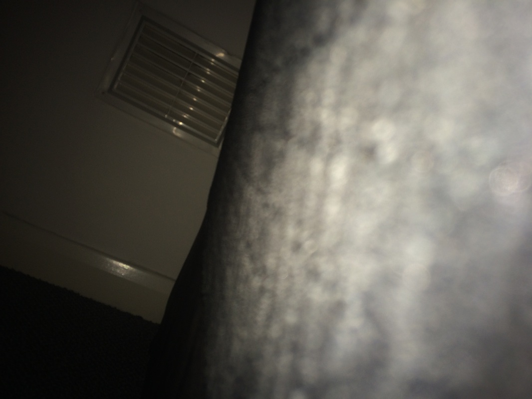
This is my least favourite image because it doesn't really fit into my theme of light and line it has some lines from the wall but then there isn't really much else there also isn't very much light just mainly at the front of the image then it gets very dark in the background. However, I really like the way it was taken how its slightly out of focus but you can still tell what it is in the photo.
|
Francesca Woodman
|
|
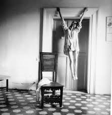
Francesca Woodman studied at Rhode Island school of design, then after went to Rome for a year where she produced a lot of work and had her first solo exhibition in a bookshop. She took a lot of self-portraits in which she likes to hide herself in by making herself blend in the backgrounds or hiding herself behind glass doors and peeling wallpaper. Her photographs show a very clear understanding of light and space you see this in her collection of photos called 'zig-zag' she shows very clear shapes and lines within her work.
|
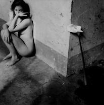
This is my favourite Francesca Woodman image. I like this because its very simple yet theres a lot of formal elements in the image that are very clear and stand out. Lines are one of the first things I notice it has strong lines from the walls the floor and the flower then I noticed the shapes within the image like the zigzag of her legs arms and body then the shape of the flower and the shapes that cover the whole flooring. This image has been composed very well theres always something to look at also the shadows that you can see on the floor it makes the other side of the building look interesting making me wonder if theres anything other there.
|
|
My next set of images I want to take I want them to be quiet similar to the last ones I took but I want to include more light and have them more like Francesca Woodman with stronger lines and shapes also with a lot of light. I want to focus more on being inside because a lot of my images are outside so I want to take more inside I also want to get people in my images and have them made more interesting by adding something I haven't experimented with before properly. I would also like to take ,y photos in black and white as I haven't experimented with that either.
|
Seventh Set Of Images

|
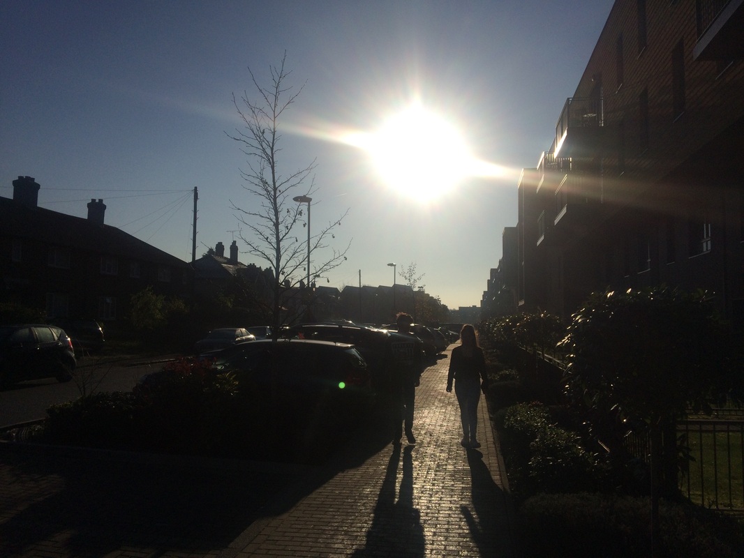
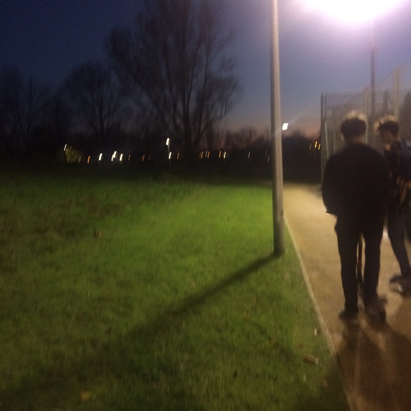
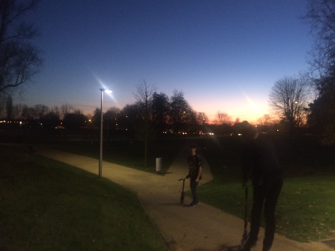
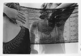
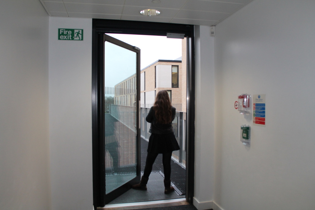
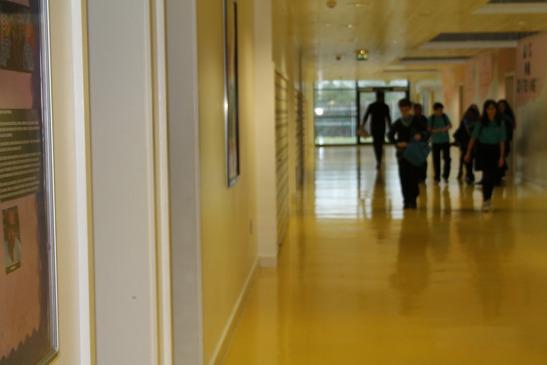
www- These are some of my favourite images I think they capture my theme quite well and they also include parts of people which I really wanted to do more of which was inspired by Francesca Woodman. I also like that these images are quite simple but show perfectly what I wanted to capture.
|
ebi- A few of the images I wish I'd taken more time with or maybe edited to make edges sharper and more focussed to get exactly what I wanted. Most of these images are very simple and I could of added more to them had some people just walking around or had some people in the images with props to make them look better and more interesting.
|
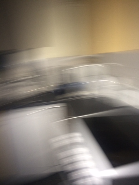
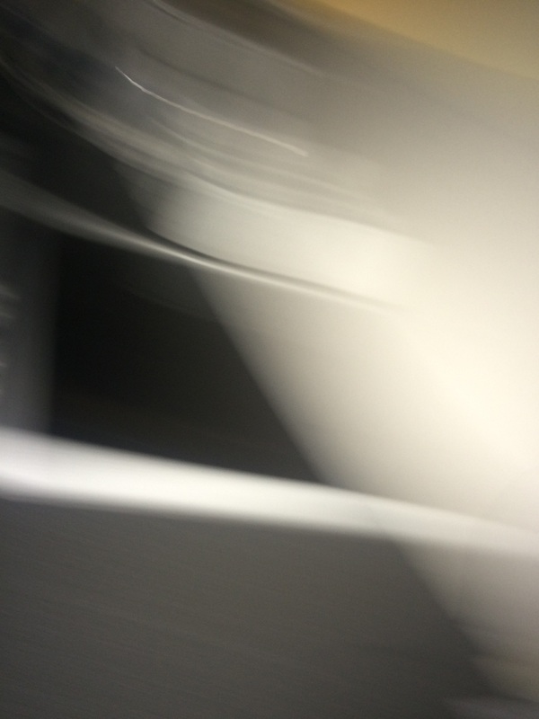
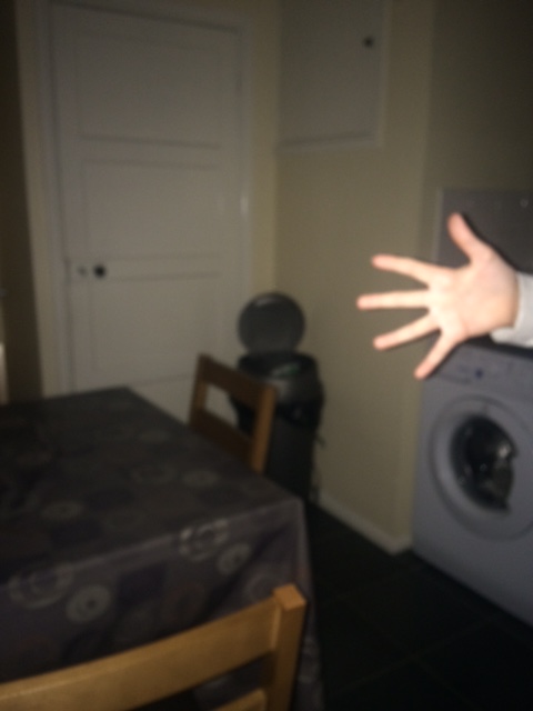
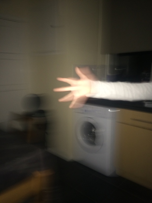
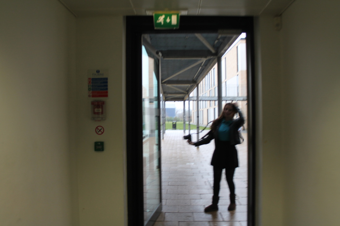
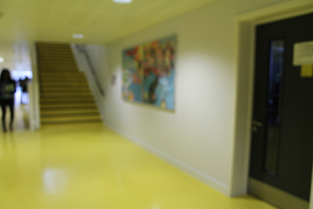
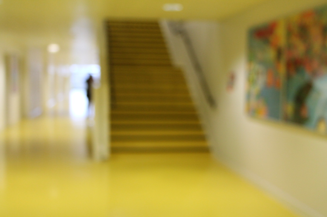
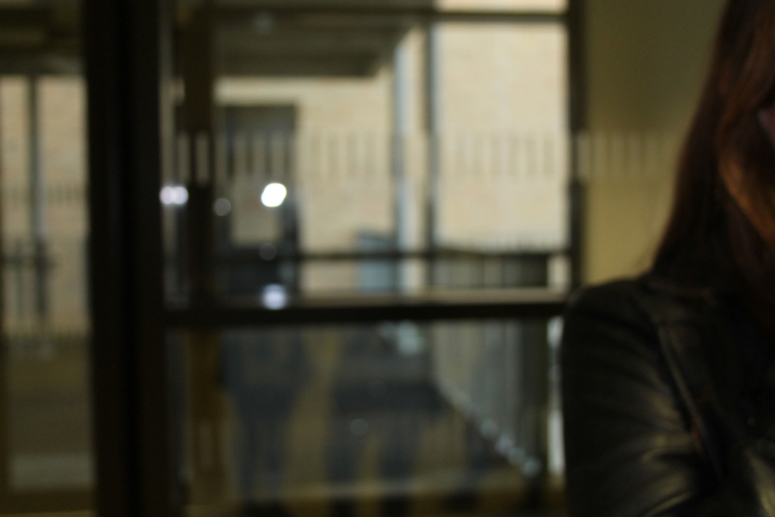
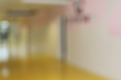
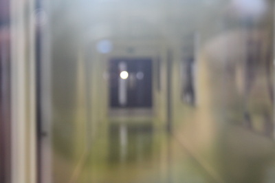
Final Piece

Final Evaluation.
During the project Abstraction I explored many ways to take photographs. As abstraction has a wide variety of themes there’s many things to explore within it such as, artists and new angles. At first I began by researching artists such as Paul Strand and Louis Reith. I found these artists by searching for abstract artists. I was first inspired by Paul strand with his strong use of line and geometrical shapes within his images. I then began to really look at Francesca Woodman I really enjoyed her images the use of light and shapes were amazing. Woodman took images in a very different way to most, a lot of her images she had only parts of people’s bodies which is quite different to a lot of artists. Francesca also liked to have all her photographs in black and white which is something I never tried.
After looking into artists I began taking images I started using my phone then moved onto using a DSLR camera. Using the camera meant having more focussed and clearer images, I began by focussing on line and shape shown my first few sets of images. Then as the project continued I started to focus on line and light inspired by Francesca woodman. I also had parts of people in my images which was at first an accident then I began to put people into them. After a while I didn’t know what else to do to make my images better, so I just started taking similar images that I had before but in different ways at new angles to make them more interesting.
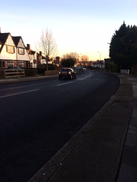
Then I began to take photographs that focussed more on light then line and my images became much simpler less chaotic and colourful. I made the colours very dull to add a sophistication to my images. After every experiment I did a WWW and EBI to that I knew what I needed to next time I took images it made it much easier to make my images better. It also made it a lot easier to evaluate my own images because it meant I looked at them in depth and could see things I may have done wrong or done well so I knew what to do before I took more in case I did the same things wrong.
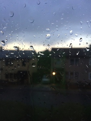
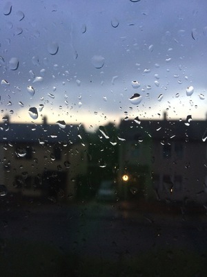
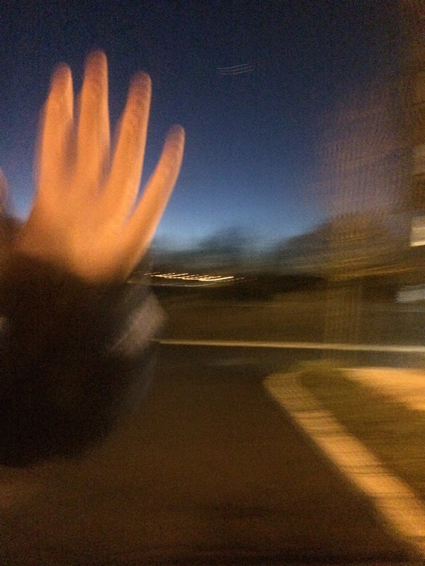
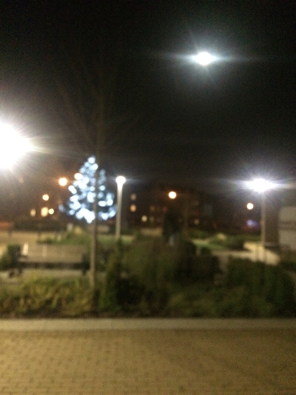
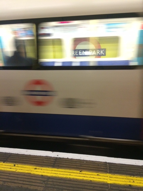
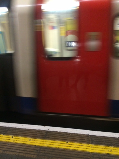
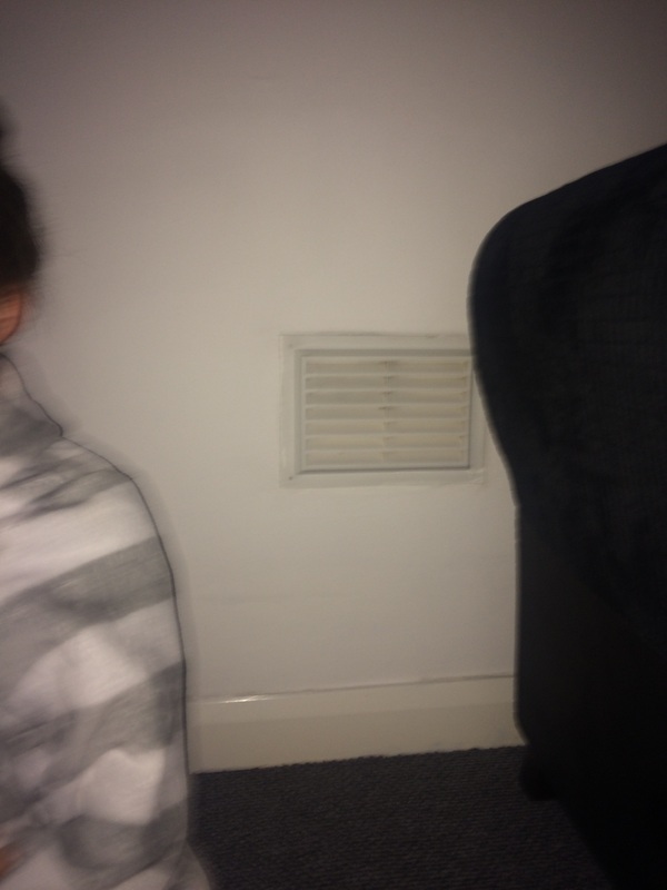
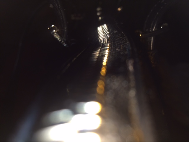
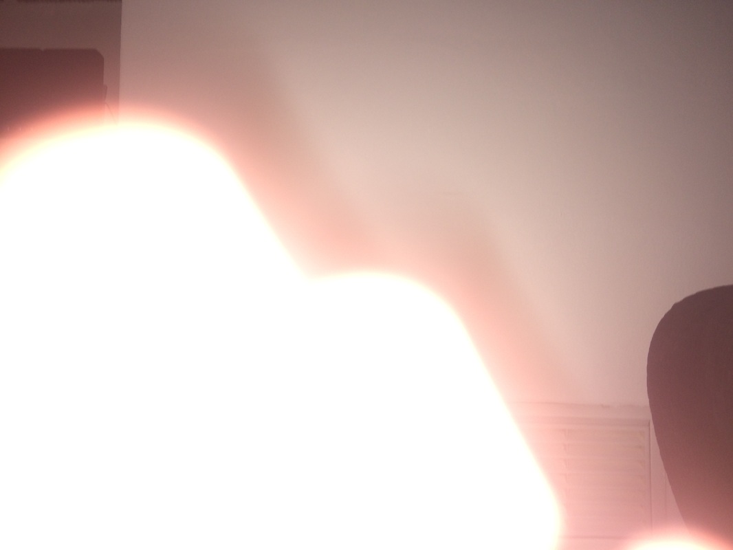
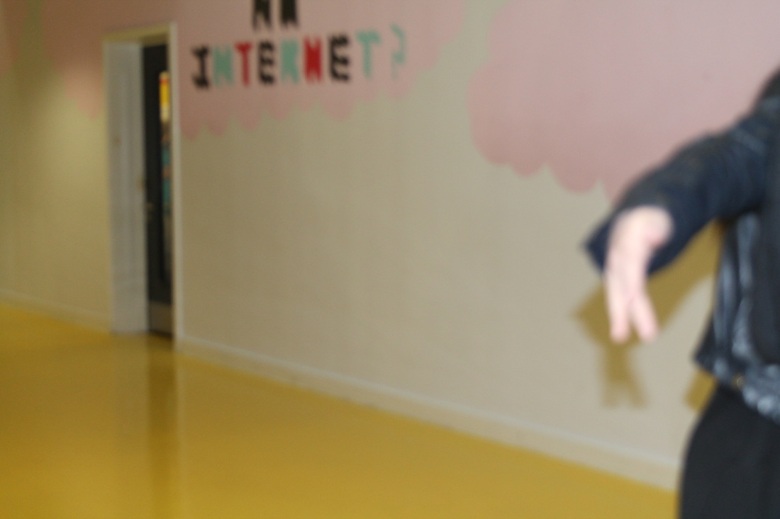
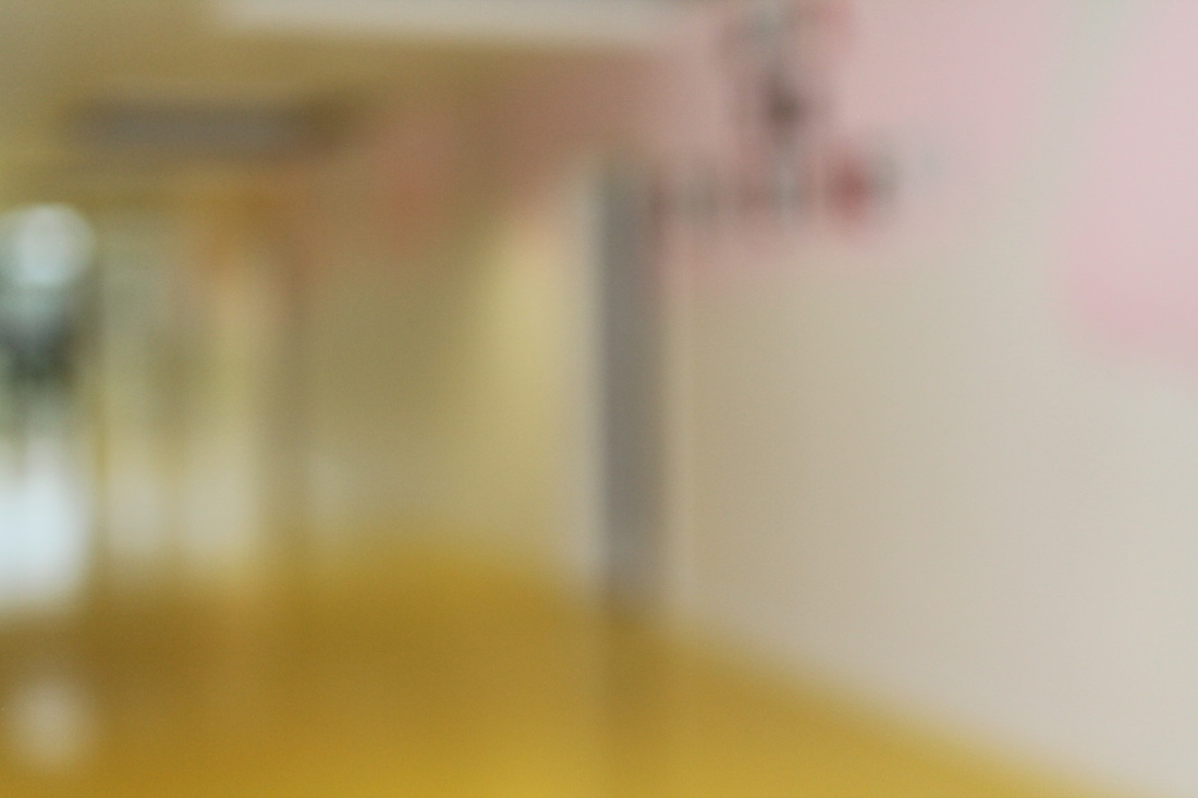
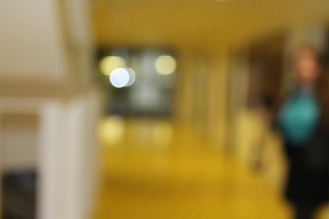
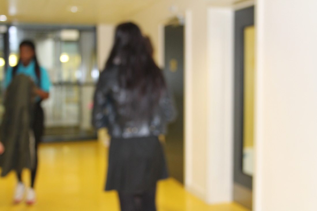
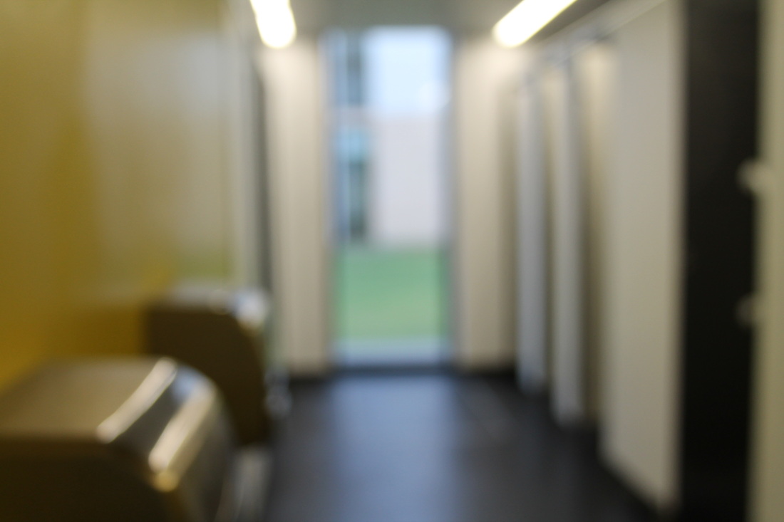
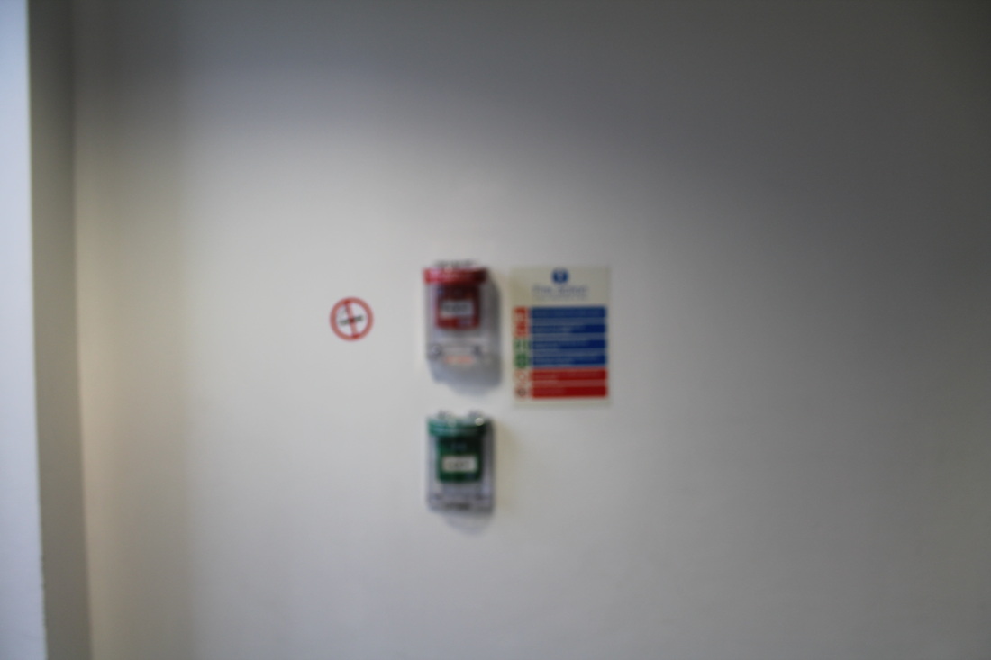
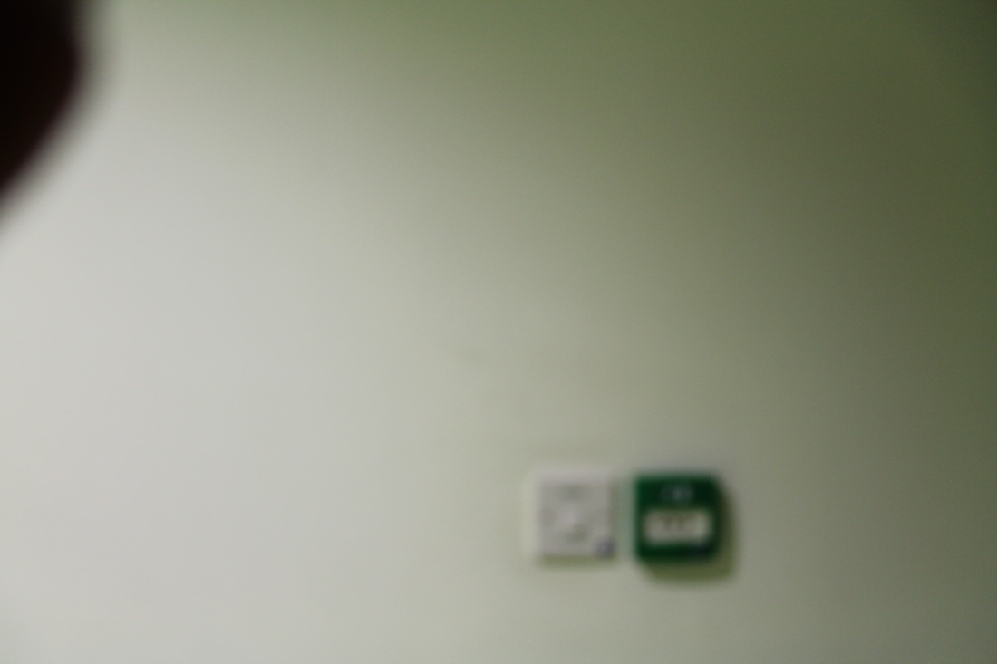
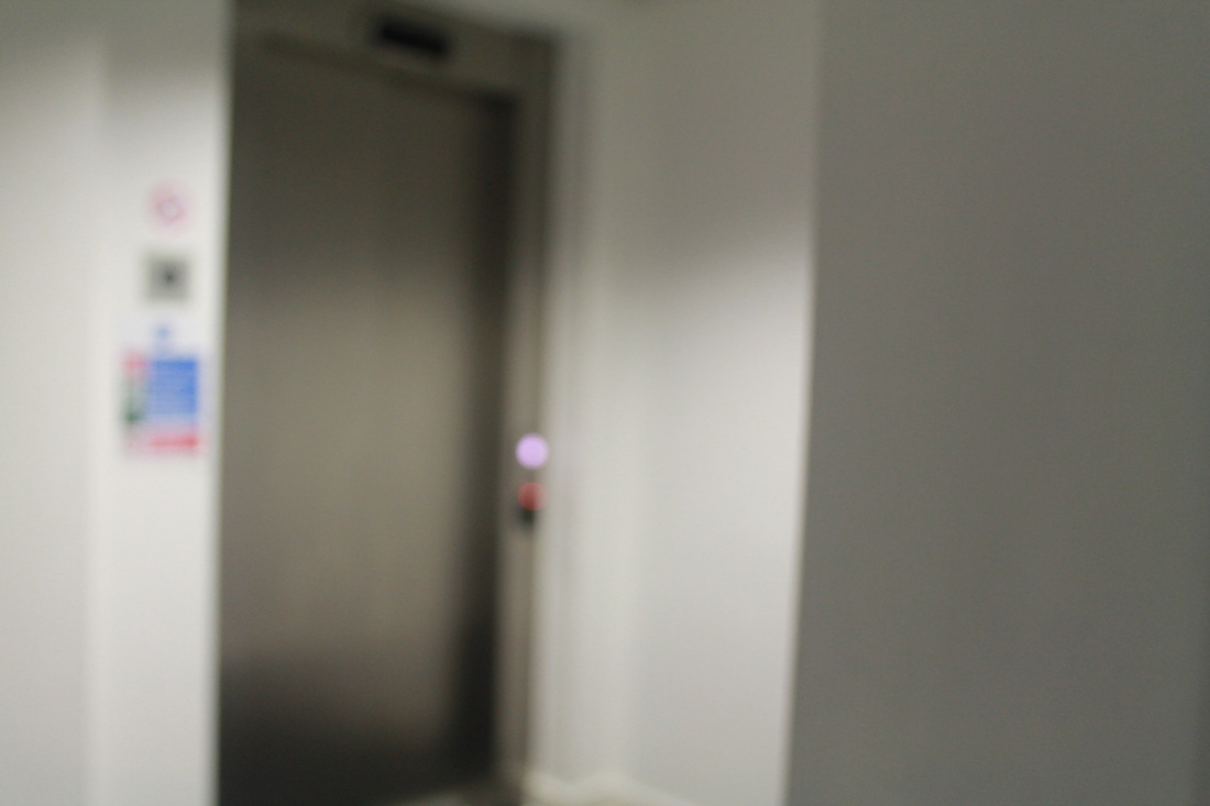
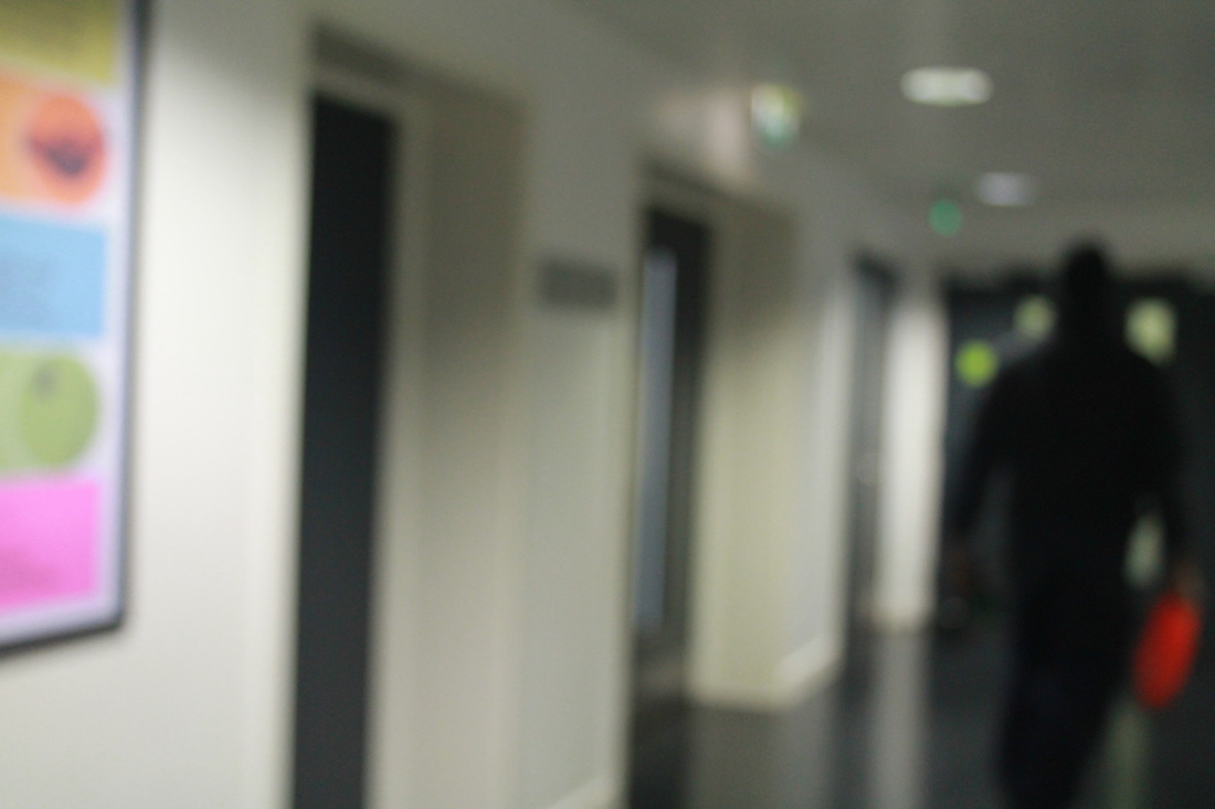
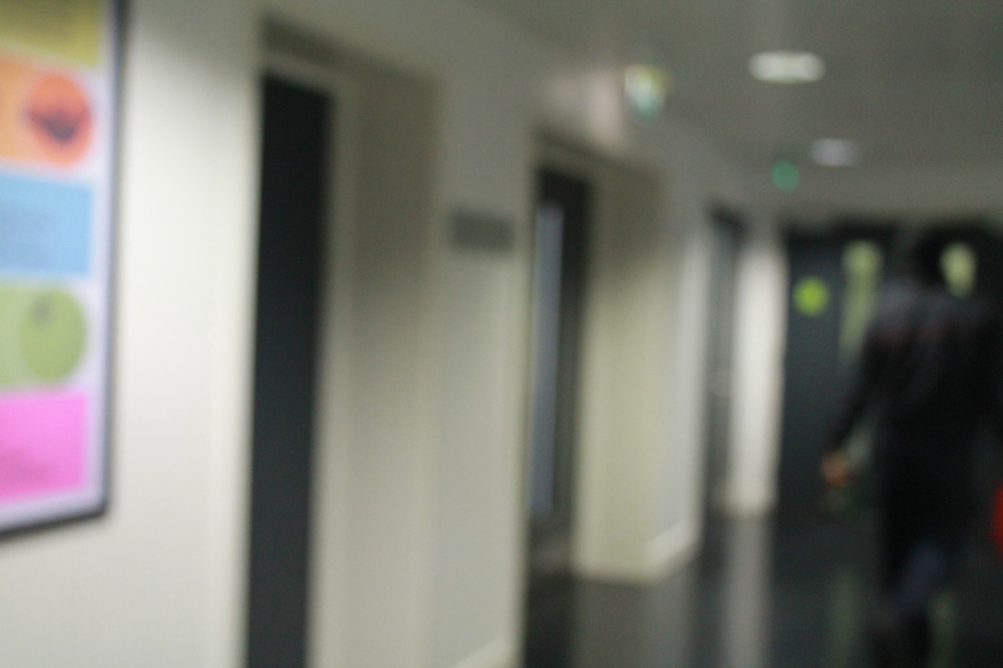
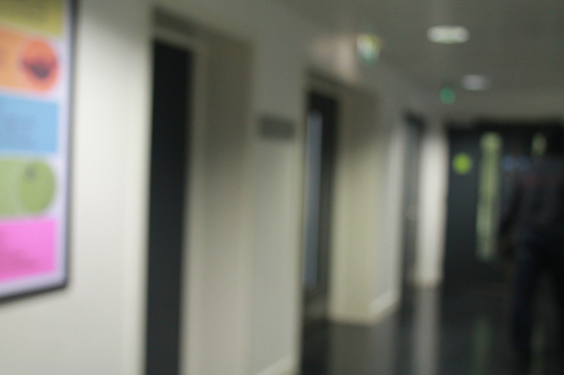
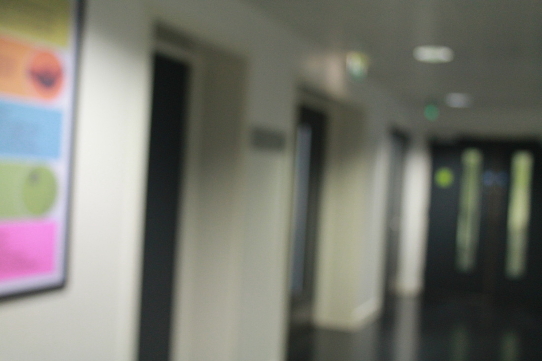
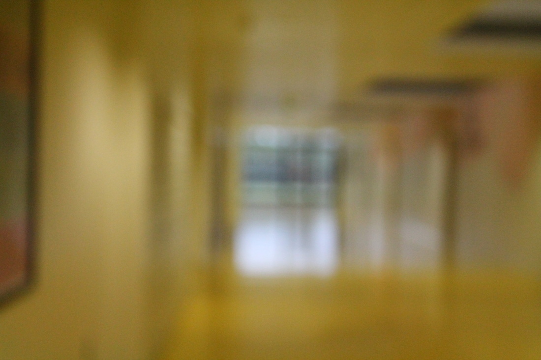
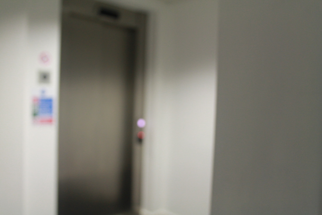
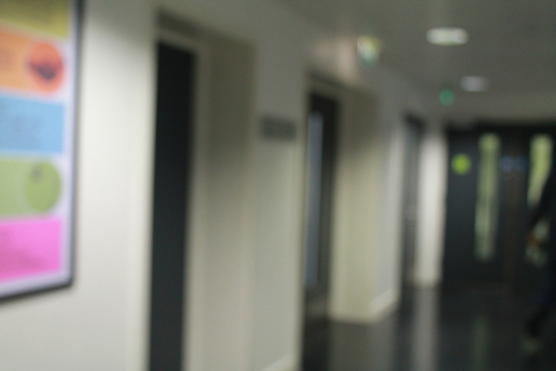
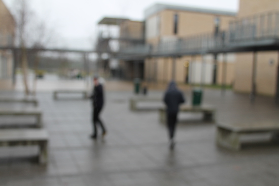
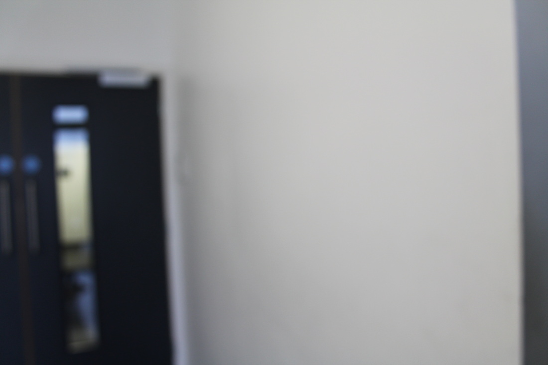
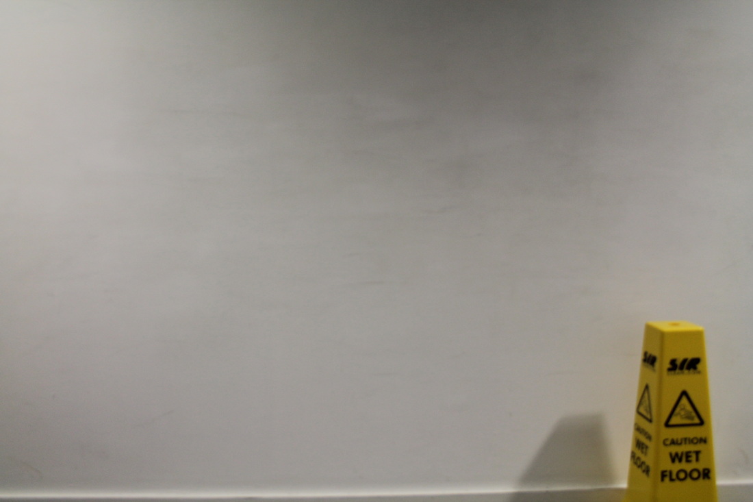
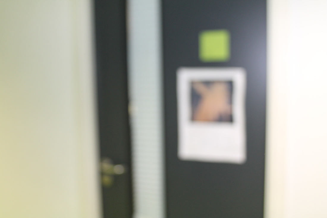
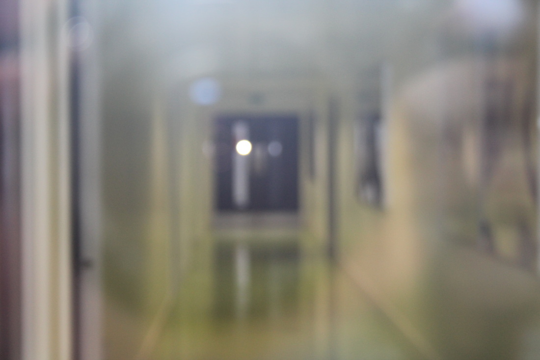
I chose these final pieces because they are all really similar they all have the same out of focus going on which makes them really interesting as you can't really see whats going on in all the images you can see little bits of colour, light and people coming through. All the images have a very similar framing they are all framed quite precisely so that theres not much in the frame the images are very simple and plain.
In conclusion, I really enjoyed this project and I think it helped me understand more about how to look images in depth and always look at what I do so I can make it better. The project made me want to experiment more with different angles and ways of taking the same photograph. I’m very happy with my final piece and the way all my work is throughout the whole project.
After looking into artists I began taking images I started using my phone then moved onto using a DSLR camera. Using the camera meant having more focussed and clearer images, I began by focussing on line and shape shown my first few sets of images. Then as the project continued I started to focus on line and light inspired by Francesca woodman. I also had parts of people in my images which was at first an accident then I began to put people into them. After a while I didn’t know what else to do to make my images better, so I just started taking similar images that I had before but in different ways at new angles to make them more interesting.
Then I began to take photographs that focussed more on light then line and my images became much simpler less chaotic and colourful. I made the colours very dull to add a sophistication to my images. After every experiment I did a WWW and EBI to that I knew what I needed to next time I took images it made it much easier to make my images better. It also made it a lot easier to evaluate my own images because it meant I looked at them in depth and could see things I may have done wrong or done well so I knew what to do before I took more in case I did the same things wrong.
I chose these final pieces because they are all really similar they all have the same out of focus going on which makes them really interesting as you can't really see whats going on in all the images you can see little bits of colour, light and people coming through. All the images have a very similar framing they are all framed quite precisely so that theres not much in the frame the images are very simple and plain.
In conclusion, I really enjoyed this project and I think it helped me understand more about how to look images in depth and always look at what I do so I can make it better. The project made me want to experiment more with different angles and ways of taking the same photograph. I’m very happy with my final piece and the way all my work is throughout the whole project.
