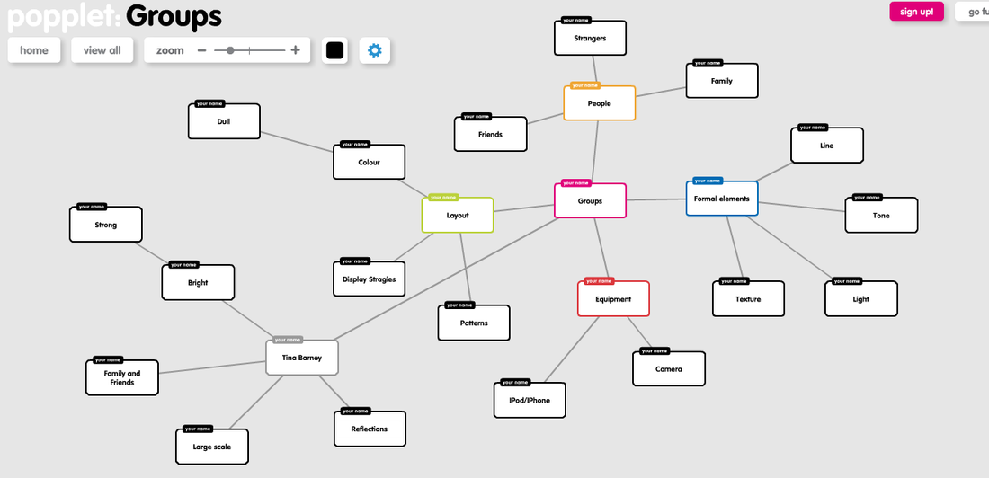
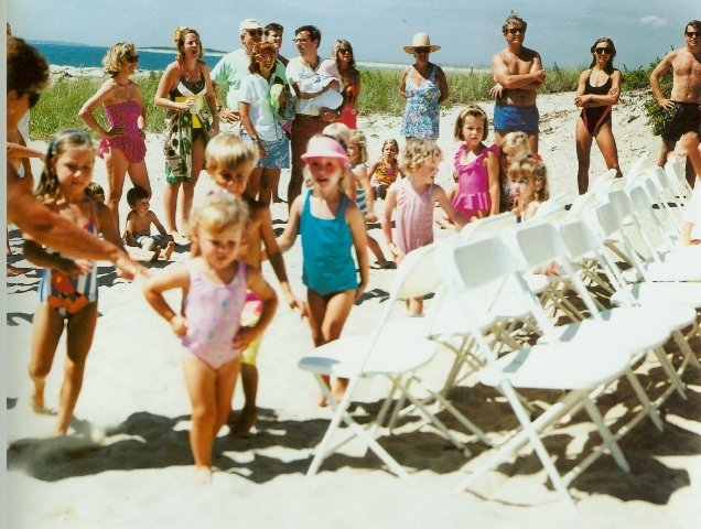
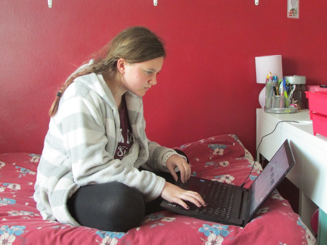
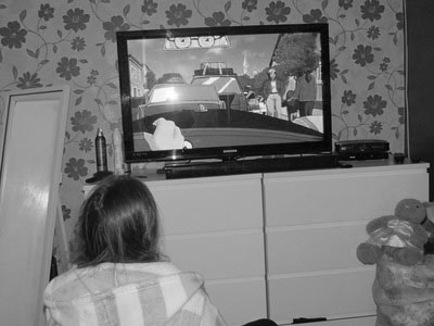
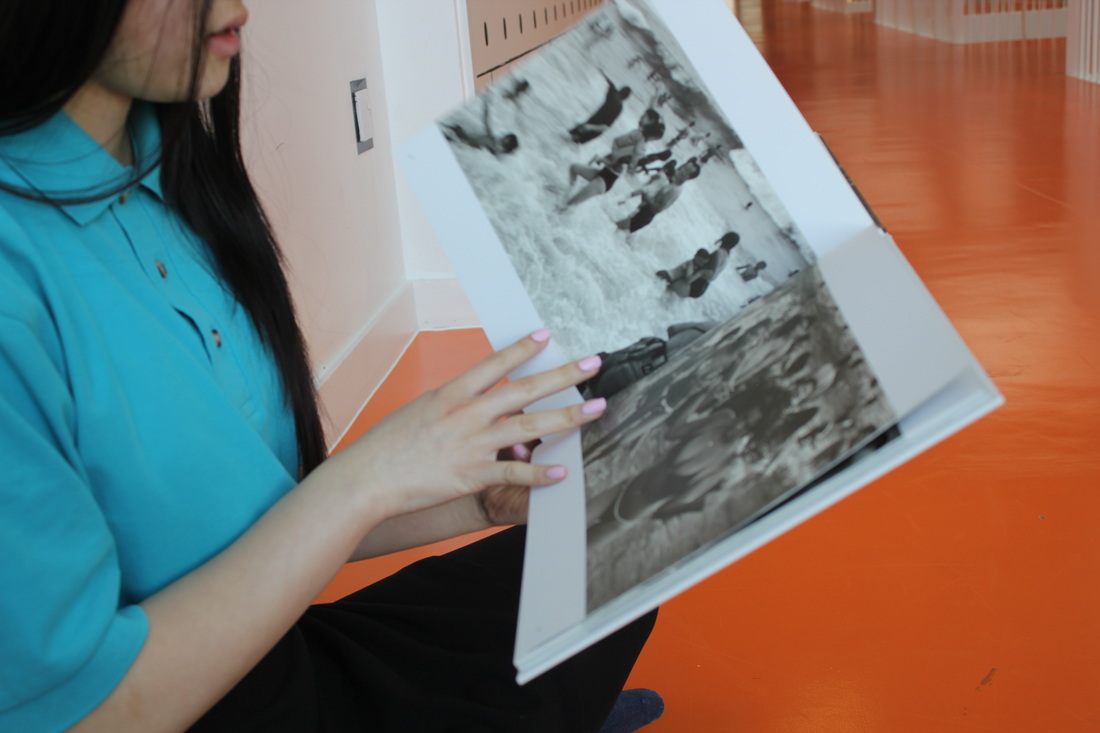
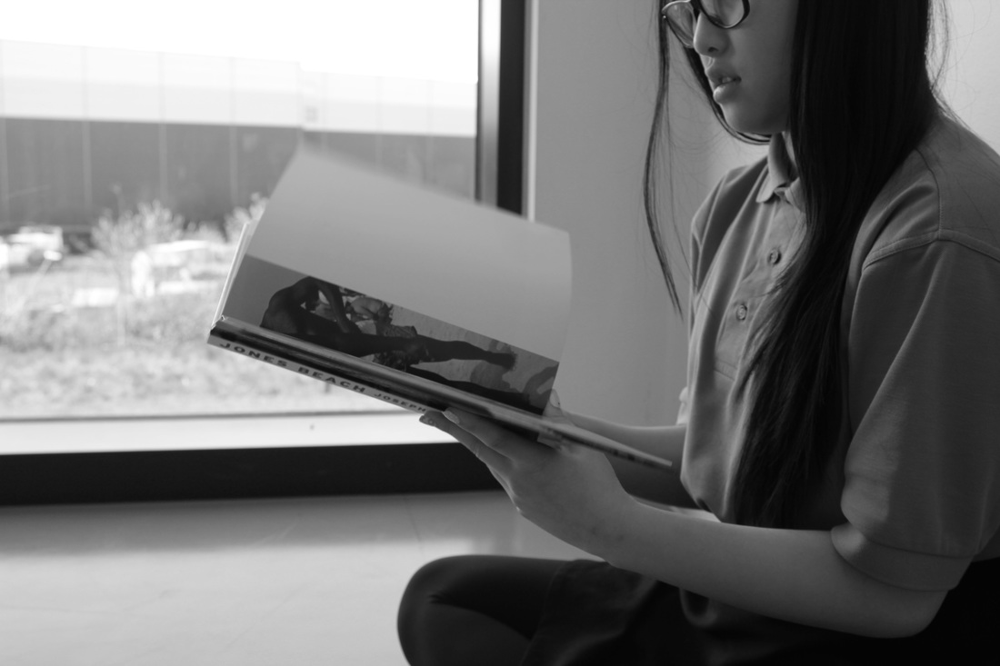
I have chosen the theme 'Groups' as a starting point. I looked at pinterest boards to help me find artist's first I found Nicholas Nixon who took many images of groups of adults and children he made all of his images look really interesting the angles he took his images and the way he used light to highlight certain areas of the images. I also looked at the work of Philip Lorca diCorcia who took really interesting images using people in quite dimly lit places and quite ironic situations. I began to look quickly at the work of Tina Barney who uses small groups of people and lots of colour within her images. I chose this theme because I think it would be the best theme it has lots of different variations you can use people, animals or objects I quite like the theme we did in Unit 1 called contrast and I feel like this could really help me to vary between the types of 'Groups' images I take. I already have ots of ideas.
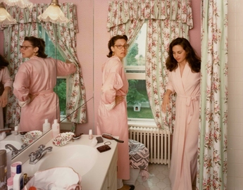
Tina Barney
|
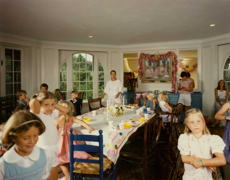
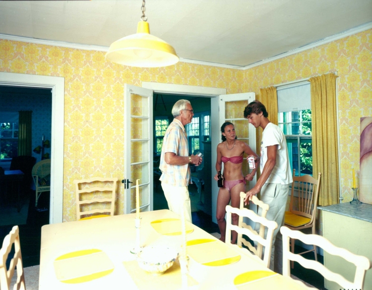
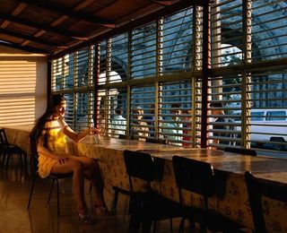
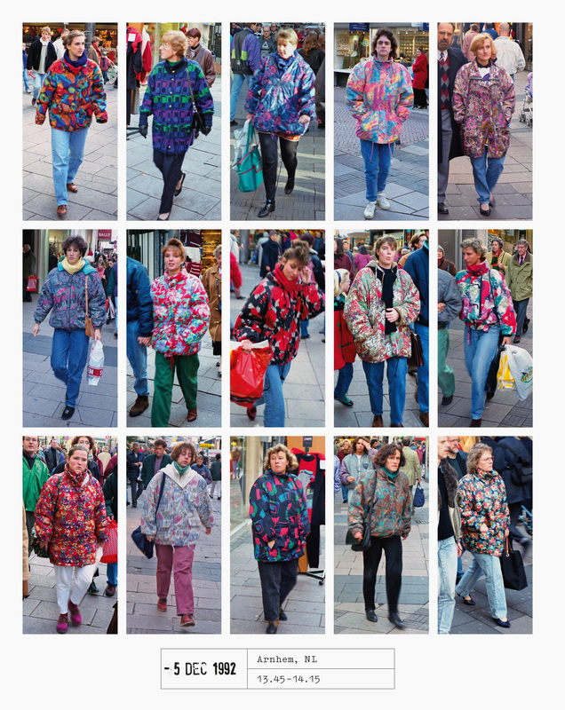
Tina Barney always took large scale images of her close friends and family which helped to capture the richness and all the details within the images. Tina also takes a lot of natural looking images within the image the way that the curtain is being drawn back to reveal the colours of the outside as the whole room has very rosy tones from the women's robes and the actual colour of the walls. The over tones of the rosy tones makes the whole scene more interesting. The way that she has composed the image makes it look very natural also the image is framed very well she made sure that you could see the mirror reflection, she also wanted to make sure that you could see outside the window. Within a lot of her image she has a hue of rosy pink making this image stand out from her other pictures.
|
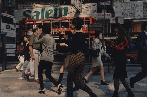
Philip-Lorca Dicorcia
|
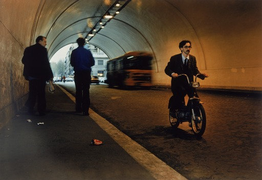
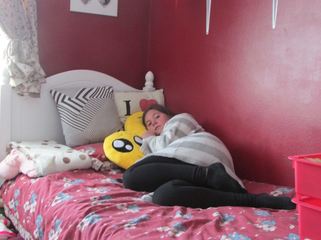
Philip-Lorca Dicorcia took mostly images of strangers walking the streets in all different cities however, this image is very similar to his other images of people alone in dimly lit rooms or places. This image is quite different we can see the girl is inside and the rest of the people in the image are outside, the girls face is also kind of covered by the lines. The girl also is wearing a dress thats the same colour as the table cloth but outside the window theres a lot more colour from the peoples shirts. This image is framed really well there isn't a lot of space around the girl and outside there isn't anything in the way. On the outside they all look like they're looking at the girl and she looks like she's looking out at them.
|
Hans Eijkelbo
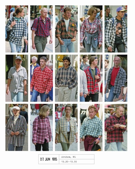
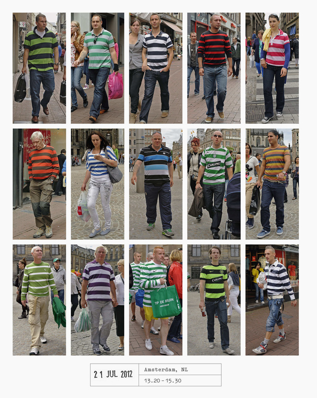
|
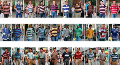
Hans Eijkelboom started by taking self-portraits in clothes he bought. He then began taking images of strangers he saw wearing similar clothing in public places like shopping centres and on the streets. The set of images of all different people in striped shirts much like most of his other work of people in the same shirts just in different colours or with similar patterns on jumpers. I really liked this idea it shows different groups of people and groups of clothing as well. All of his images were taken on a little camera that hangs from his body as he knew most people would react to a camera. Hans Eijkelboom's images are all quite well framed and clearly well thought out he also uses colour quite a lot it makes his images stand out from a lot of others.
|
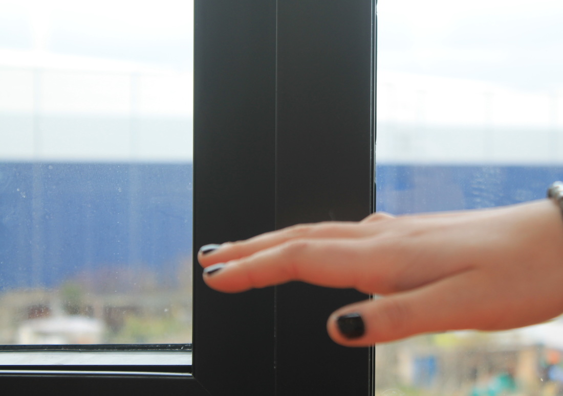
Experiment 1
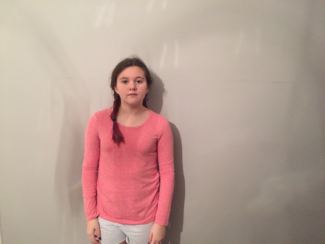
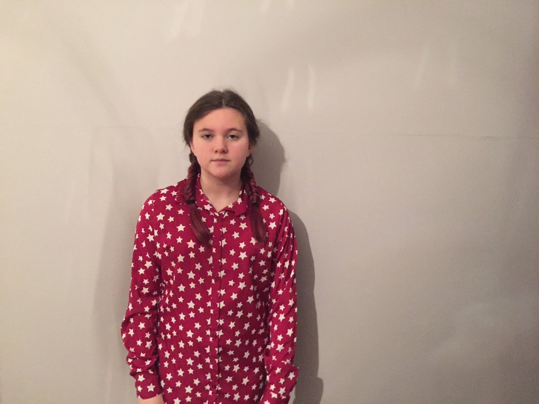
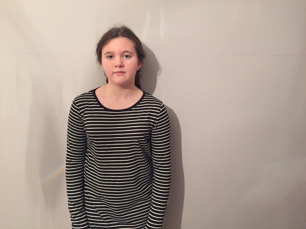
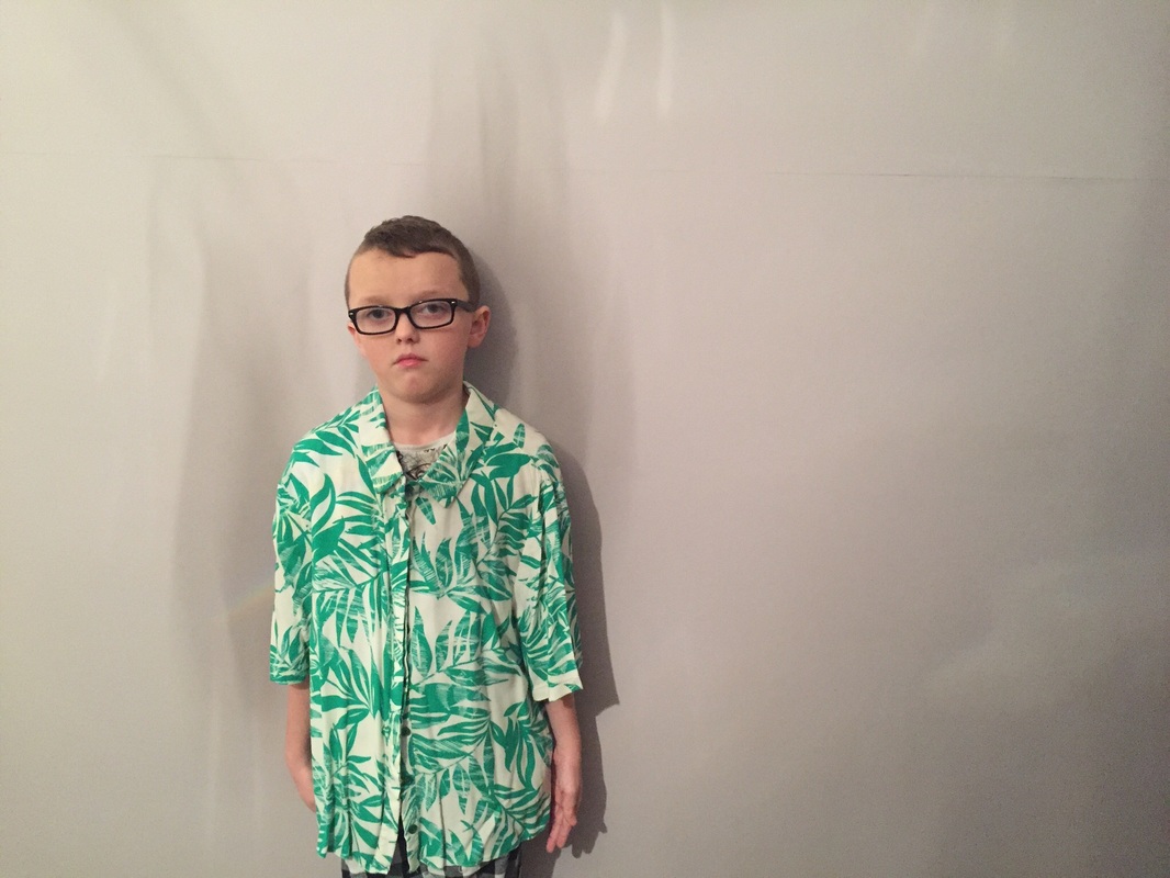
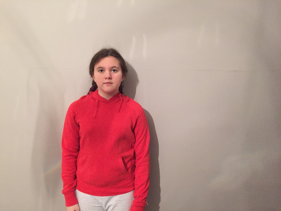
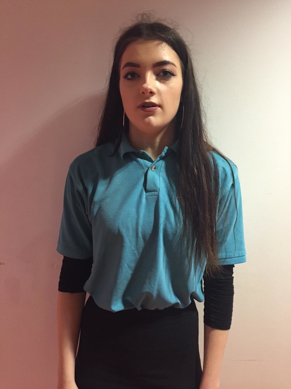
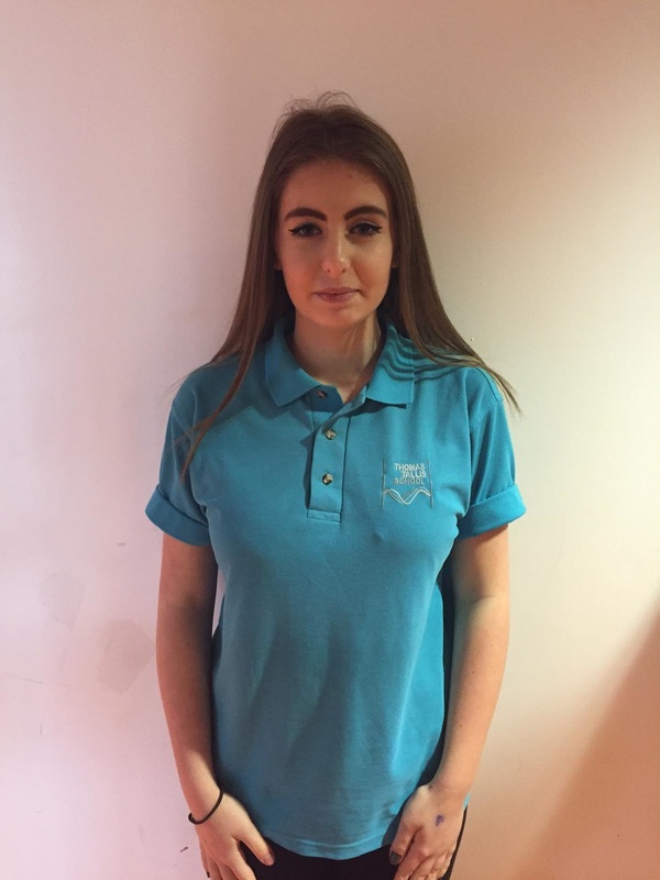
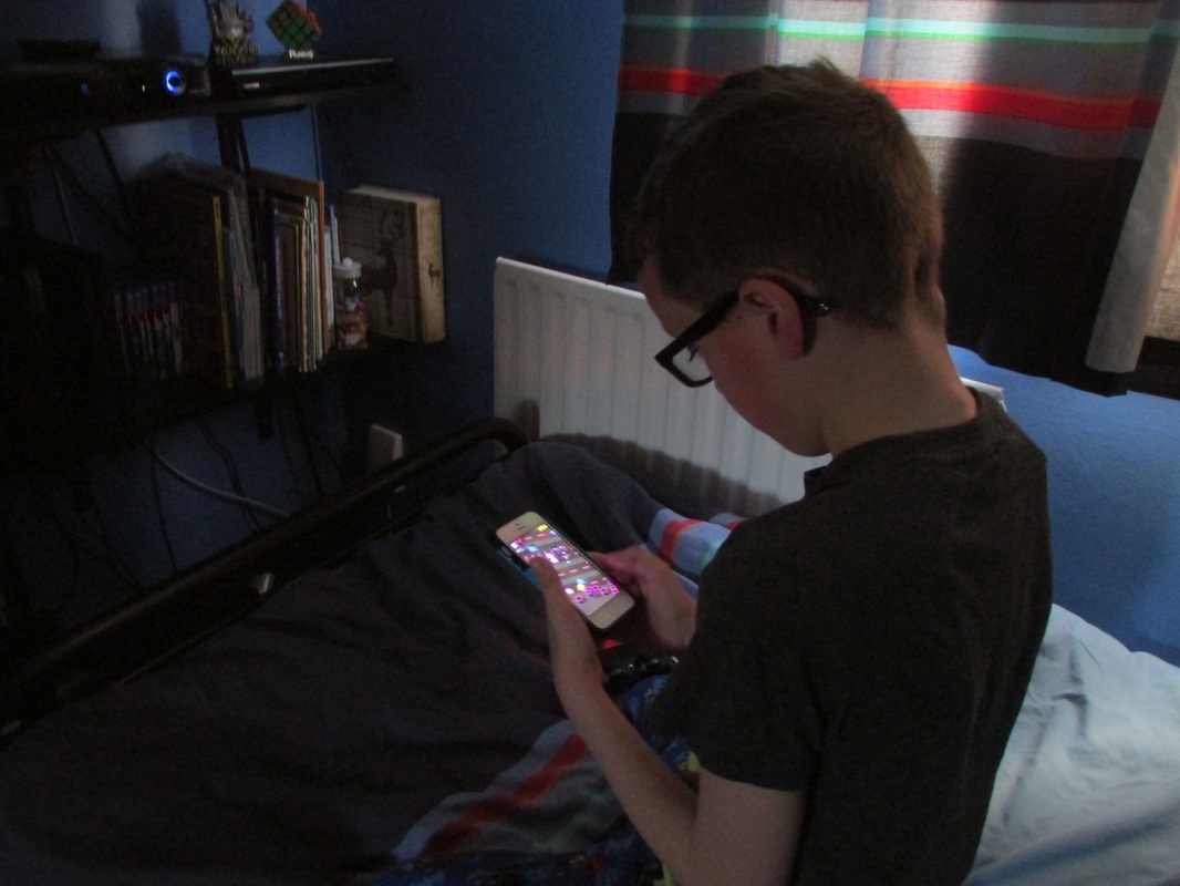
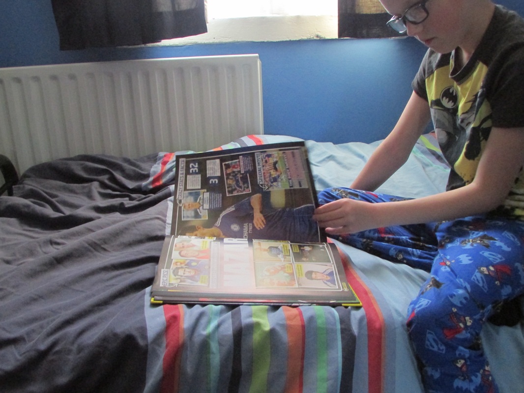
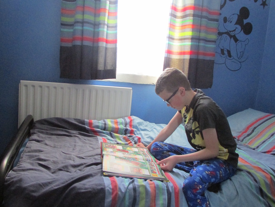
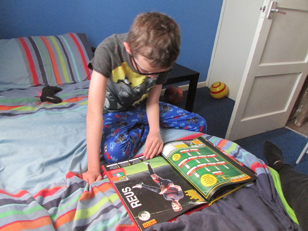
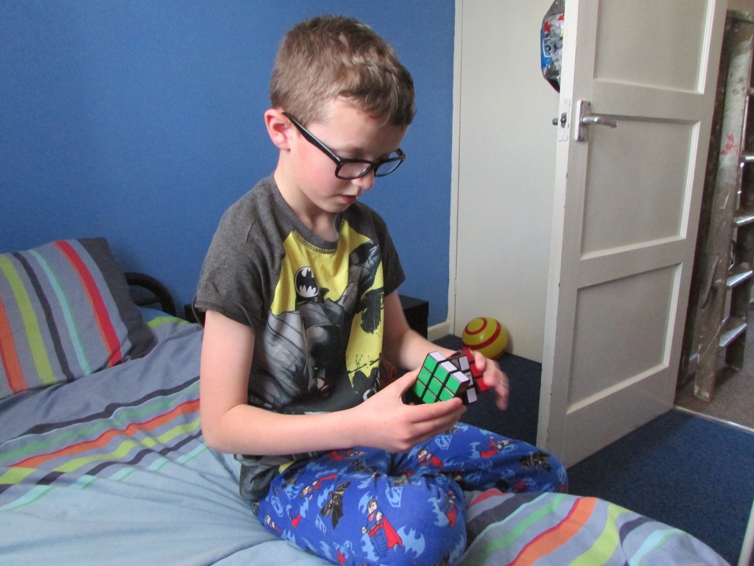
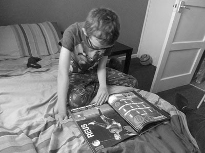
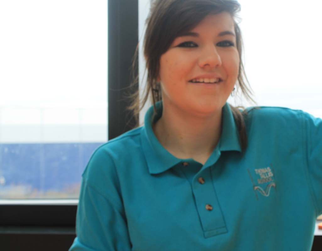
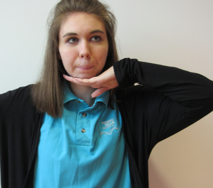
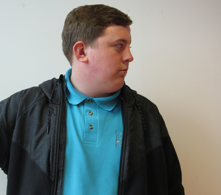
This is my first set of 'Groups' images I based these images off ones of Hans Eijkelbo who took images of different people wearing different shirts. I decided to use the same person model different t-shirts. I think these images are all framed quite well and because of the plain background the main focus is on the person and the coloured shirts. I could of made each image slightly different by having different poses going on in every one but chose to keep most of the images quite simple. I also think I could of changed the background for a few of the images maybe for the more dull coloured shirts have a dark background to make them stand out more and not just nearly blend in with the light background.
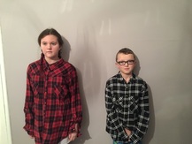
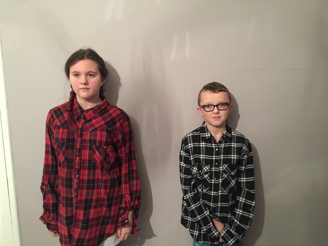
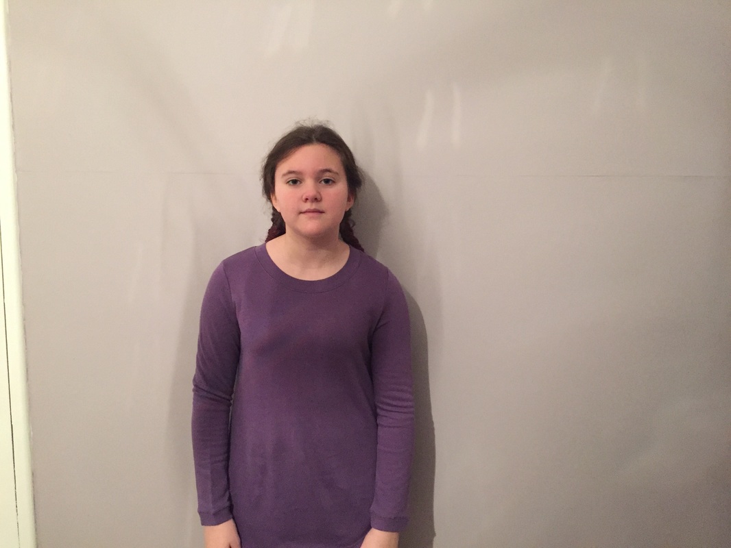
I think this is my best image because it shows exactly what I wanted it too I really like that they both have on plaid shirts that are different so they contrast from one another they also contrast from each other because of their height and gender. I really like this image with the plain background it helps the people and the shirts really stand out, also I framed this image really carefully to make sure they had enough space between them and around the sides of both of them I wanted to make them both quite central so they were the only things to look at in the frame. However, I could of been a bit more careful and made sure there was no shadows on the wall behind them.
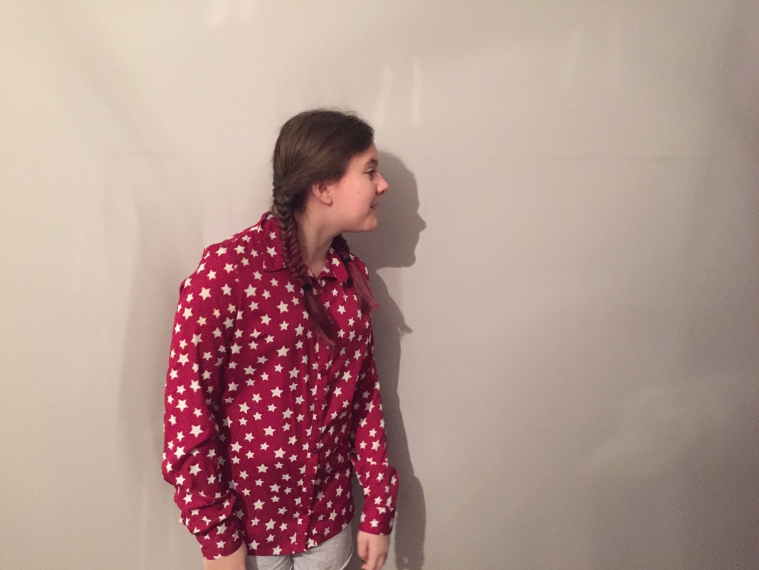
This image was the least successful because although its different from the other images it also shows more than what I wanted it too it has a lot of shadow on the background and the framing is slightly off as she was moving it made it difficult to keep the image very central so you can see part of the wall next to the plain one. This image also isn't totally in focus as she was moving focussing the image was quite difficult to do so its slightly out of focus. It didn't work as well as I had hoped as all the colours are dull she doesn't stand out as much as I would like.
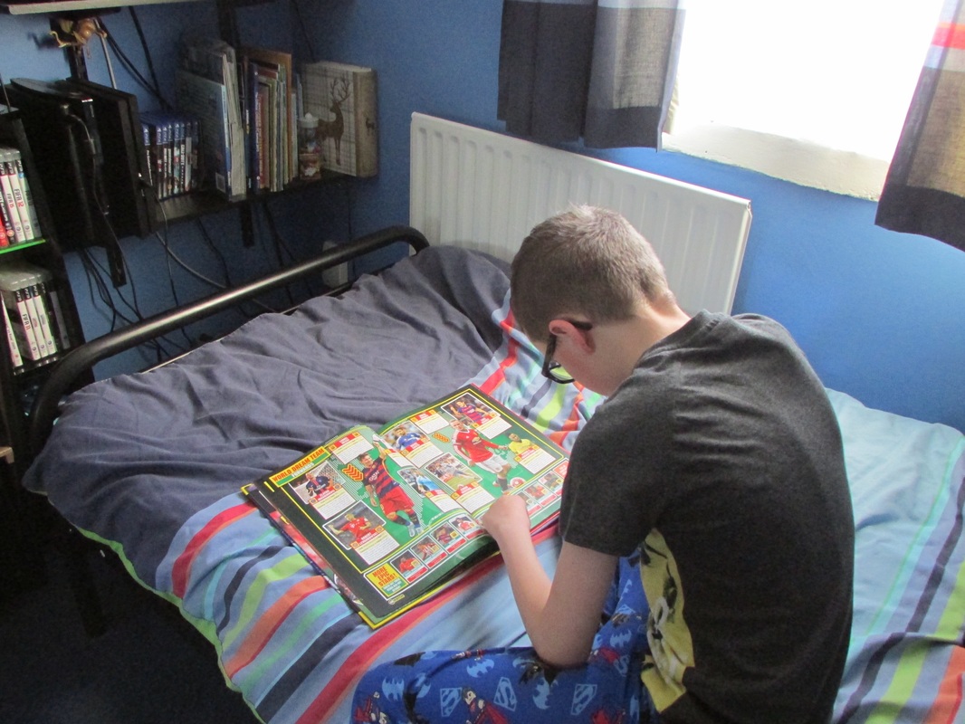
Experiment 2
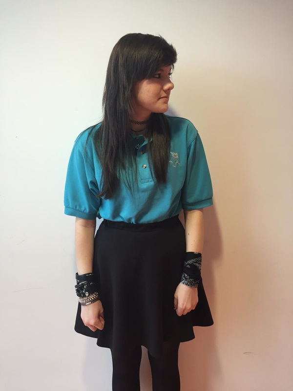
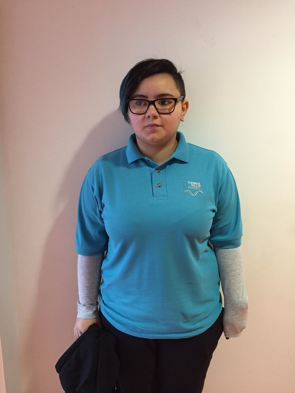
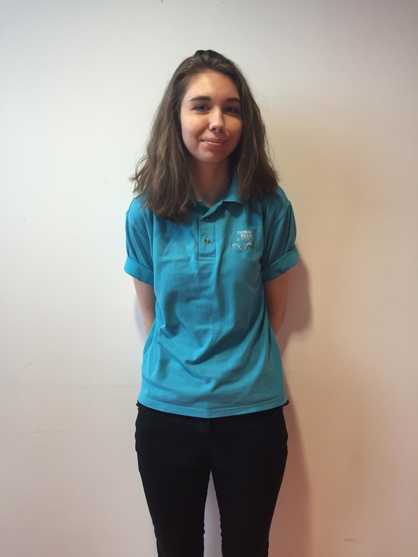
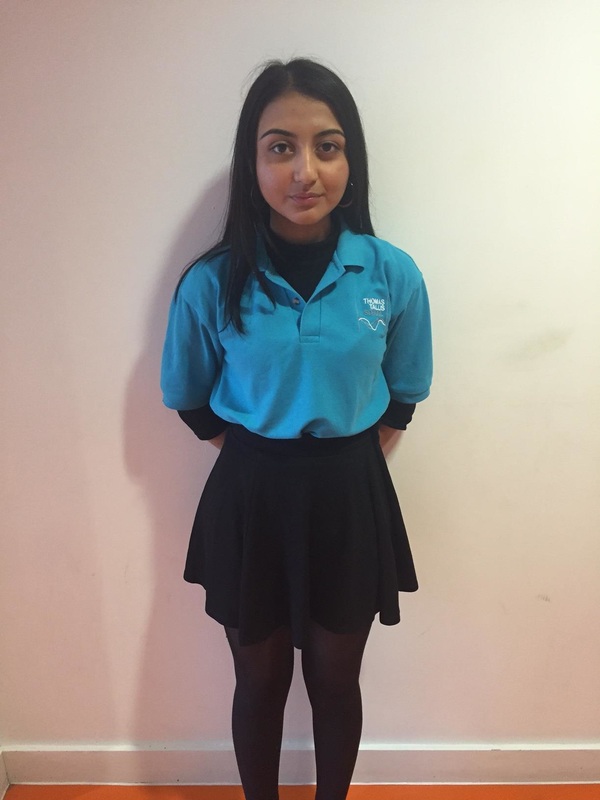
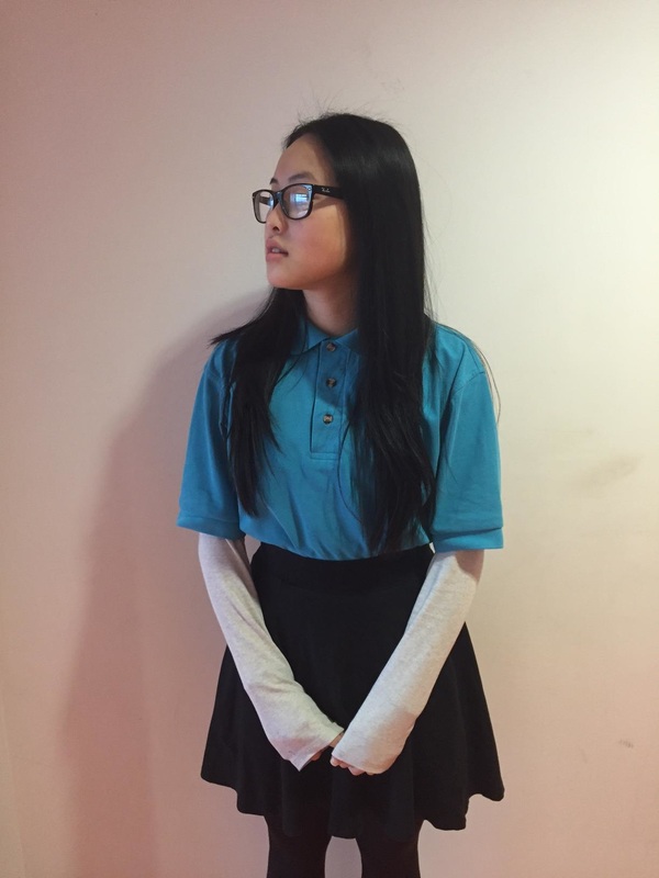
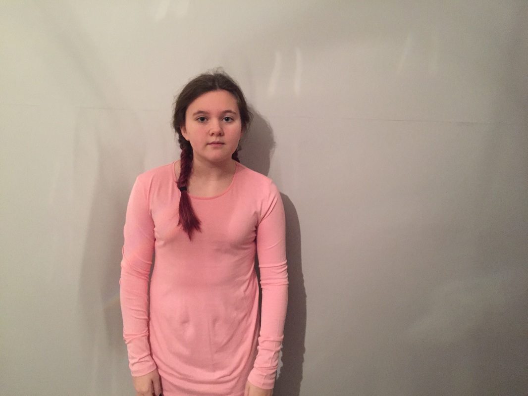
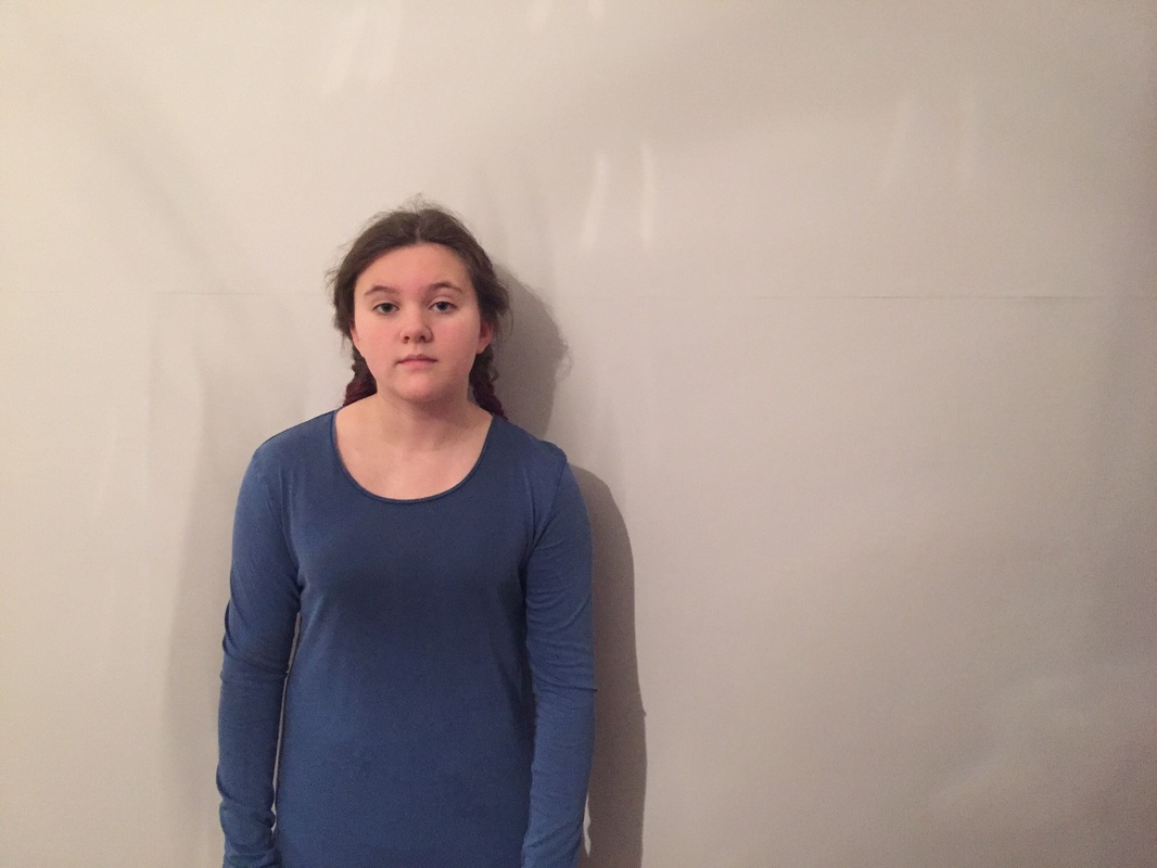
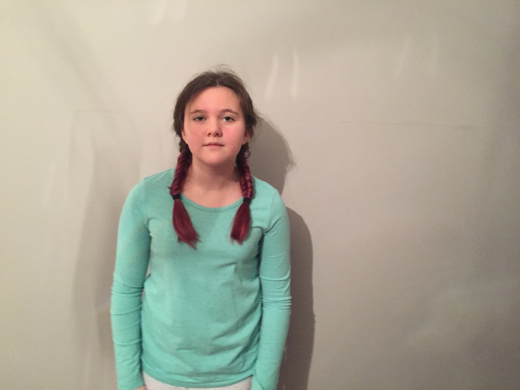
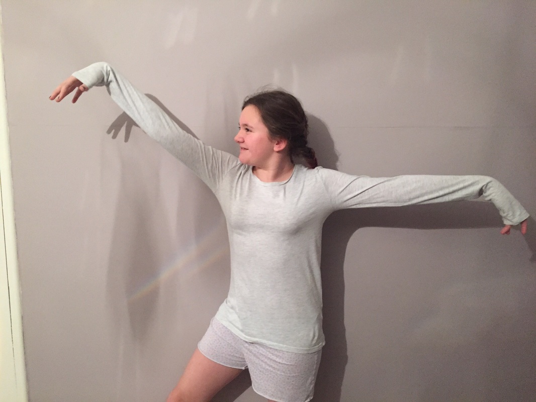
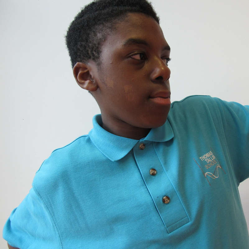
This set of images are very similar to my first set I like the idea of simple images with plain backgrounds. I like these images because there simple and all different each one has a different person however their all wearing the same shirt I made these images all look very similar but there is a few people looking off in different directions and having all different facial expression. These images are all framed quite well the person is central but on the backgrounds theres shadows which I don't like. In my next set of images I want more interesting backgrounds so maybe out on the streets taking pictures of strangers all in different clothing. I think most of these images are very dark and I want to make them a lot brighter more lights and a have people in different shirts and all have something quite different going on within my images.

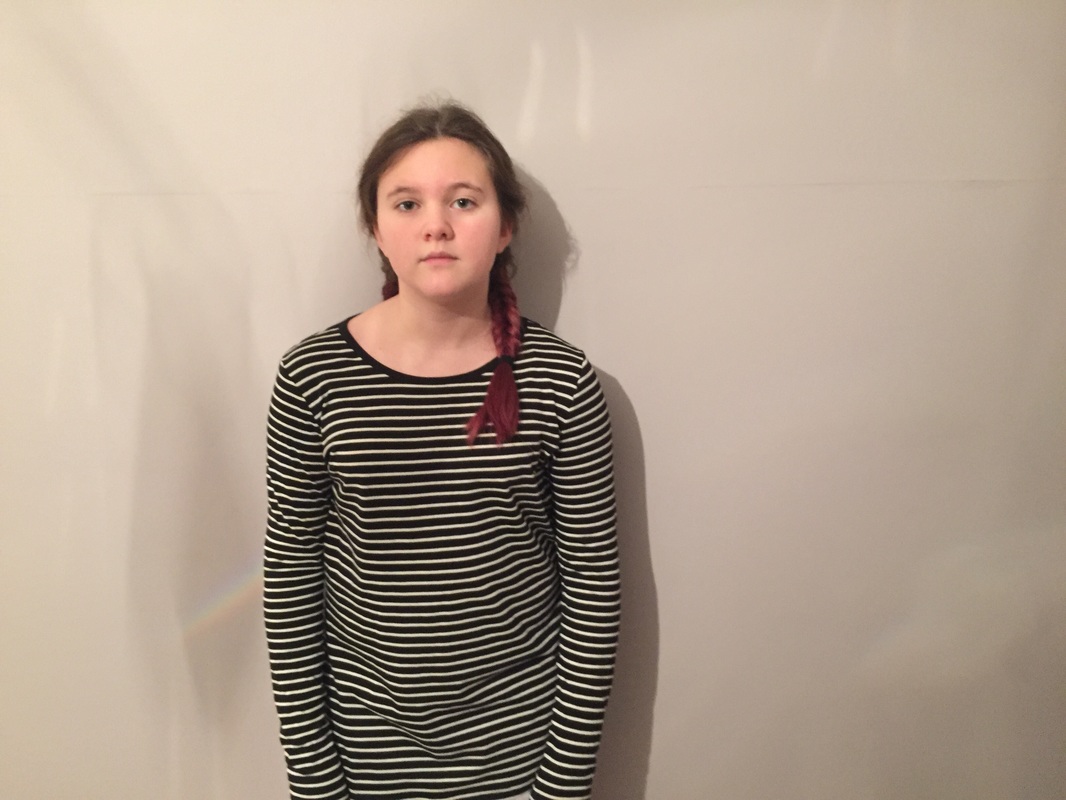
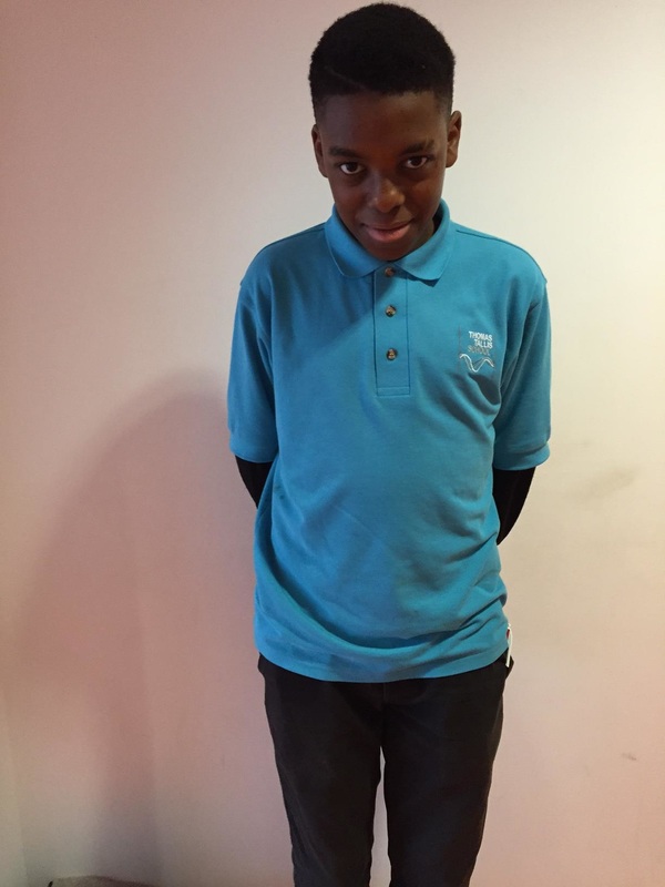
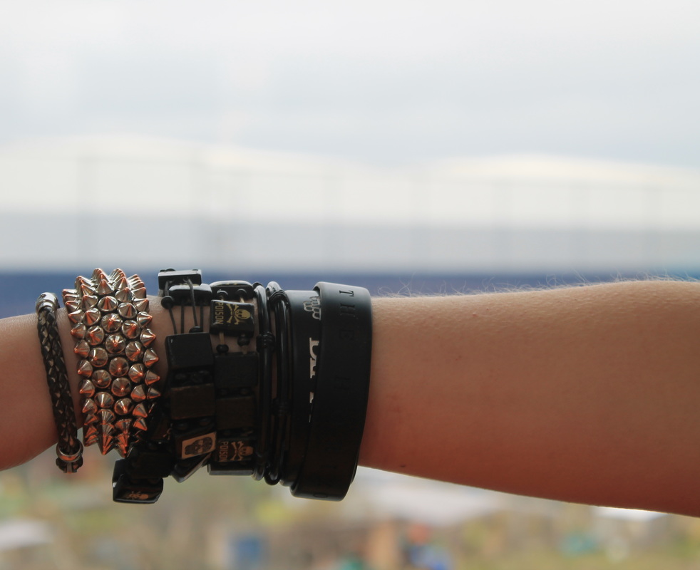
I think this image of Alex worked the best because you can really see her own style the way that she wears her jewellery and its seen in the images unlike others. I also like that these images also have a plain background it makes it easier to notice the school shirts they all have on this image was framed well I wanted to make her only thing you could focus on. Also this image is different because Alex chose not to look at the camera so you can see only half of her face it looks really different from the others. However, this image could be a bit more interesting

I think this image was the least successful image because Bethany wasn't looking at the camera and she covered most of her face I also don't like the background its plain but you can see something in the corner of the frame. This image also in focus as she was moving it was hard to keep her in focus, she also isn't very central as she was moving. I also don't like the way that she moved her body so that she was facing side ways I wanted her to face straight on so I could take a better image. However, I do like that the colour of her shirt still really stands out over everything else going on the frame.
Hilla Becher
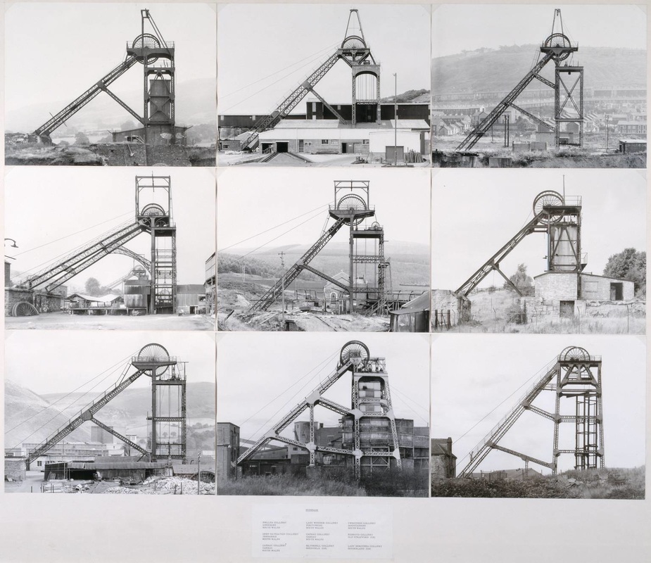
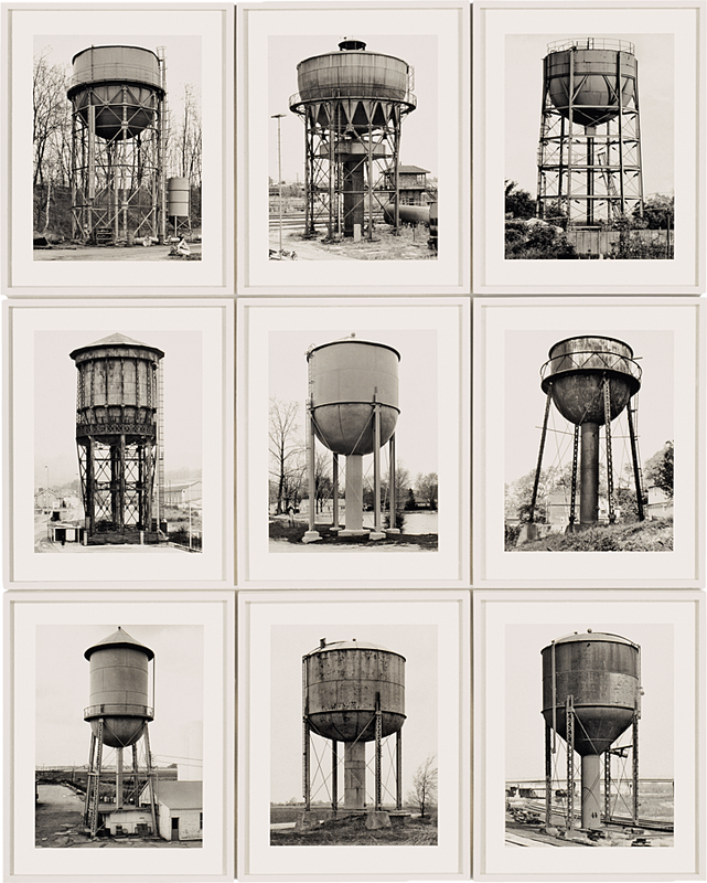

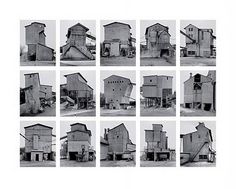
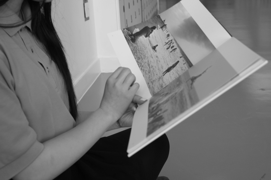
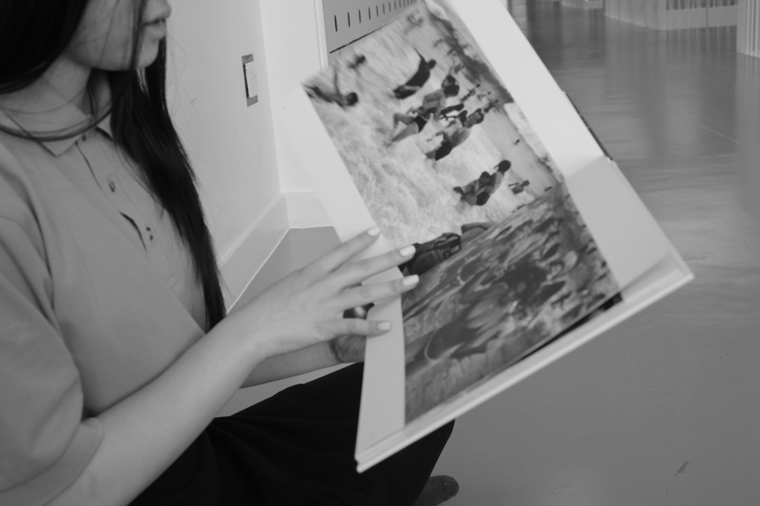
Hilla Becher and her husband Bernd started taking mainly black and white images of industrial architecture like water towers, blast furnaces and oil refineries. There work was known as typologies a college of the same subject matter but different images. All of their images are very similar the black and white really helps with the detail you can see little things you may miss if they were in colour. Most of their images also have the subject from all sides and angles so it makes you really want to look at them and pay attention to all the little details about the place every image shows the place in a different way and setting so you can't miss a single part of it. .
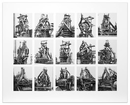
Hilla and Bernd Becher took many images of industrial architecture for example this image of a blast furnace. All of their images are taken in black and white making the details really stand out they also really capture every angle and side of the subject making you want to study the images more. The composition is also very central within all the images they capture them in way that really gets everything composition of the images are all very central and widely shot capturing some of the surroundings as well. All of the images are exactly the same size and the space between each is identical it really helps to focus on the subject more, it also showcases all of the images off at the same time without having them all separate from one another. Each different set of images is very different from one another making each and every one much more interesting.
Herman Costa
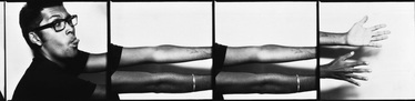
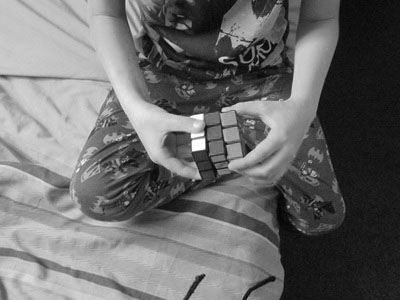
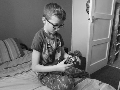
Herman costa takes multiple images and groups them together to make one large image. I like his images because he is doing something really different to a lot of other photographers he took multiple images of the mans arm and then grouped them together to change the way it looked. Throughout this image theres the use of strong lines and strong tones that really help to make the image different. Herman Costa used light to make the mans face and hand look a lot brighter than the rest of his arm. I think that having the arm all pieced together really gets across how the photographer wanted us to view it.
Experiment 3
With this set of images I want to crop quite a few of them and make them into collages with my brother doing one set of things whilst my sister is doing a different set of things. I want to make them all different so maybe cropping these images to make them all look better together by making them all very different from one another they will all start to change the way that they will look as they come together and get cropped and changed. All of these images are also all framed quite well I wanted images that were all framed really well so that I could easily crop and change them around.
Black and White
Experiment 4
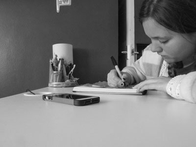
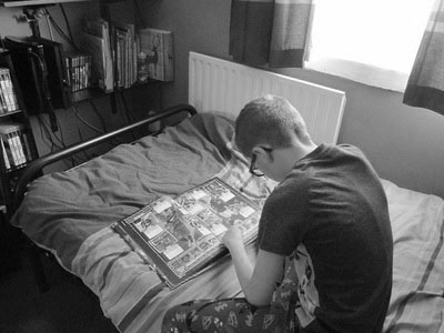
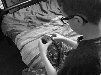
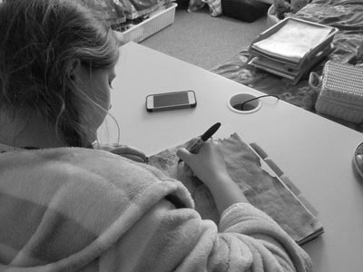
I took a second set of these images so that I had different images to use for my collages. I think these images are much better than the first set as they are already close-ups so they didn't need as much cropping. These images are also framed quite well, the lighting in the second set of images is also a lot better than the first making the hands and objects a lot clearer. I also made sure each one really focussed on what was going
Black and White
Jim Golden
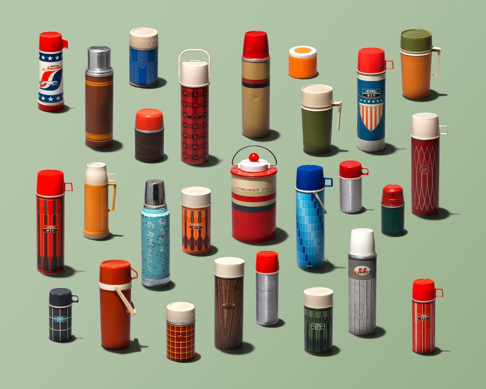
Jim Golden took many images of groups of objects that all go together to either make something like a bike or that all go in a room together like a kitchen he also has many images of objects that are all the same thing but all look different. All of his images are taken on plain but colourful backgrounds that really help the things within the image to stand out. Jim Golden's images are all framed very carefully that really help to bring the whole image together. Most of his images are very simple he places each item very carefully to get the perfect balance between composition and lighting. Looking at a group of objects that are all exactly the same gets you to notice the tiny differences between the items within the picture.
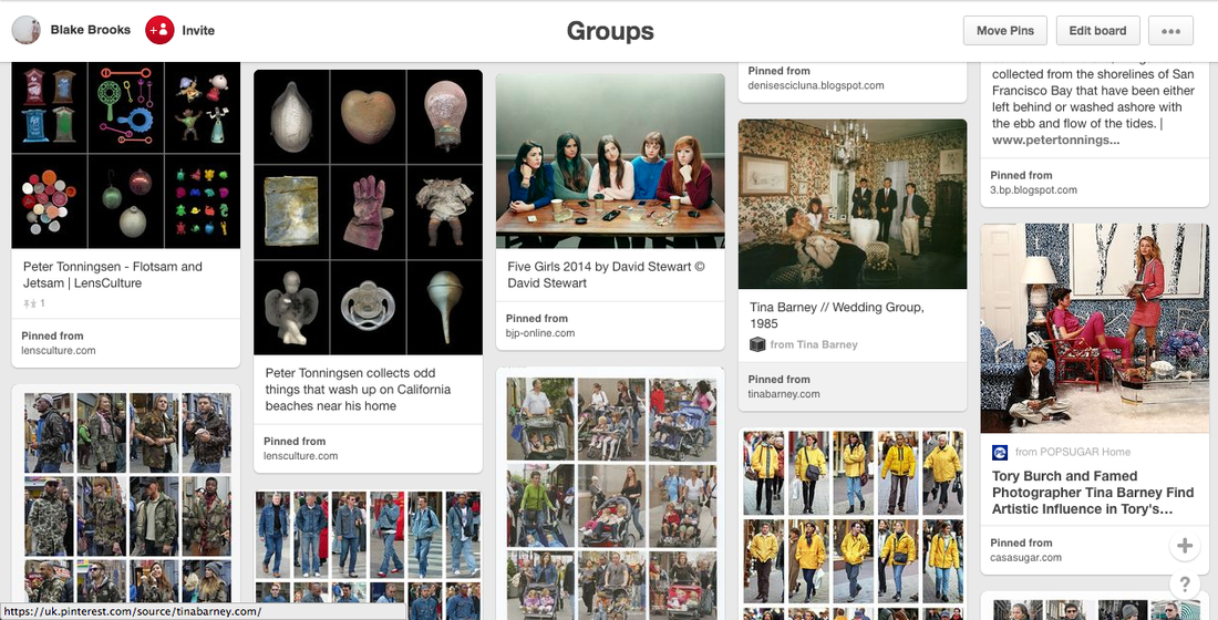
Peter Tonningsen
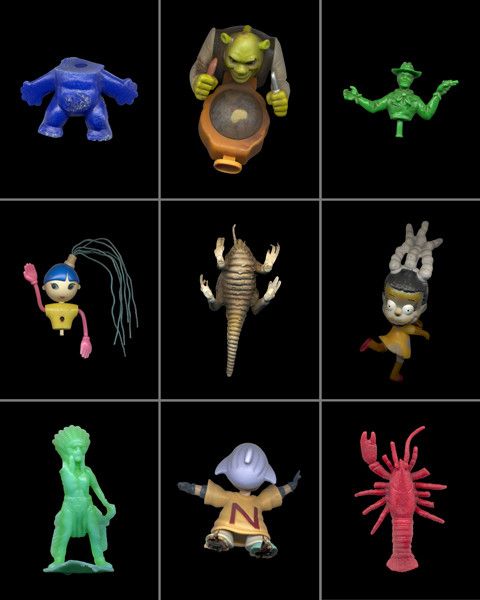
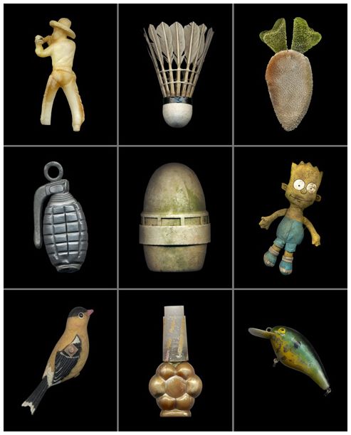
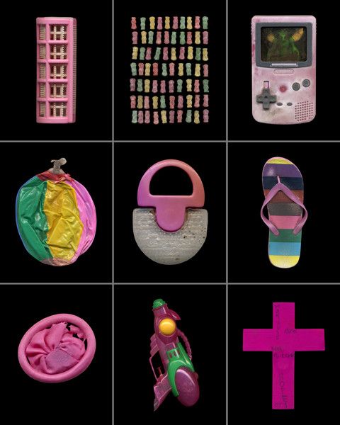
Peter Tonningsen take images of groups of objects he finds washed up on a Californian beach. He puts some objects together as by the colour or what they are so like children's toys and things that are of a same shape. All of his images are framed very well so that you can see each object in detail which helps to understand he whole image and why each one was chosen to be put into the set that its in. Peter Tonningsen also has a plain background which helps us to focus on all the objects.
Experiment 5
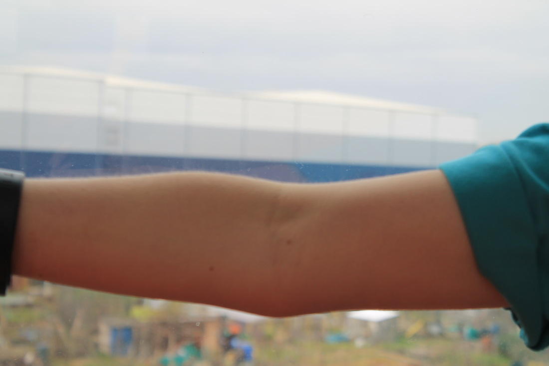
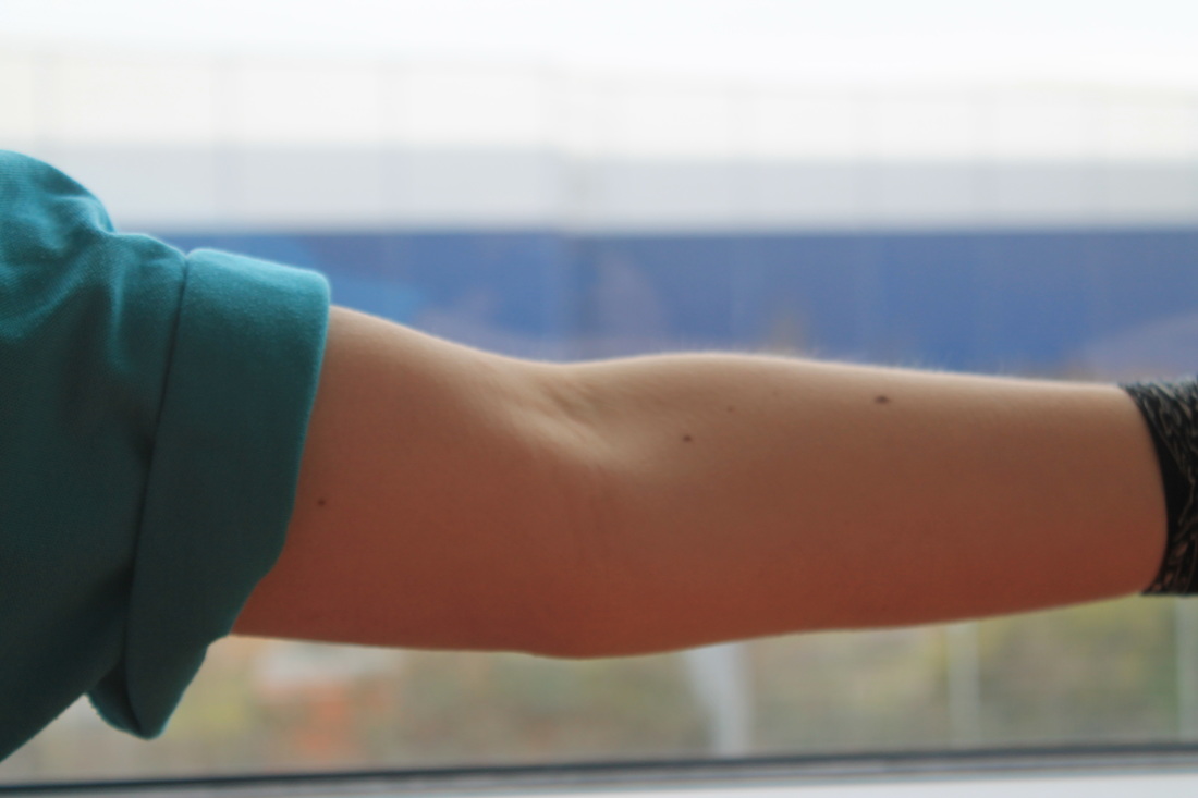
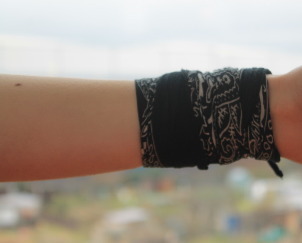
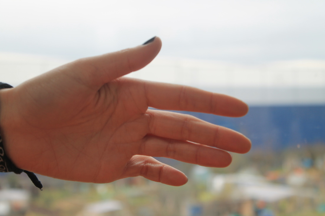
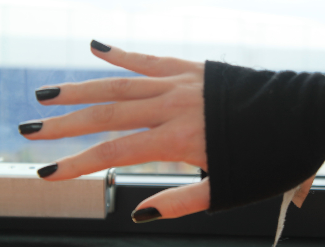


I got inspiration for this kind of image from Herman Costa who has a few images like this and I really liked the way they were pieced together nearly perfectly but they didn't quite fit so I decided to do the same thing the images don't fit together perfectly and it makes their arms look quite different. I also really like that all my images are in focus but it was really difficult to make sure they were all the images were framed properly so that I didn't get the same part of the arm in the pictures. This was quite hard so part of the arms do overlap slightly but I have cropped some so they fit better together. the first one of Alex worked really well it lined up quite nicely but then the second one didn't come together as well and then the last one is matched up with the arm and hand but when it gets to the forearm it becomes really out of place as does the shoulder area. I then decided to change the order around to make them all look really different and as they wouldn't go together I thought it would be best to change the way they looked altogether.
Experiment 6
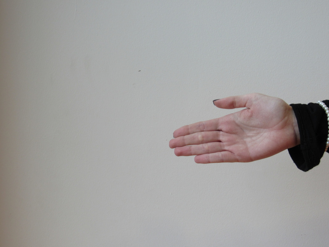
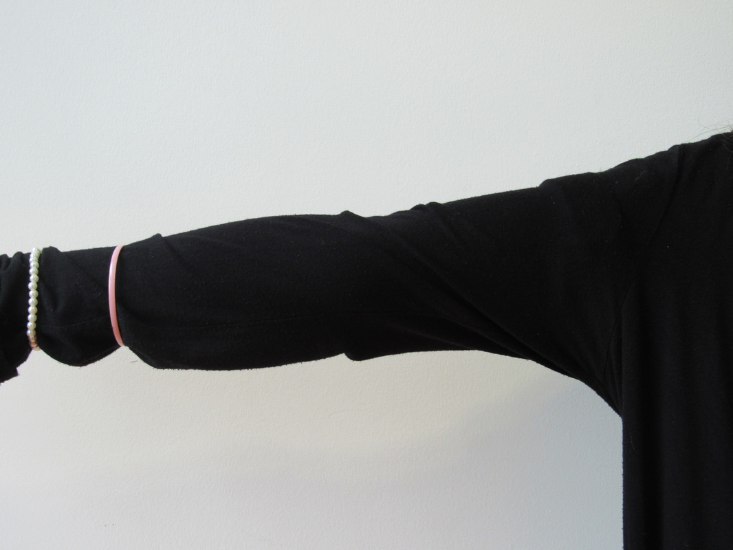
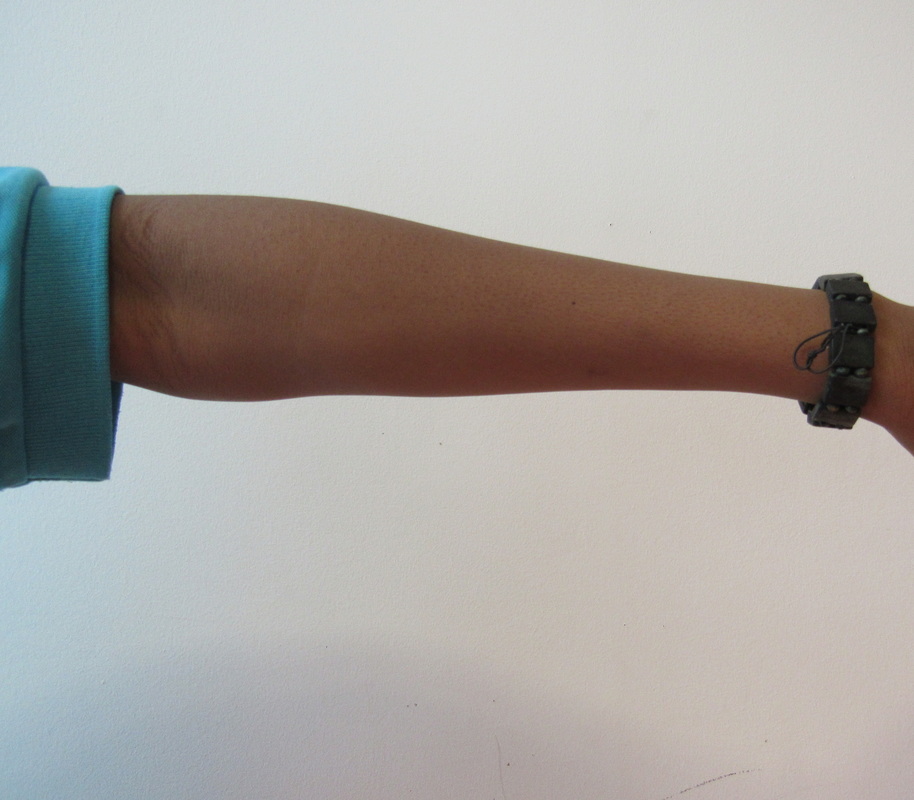
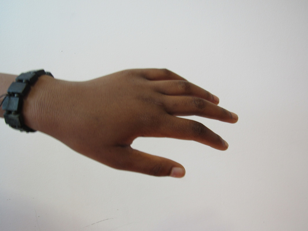
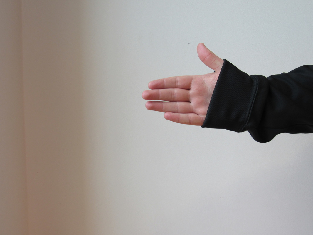
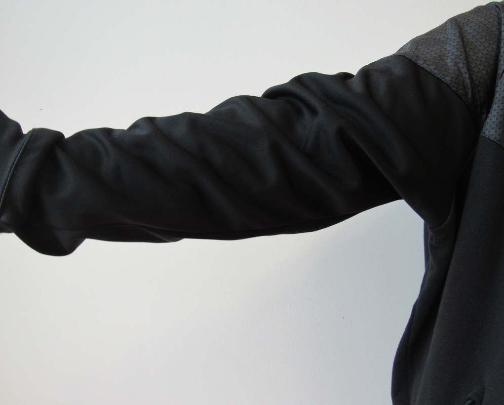
In my second experiment I managed to make the hands line up with the arms much better but the bodies are still very out of place they aren't high up enough or zoomed in enough to match up with the rest of the arm. But these images are well framed and the lighting is good too I made sure there was a plain background to help focus on the the arms and hands. Also within the image of Promise the hand and arm don't match up exactly but I feel as though it makes the image look really different as its bigger than the rest of the images that go along with it. The first ones of Lauren are also out of line much like the one of Ed the bodies and shoulders don't match up to the arm and hands.
Tom Hunter
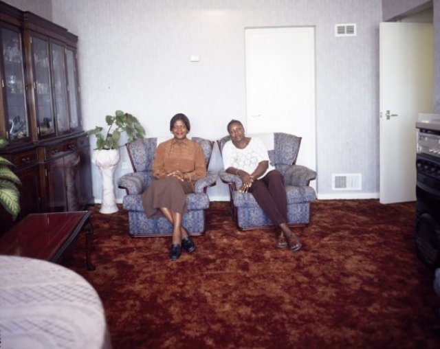
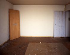
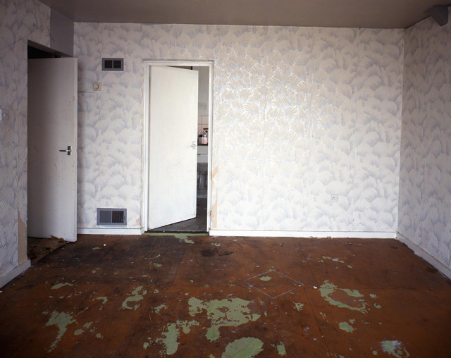
Tom Hunter took images of people within their own homes all in the same tower block. These images were taken of these people before they had their homes destroyed. I like these images because they show the families within the images but they also show the kind of environment they live in. Tom Hunter also took images as the flats were being destroyed so after everyone had already left he went back to the residents and took more images. The more barren, and plain backgrounds are a lot less exciting to look as as they show a lot less character unlike the first images where the people and furniture helped to add more depth to the images. All of the images are very focussed and are focussed mainly on the people. Whereas the next set of images don't really have any main focus they have no people and very little furniture left within them.
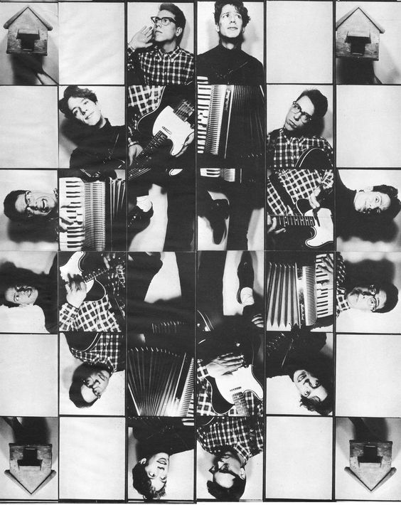
Final piece
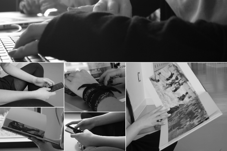
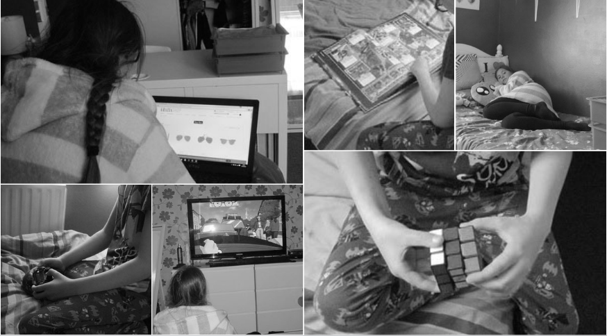
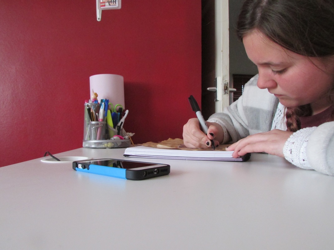
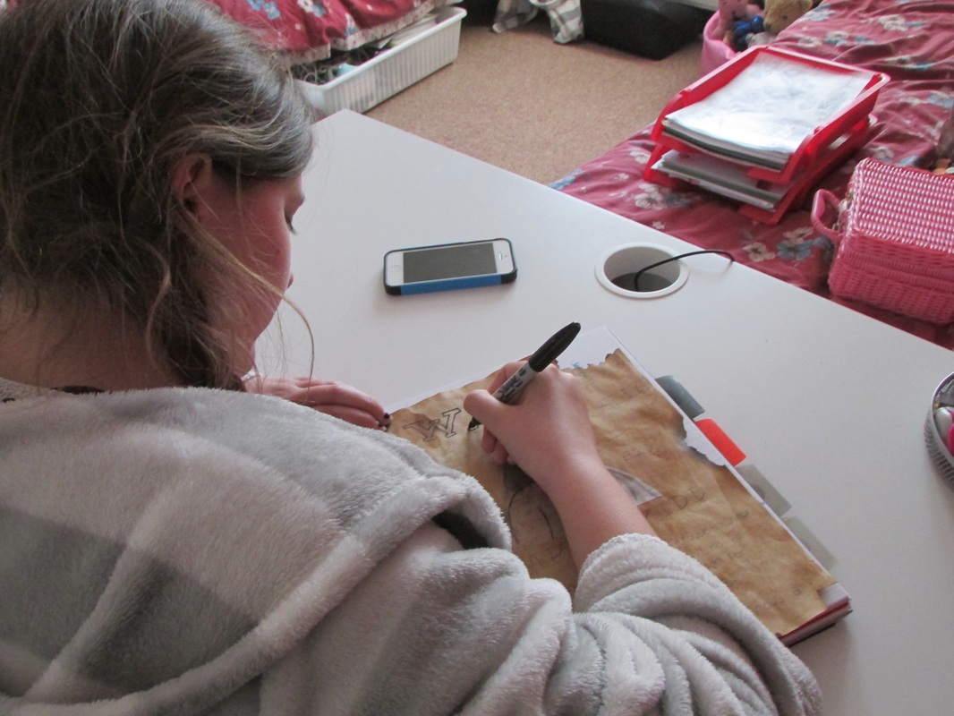
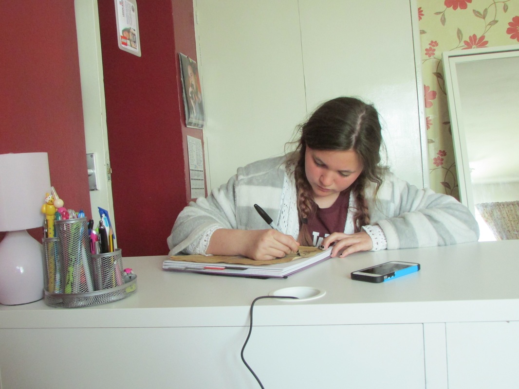
I chose this way to display my images because it focuses heavily on the action that they are doing. It helps to see their hands and what they are holding, I got the inspiration to display my work like this from Herman Costa. He has many of the same image within his work that he repeats over and over in the same collage I wanted to show my work in this style but wanted to use a variety of images. I also decided to use these images in black and white as when they were in colour the colours were all very different and made the images look too busy, also in black and white it really enhances all the details and adds more tones to the images. However, I feel as though some of the images are slightly too dark and could be focus slightly more to make the overall collage look better. I then took a second set of images which are a lot better I straight away did close-up shots of people's hands and what they were doing it was a lot easier this way as I could put them in the collages and they didn't need as much cropping.
Evaluation
I chose the theme of Groups because I felt as though it was a theme I could represent and do really well I instantly had lots of ideas of how I could present it. I also found that Groups had a lot of freedom as you could focus on anything you were interested in and present it in any way you wanted through objects or people. You could also get across what you were trying to show through any means of displaying your work so with my final pieces the colleges was a good way to show a variety of images through both people and objects.
At first I began looking at Tina Barney who took many images of her family and friends in very everyday situations, she uses colour and framing to present the situations as more normal. I then looked at Philip-Locra Dicorcia who didn't really influence my work majorly unlike Hans Eijkelboom who was the inspiration of my first set of photographs of my sister in the different shirts. I took the main focus from his work because I felt as though it was a really good way to demonstrate the theme Groups. After that I decided to have a look at Herman Costa who really influenced my work very heavily especially with the pictures of the arms and my final piece making collages.
I did my first set of images based on the work of Hans Eijkelboom which I feel like was quite successful I wanted to keep the background very plain to make the images look very simple. My second set were people in the same shirts but the people were different I feel as though this experiment didn't go as well as the first set most of the images are very dark. However, these images still have the plain background to make them look simple. My next set were inspired by Herman Costa when he made a collage of a man with his arm out I decided to use his idea. I found this quite difficult as I had to try to match the arm up so it looked like it was the same person this was really hard to do when some of the framing and how zoomed in the camera was on certain images. I found this really difficult at first but then the second set were slightly easier however, I couldn't get the body to connect with the arm quite as well as I wanted, making the images not look as good as I wanted them too. The next set was the images I used for my final pieces I took the inspiration from Herman Costa he took images of people and collaged them together to make his images much more interesting.
I evaluated all my work as I went through the project so that I could reflect on what I had done as I did it. I could then look at what I didn't like and change it for the next set of images I took and this was also a way to show what I wanted to keep the same about my work. This helped my work to develop and get better as I went through it gave me a chance to look at the way I composed images and how I framed them. However, as I was going through the project I didn't give new things a try I didn't use other techniques and processes I stuck to simple images with slight photoshop editing I do feel like I should of tried lots of different ways of taking images and using different cameras and other things to take images. I also could of used a lot more editing and really changed the way my images looked.
My final piece was chosen because I feel as though those are the best images I took throughout the project I really liked these images because they represent the theme really well these images are also still quite simple. But when they are brought together in this way it makes them look more interesting and busy it takes from a simple image to much more interesting way of seeing them.
