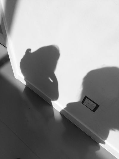
Chiaroscuro is an Italian word for light and dark. Its the effect of a contrasted light and shadow. 'Chiaro' meaning light and 'Scuro' meaning dark.
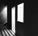
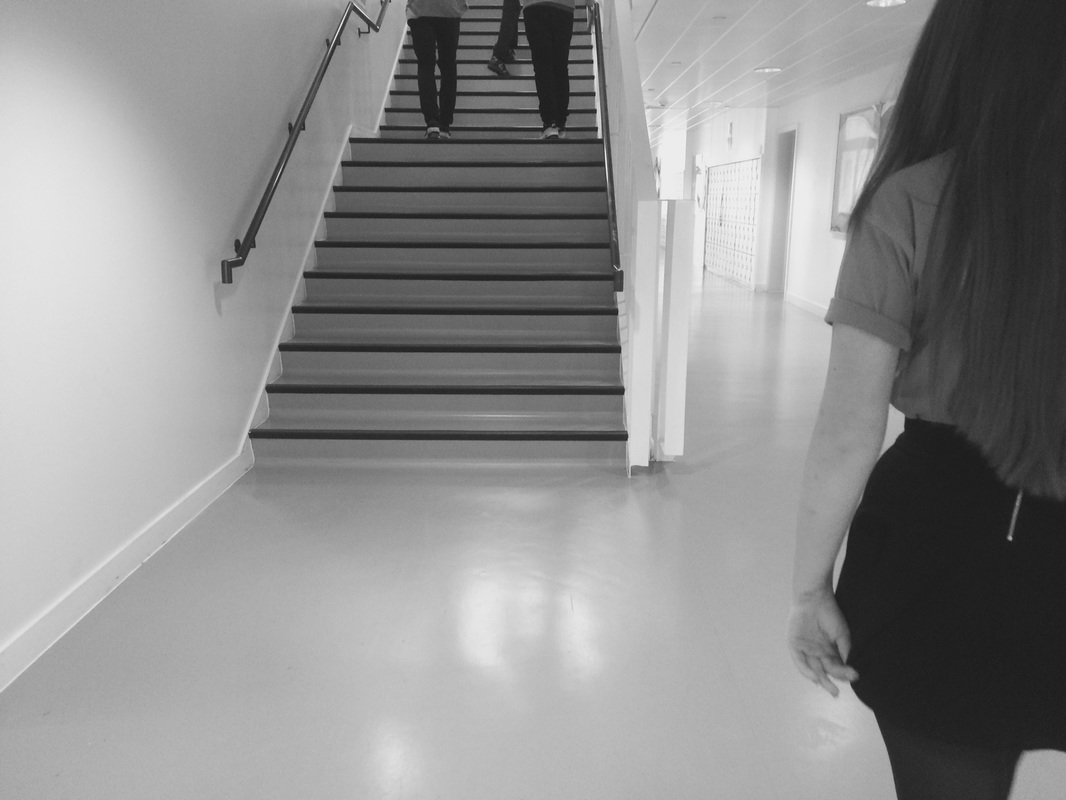
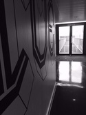
In this image theres a lot of light in the back of the image like behind the wall and its seeping through the gaps in the wall and from the stairwell. But towards the front of the image its very dark across the whole surface. Theres different contrasts it goes from very dark then theres greys in the furtherest back where the light is more spread and even but then there is also very light parts within the image.
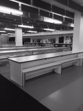
Experiment 1.


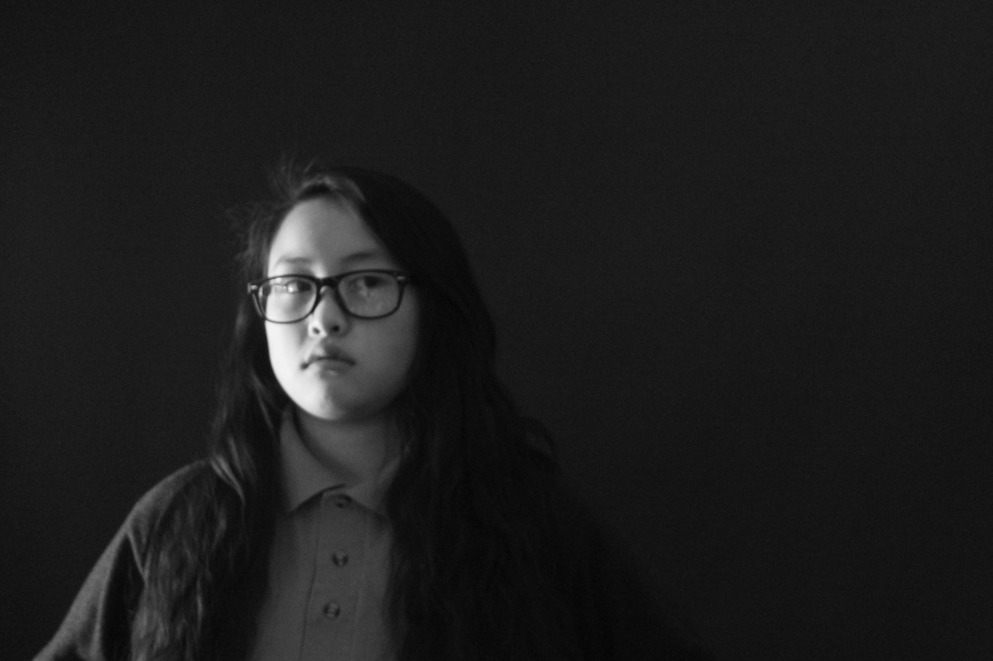

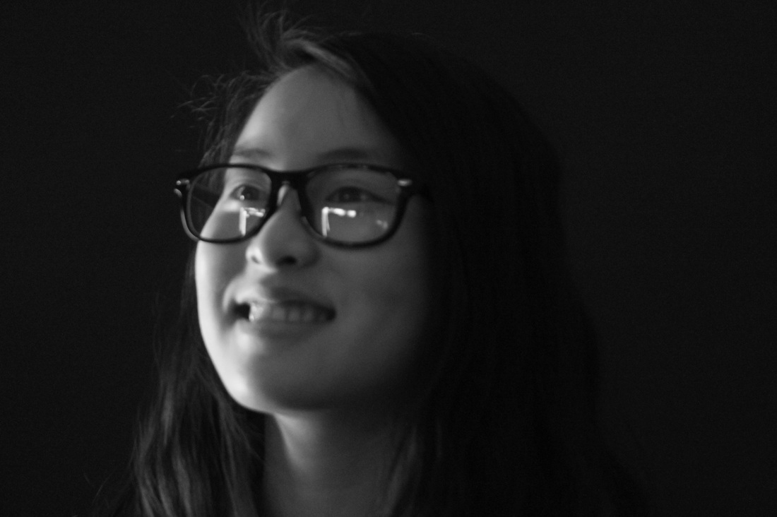
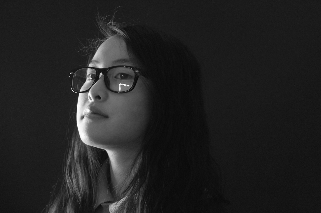
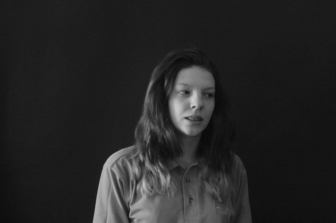
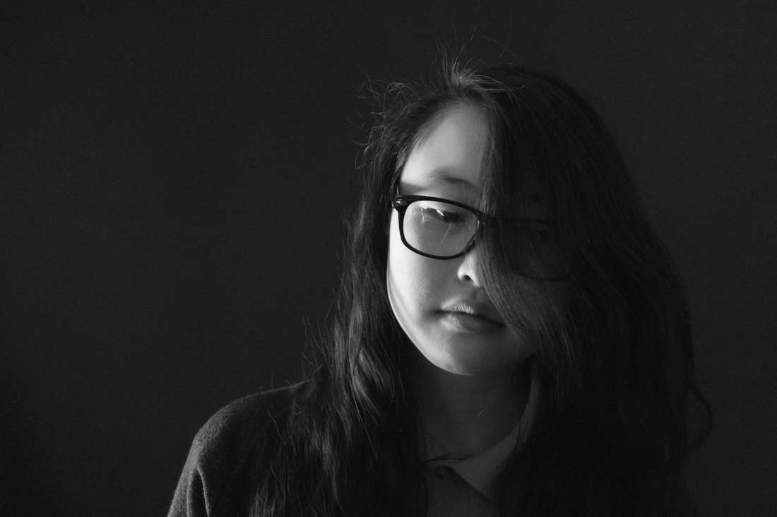
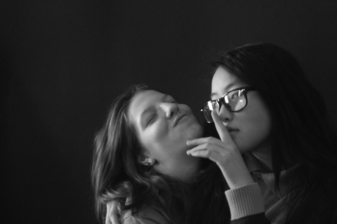
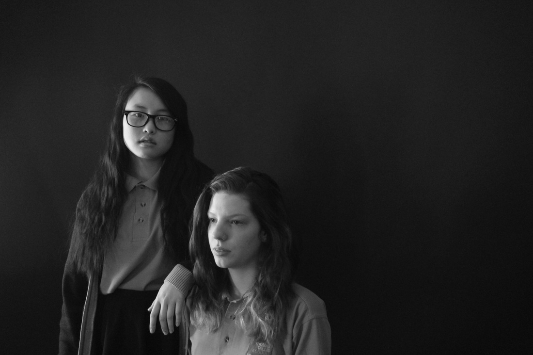
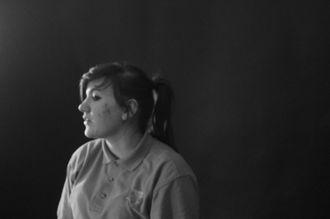

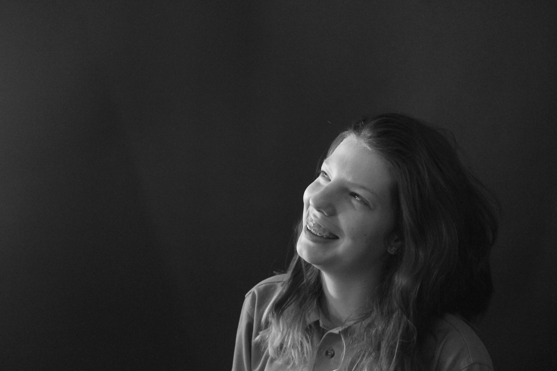
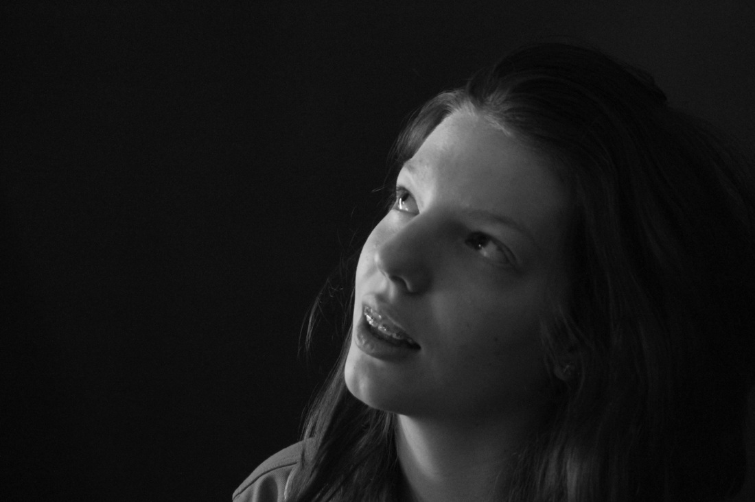
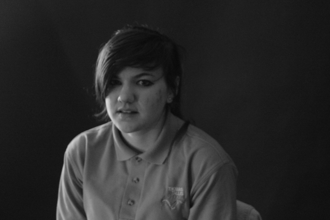
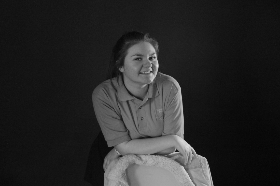
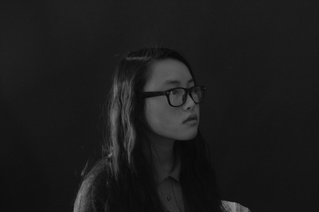
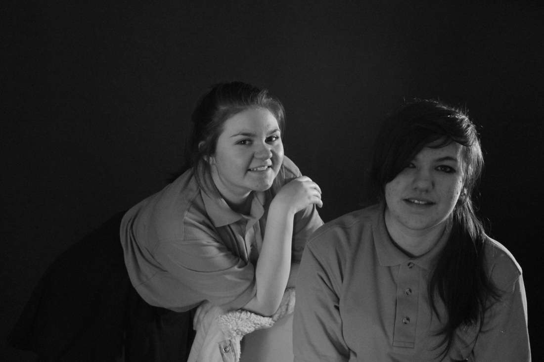
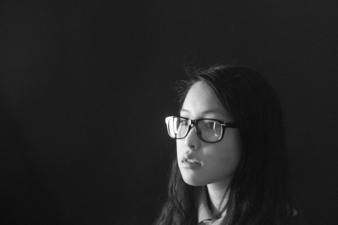

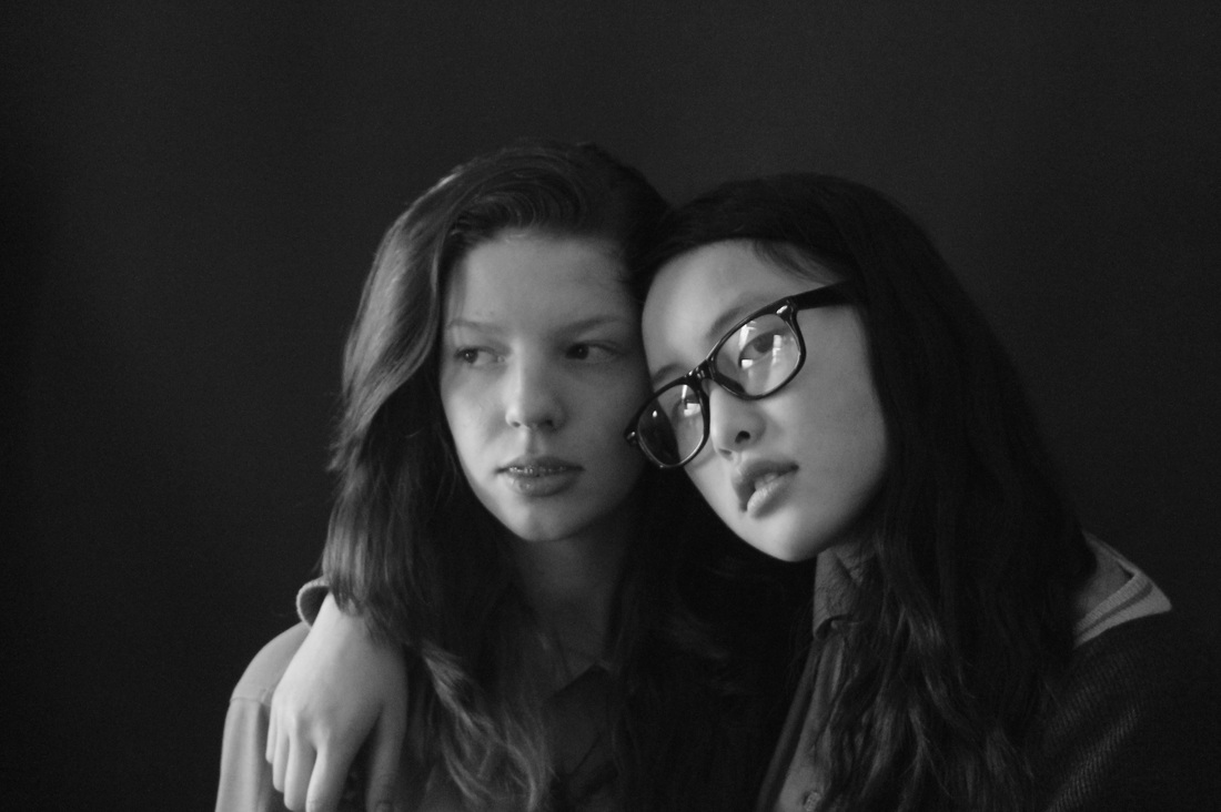


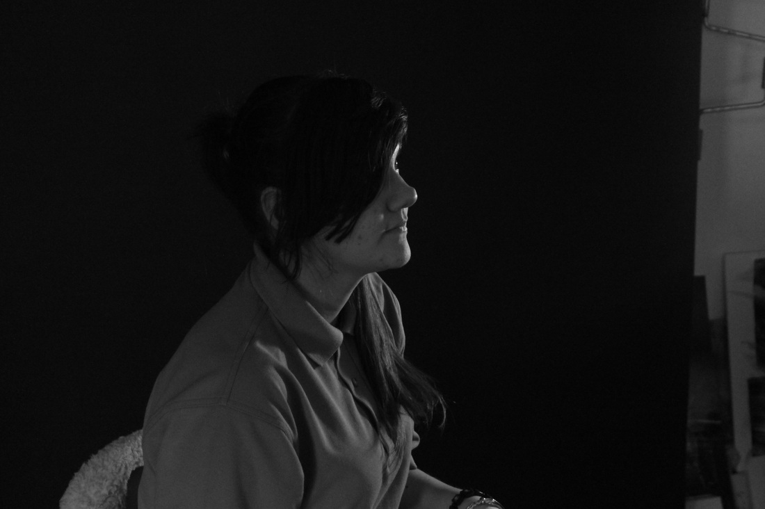
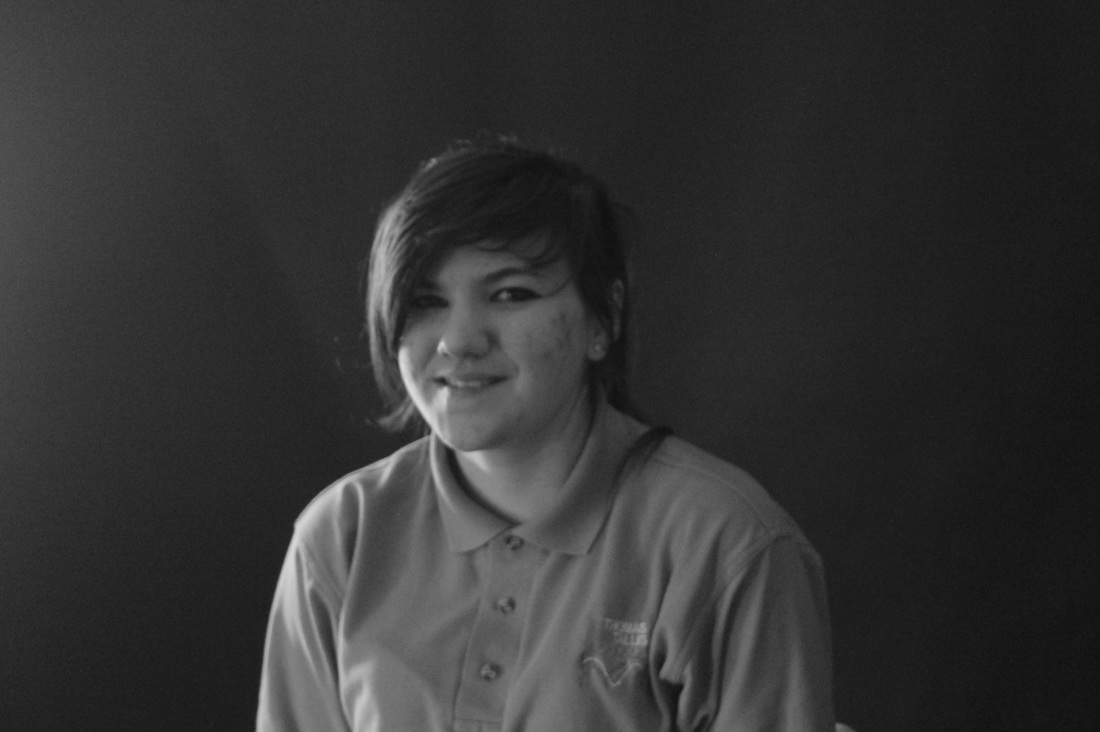
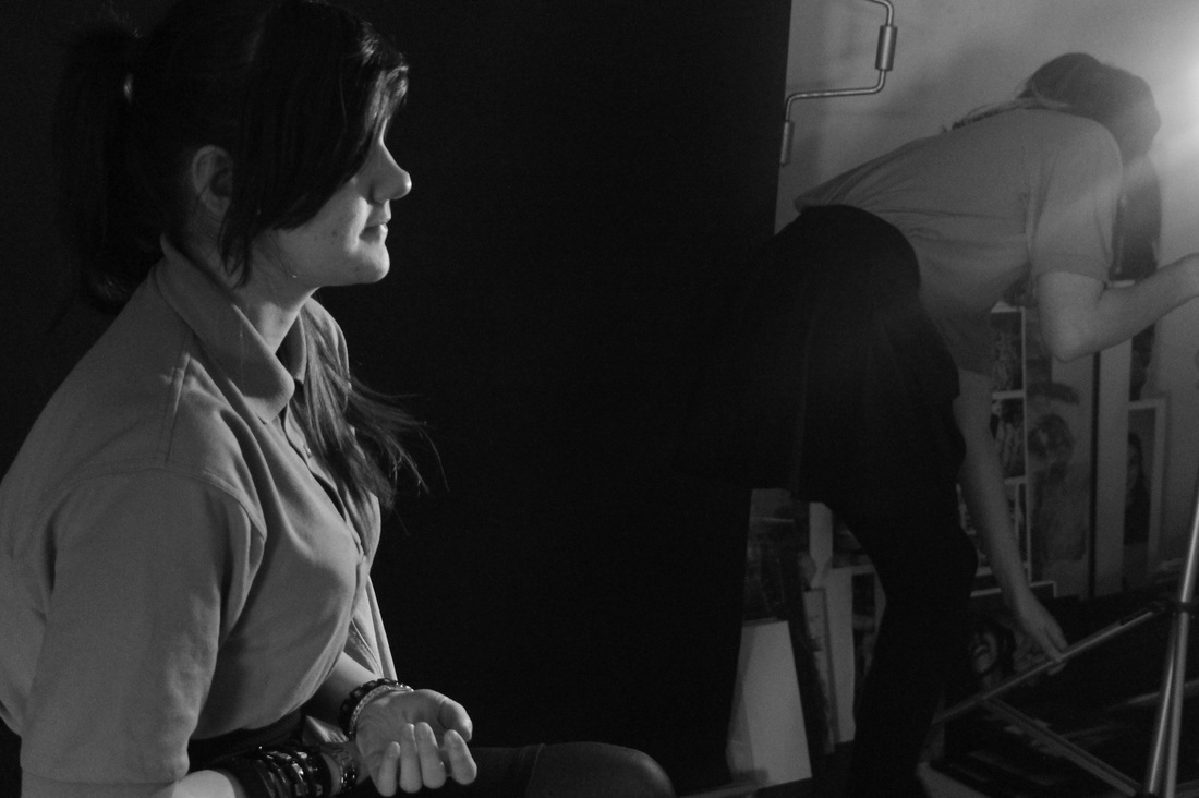
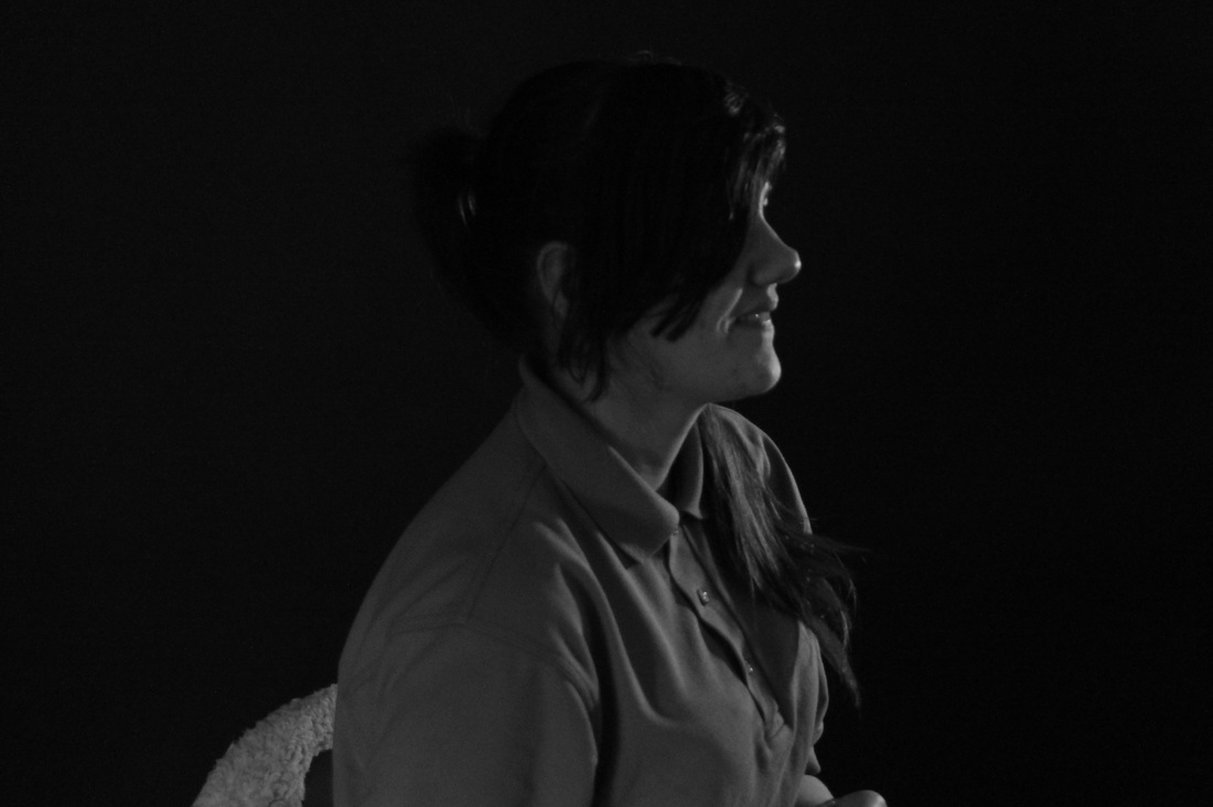
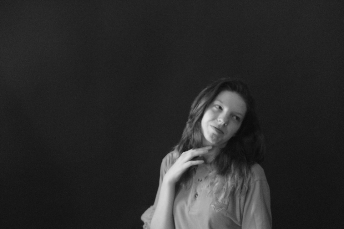
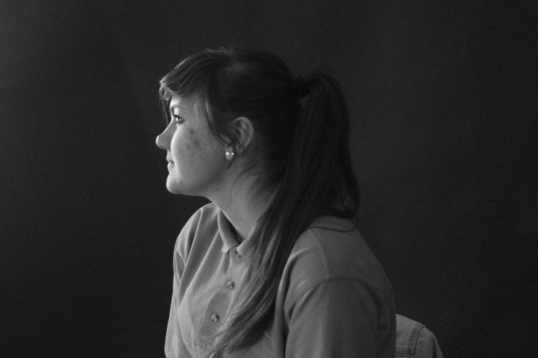
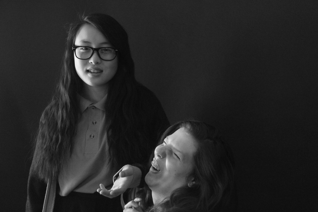
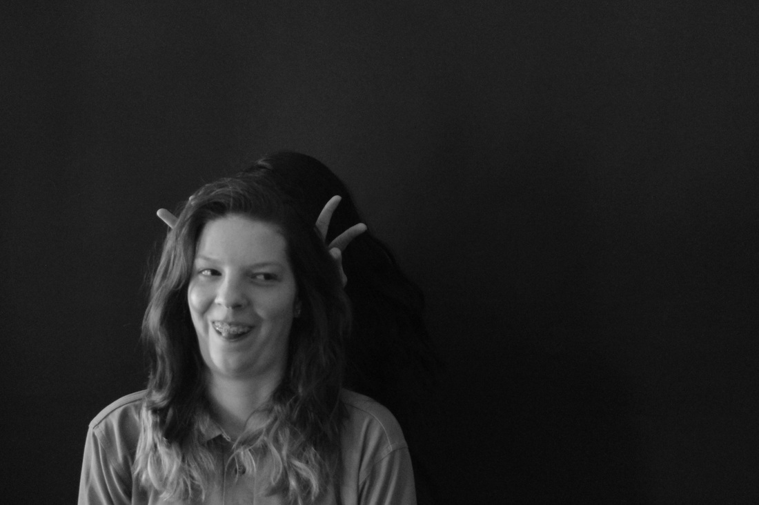
I think the lighting went really well and there was no light on the background and it came was a good experiment I also think that the photos look really good there really focussed and the lighting made the main subject in the photo stand out. I also think that most of these images were framed really well all the people within the images were put in a place so that light wouldn't get onto the background. The images were all planned out so everyone knew exactly what they needed to do.
I think the photos could have been better if we had less light in a few of the images and a few are actually quite dark and could use more light on someone to make them stand out even more. There could have also been more different and interesting angles this would have made some of the images different from one another they would also look more appealing if we had something different going on with the angle or the lighting on a person.
I think the photos could have been better if we had less light in a few of the images and a few are actually quite dark and could use more light on someone to make them stand out even more. There could have also been more different and interesting angles this would have made some of the images different from one another they would also look more appealing if we had something different going on with the angle or the lighting on a person.
Edward Weston |
Trent Parke |
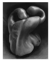
Edward weston took this photograph of a pepper in 1930. Its seen in quite a few of his images that he likes to take very everyday objects and make them look very interesting and nothing like what they actually are. The way the light hits the pepper makes it the only thing you look at and its stands out and becomes the main focus. The curves of the pepper are very interesting and grab you attention but also make it looks like something else.
|
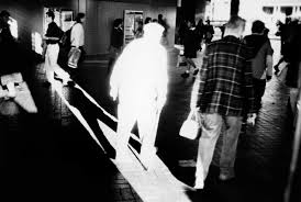
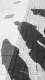
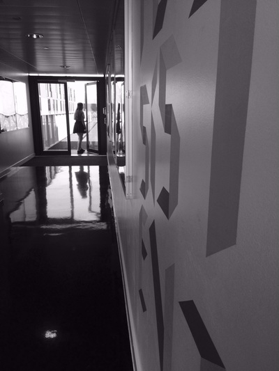
This photo is very contrasted, it has lots of light then lots of dark the man is very light and you can't actually see him it just looks like the outline of his body and his shadow. There are parts of image that are really dark and again you can't see anything but all the light is coming through an opening like a door or window. The other people around in the image they are quite light and can quite clearly been seen.
|
Sally Mann |
Elliott Erwitt |
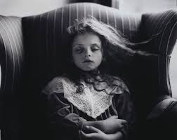
Sally mann took lots of images similar to this in her career she has lots of dark and light within many of her images especially this one . The dark behind the little girl and to either side of her, on the right side of her theres a lot more dark that carries on round the the left side and underneath her hair and the shadows created by the chair make all the light focus on the girls face and body.
|
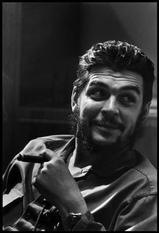
Elliott Erwitt took many candid shots of people and this image shows contrast perfectly with the light on one side of the mans face with the dark corner behind him also on the mans face theres contrast from his dark beard then his face looking really light. Theres also the contrast between the tones in the image like the black and greys all around him.
|
Francesca Woodman
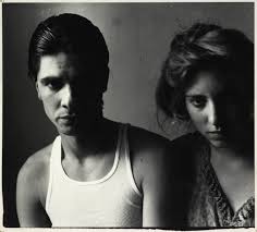
Francesca Woodman has shown contrast perfectly here with this image, she shows different tones and colours within this image. The way the light reflects of off the mans face and makes the other side of his face very dark the shadow then makes the right side of the woman's face darker and that whole side of her body looks darker as she's blocked by the man. The woman is just has a lot of darker tones on her body in general a lot more grey to black, the man looks a lot lighter more grey to white. The image overall has lots of different tones to it with lots of shadow and contrast.
Experiment 2
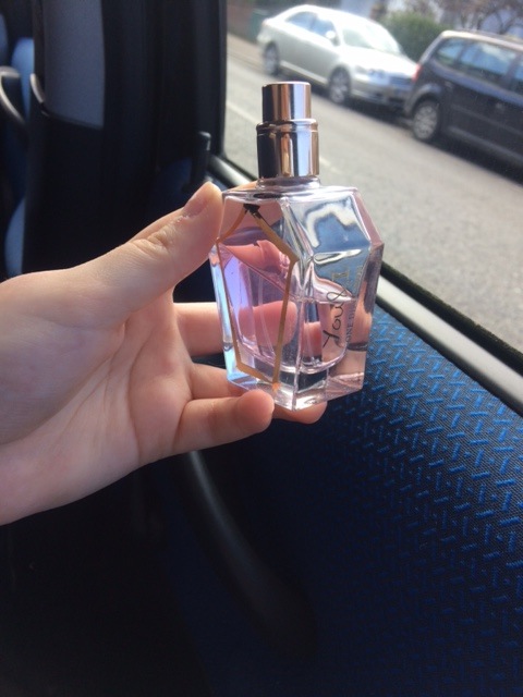
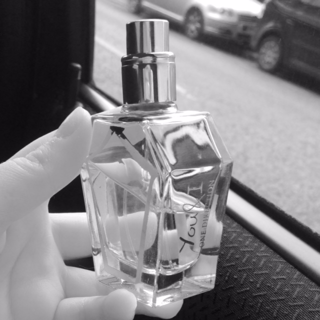
This image doesn't show light and dark very well but its still there, in the black and white version it has a lot more tones and contrast. On the bottle top theres a lot of contrast you can see that theres light round the front of the lid then round the back of it theres a lot more dark. Also in this image theres my hand because theres a lot of light it looks kind of transparent . If i had taken this image somewhere with less natural lighting you would have seen more of the tones and the contrast would've been clearer, in the bottle you can see the reflection of what is behind it and it could be quite distracting from the main focus.
Francesca Woodman
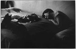
This image shows contrast really well you have the light coming from the corner, its just slightly on the baby and the side of the women's face it makes the rest of the image very dark and the cat looks like its just a silhouette. It also shows lots of tones and colour from the corner thats very white and then the women and baby who look more grey then the black down by the woman's feet. But there also looks like theres another source of light because theres a little bit of light near the woman's knee and the side of the bed just next to the cat.
Rene Burri
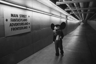
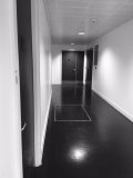
This image was taken by Rene Burri and I really like this image of his because theres lots of contrast within it like the happy looking face of Mickey Mouse then all around him the quite dark and the dingy looking hallway he's walking down as well makes the picture look very dark. But compared to the light at the top of the wall and across one part of the floor when you look at the sign as well theres light across the top of it then it gets darker as it goes through the sign. This image has quite a lot of strong lines within it like from the wall and across the ceiling which look like lights. The way this image was taken it makes it look quite creepy from the way the lights shine over the whole image it gives it a kind of dingy old look and the corridor is pretty much empty making the atomsphere just creepier overall.
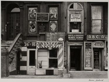
Aaron Siskind
|
This image was taken by Aaron Siskind and this image is one of my favourites because the really dark doorways and windows of the shops then the light of the front of the shop. The way that the photos been taken makes the right hand side of it look a lot darker than the middle then going over to the let hand side it starts to become quite dark again. Also near the top of the image it gets really dark but as you get closer to the ground it becomes much much lighter. The way that he uses contrast within his images is quite different to a lot of other artist's because he uses colour and tone in a totally different way. Within this image he uses many of the formal elements like line is a prominent you can see it in the doorways and on the barber shop it makes the whole image look like its been framed really well.
|
|
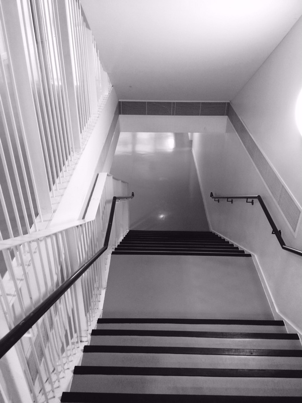
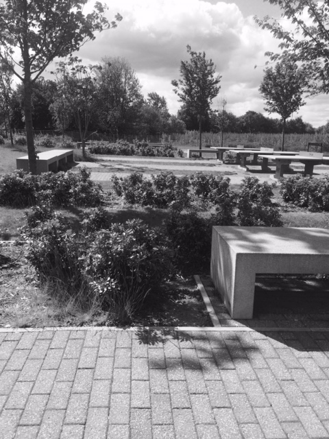
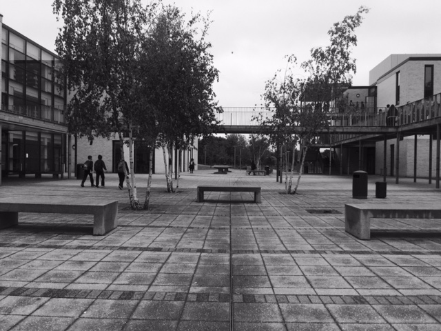
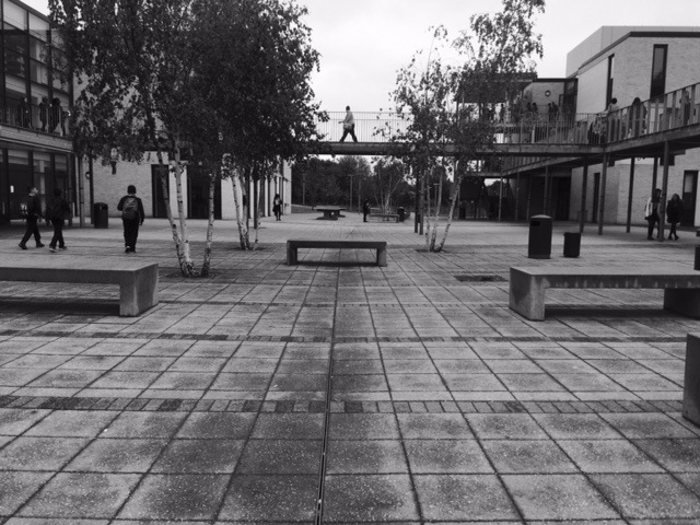
Experiment 1
|
|
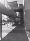
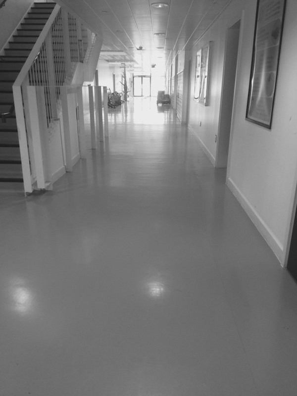
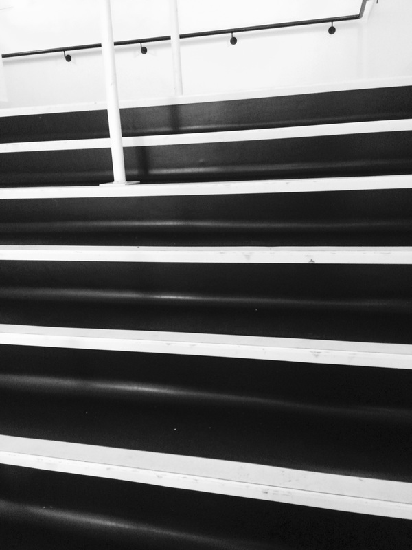
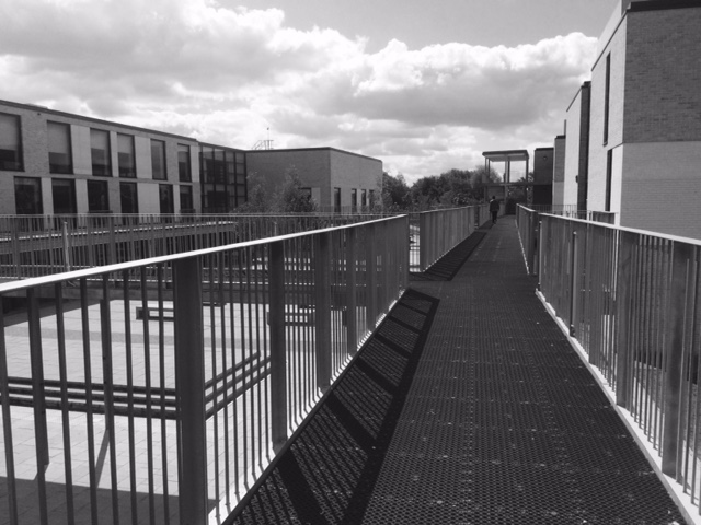
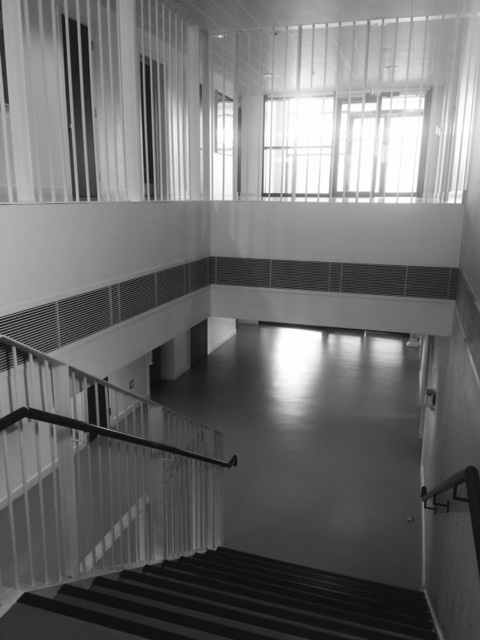
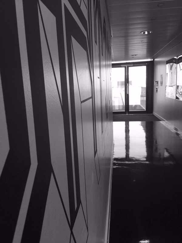
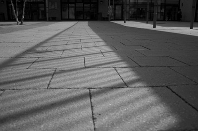
This is my favourite image because I think it shows contrast really well the shadow from the stairs makes one side look really dark then the sun being on the floor on the other side makes it look really light. This image is framed really well the main focus is very central and there's not really anything else around it to be drawn to.

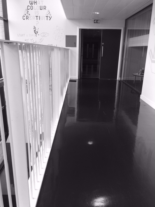
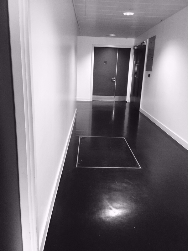
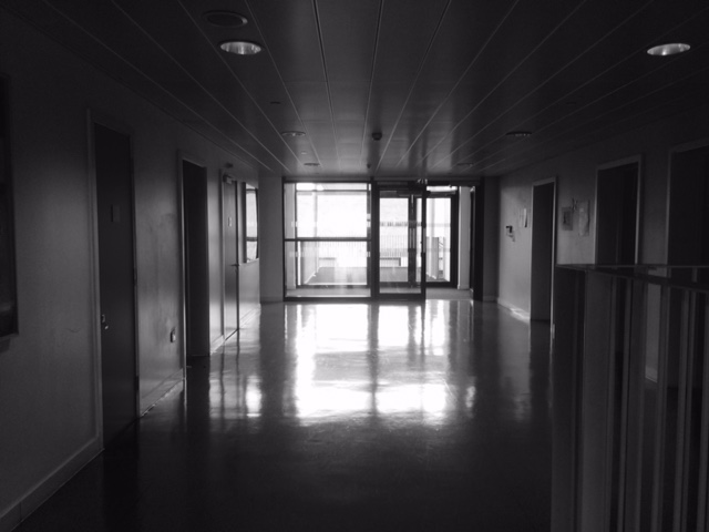
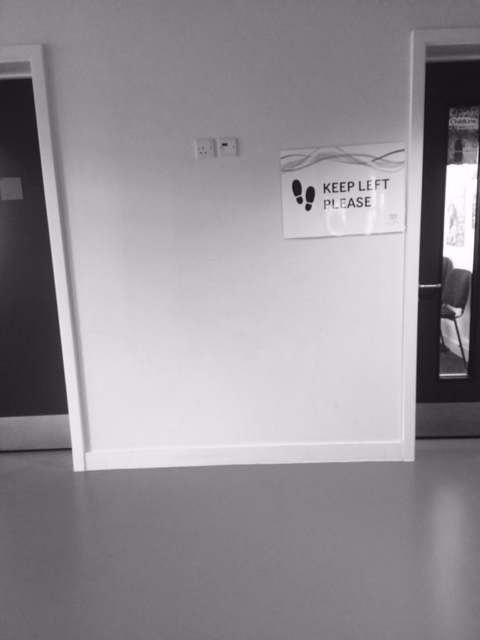
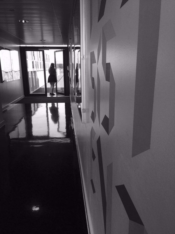
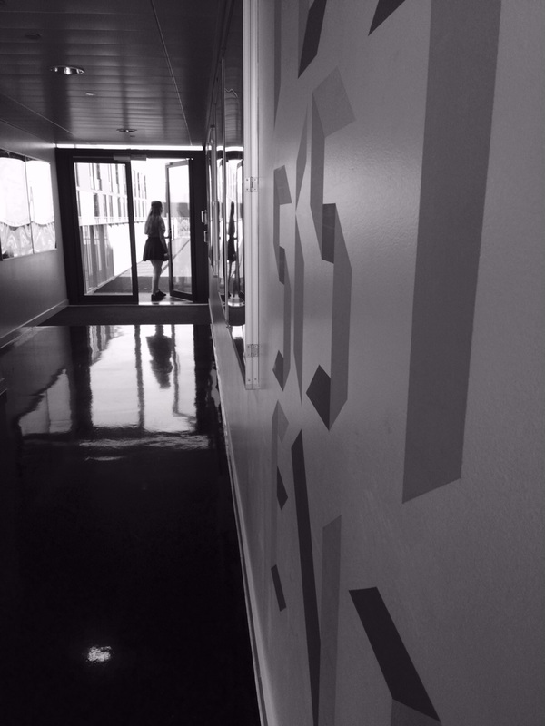
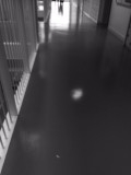
This is my least favourite image because I think its very light theres not enough darker tones to be contrasted enough. Theres quite a lot of whites and greys within the image but theres not much darker tones. The way the light comes through from the back of the hallway. This image is also framed fairly well the main focus is something you notice first but you have got others things to look at and take the focus away.
|

Experiment 2
|
|
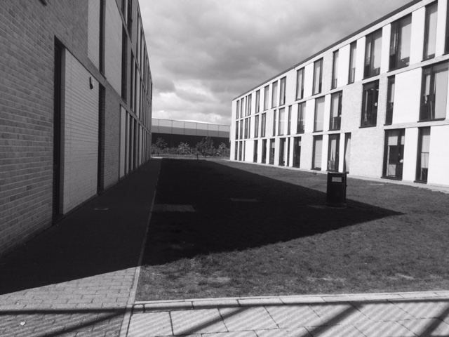
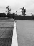
This is my least favourite image because it isn't centred and the contrast is really dramatic it goes from really dark to really light and I don't like the way that the light is reflecting off the windows of the building and cars. Also in this image theres not much focus theres a lot going on within it so theres a lot to look at and it can be quite hard to focus on just one point of the image.
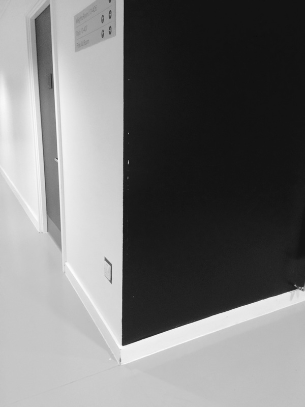
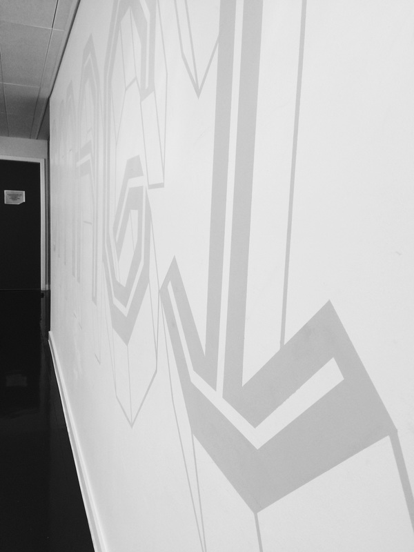
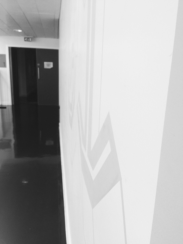
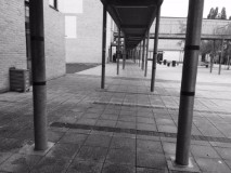
This is my favourite image because I really like the contrast within it so the start of the wall where the camera was then as you look down the wall it continues you see it becoming lighter with more greys then going in white blending with the light from the door. I also like the way this image is framed the way that you can just see everything you need to theres nothing else to distract you from the actual focus.
|


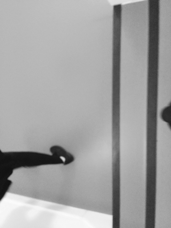

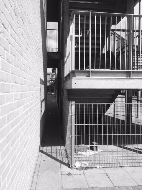
Experiment 3
|
|

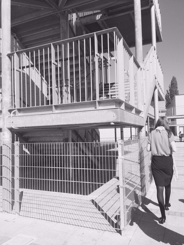
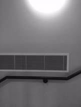
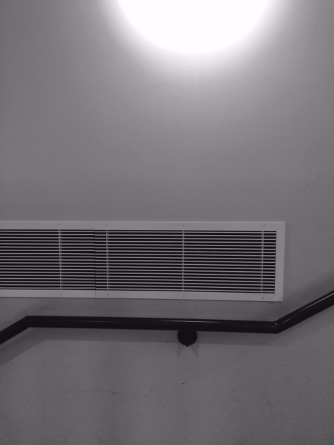
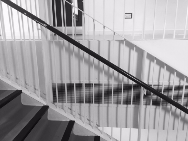
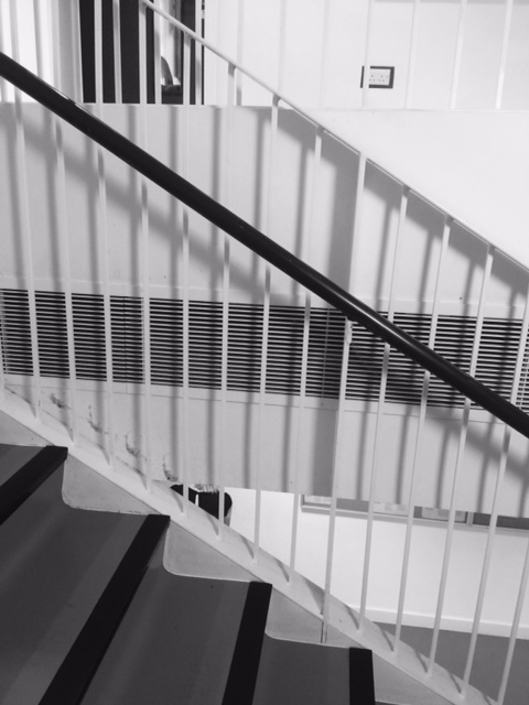
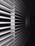
This is my favourite image because I like that the bar is quite dark in comparison to the white wall behind it. I also really like the way the white bars cross the little vent behind them it makes the focus quite central the slight shadow coming from the light above makes the whole image look really different depending how you look at it.
This is my least favourite image because it doesn't show much contrast the light gives a very white tones but it doesn't get much darker throughout the image it just fades in a lot of grey tones. It also isn't framed very well I took the image really quickly and didn't think about the framing and composition of the image.I could improve this image by thinking about how to frame the image better and trying to take an image with more tones.
|
Florian Bong-Kil Grosse |
Gillian Wearing |
|
Florian Bong-Kil Grosse has this collection called the blind walk he took images to document the movements of a blind person who was being told directions. Within these images he creates sharp shapes and lines which bring the whole image together and contrast very differently from the man and how he's moving around. The mans quite dark clothing is very very contrasted to the white all around him it also makes a contrast to maybe what the man can see in his mind and what is actually around him.
|
The english photographer Gillian Wearing took a group of images called Signs that Say What You Want Them to Say and Not Signs that Say What Someone Else Wants You to Say. I really like this set of images for many reasons its the way that they contrast from how you look at the person then what the sign there holding actually says makes you think really differently about the person your looking at. Gillian Wearing composed all of these images really well everything within the image really fits in with the person your looking at. She made all the images quite colourful and all of them have lots of tones within them. She also tried to show the person in the way they should be seen with a very different background to really show the contrast.
|
|
|
|
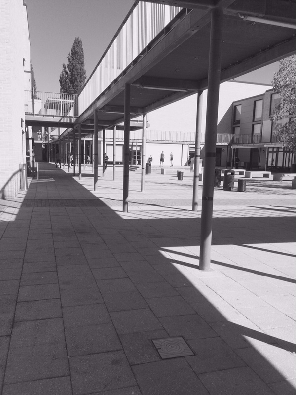
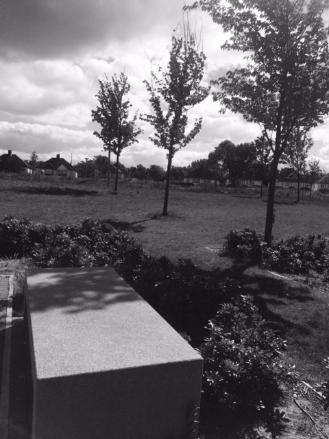
Experiment 4
|
|

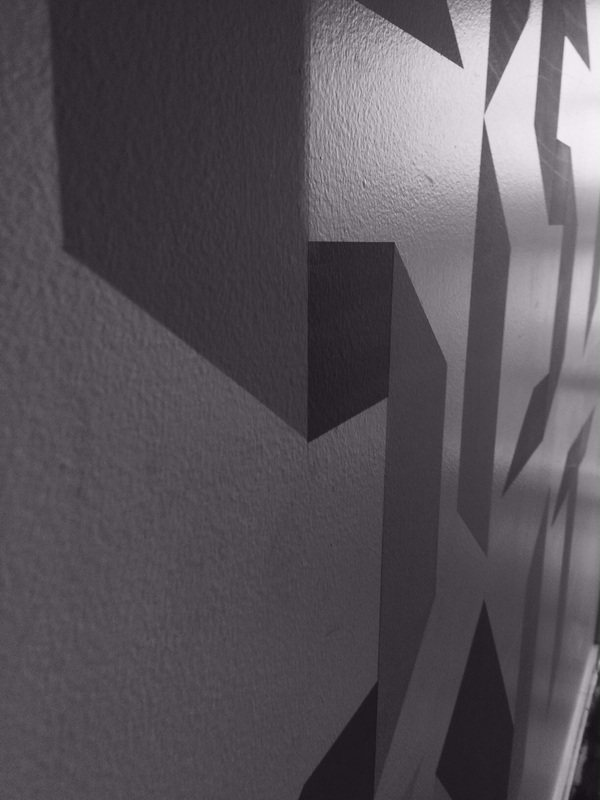
This is my most favourite image. I like the way the light looks like it reflects off the wall and the ceiling. I think this image shows lots of tones going from light to dark greys. Its a highly contrasting image like the tones and within the really strong lines and shapes on the wall compared to the rest of the image. I could of made this image better by zooming in a bit to get rid of the doors in the background. Within these images I tried to capture shadows which I think I did quite well in showing shadows and line
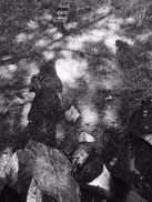
This is my least favourite image because it hasn't really come out the way I wanted it to the shadows are hidden by the shadows of the trees and branches although this image does show lots of tones which I really like about it. When I took this image I really thought about how I would frame it and I wanted the main focus to be slightly off centre but I also wanted to get the wood and rocks in at the edge to make the background more interesting.
|


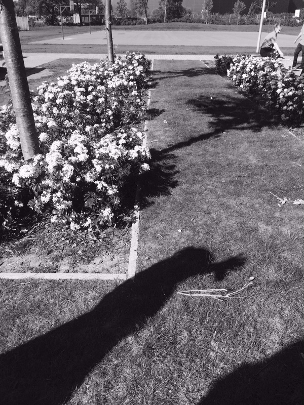
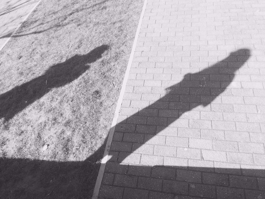
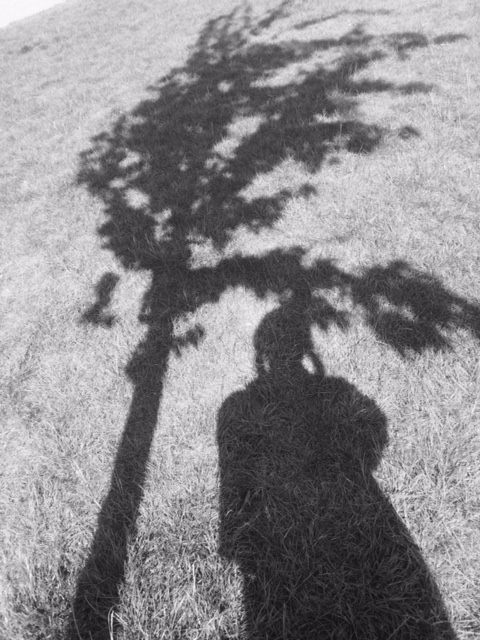
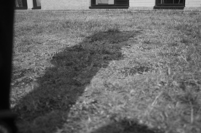
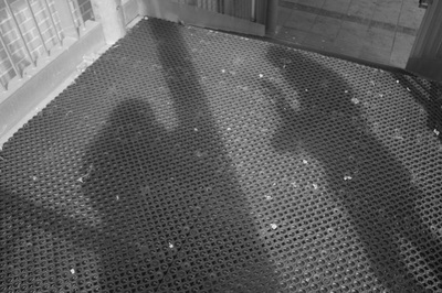
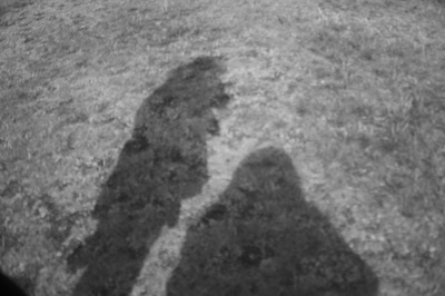
Experiment 5
|
|
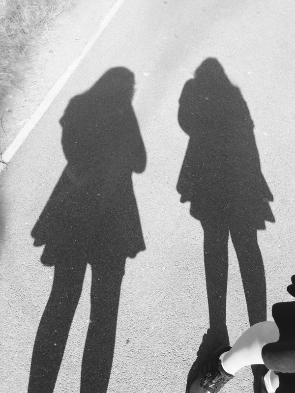
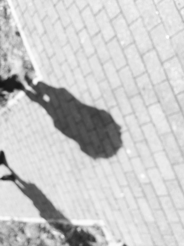
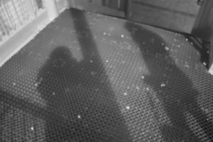
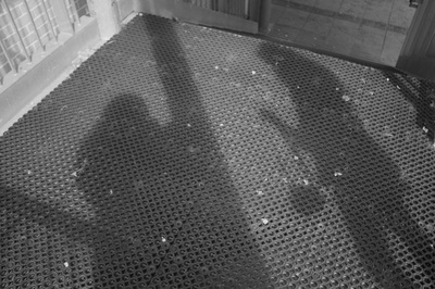
This is my favourite image because i really like using shadows and it shows that really well. It also has quite a lot of tone within the image one shadow looks a lot darker than the other. I think I could of made this image better by getting more of the people in the image. I could also have framed the image better making the main focus in the centre. In these images I wanted to focus on shadows, light and line I think these images did this quite well.
This is my least favourite image because its out of focus and it also doesn't show shadows how I wanted to show them. It also doesn't show much contrast it has slight tone but isn't showing many. Although the image is framed quite well its more central which I wanted for all my images. I could of made this image better by making sure it was in focus and made sure we were standing the same way. To make my images even better I want to focus on shadows as my main focus.
|

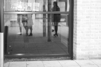

Experiment 6
|
|
WWW
These images are unrelated to my theme of shadows except one of my images. But I do like most of these images I like that they show contrast still with lots of tones and clear differences. They also show EBI
These images could have been more related to my focus on shadows so that they didn't look so out of place. They also could have been more contrasted than they already are as there wasn't much natural light I found it really difficult to find light for these images. I also wanted these images to be framed a lot better than they are now there is two images that I framed properly and made sure it was very central. Next time I take images I know that I need to find ways to light my images and take the time to frame them properly. Most of these images don't have a clear main focus. |
Final Piece

I chose these images because I like that they all have shadows or reflection. I think they all show my chosen themes of light, line and shadow really well. I also like how they are all framed and look together as a collective group of images. The reason I chose the first image is that I like that the shadow is the main focus but there are other things to look at within the image theres also little things hidden within it also I like how I framed the image its quite central and makes the image look more interesting. I chose the second image because it shows really strong shadows within it that I really like it shows my use of the natural lighting and the strong outlines. Florian Bong-Kil Grosse was the inspiration of my final piece the way that he photographed his images they were simple and had quite plain backgrounds I choose to use his ideas of shadows but decided that I wanted something more going on in the background so I made the backgrounds slightly more interesting like with the first image I was outside with shadows of trees behind me I then had the plain background. Then the last image I decided to do something really different and have the person in the image but also having their reflection on the floor.
