Erwin Wurm
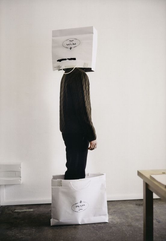
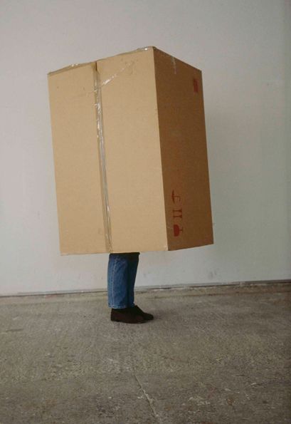
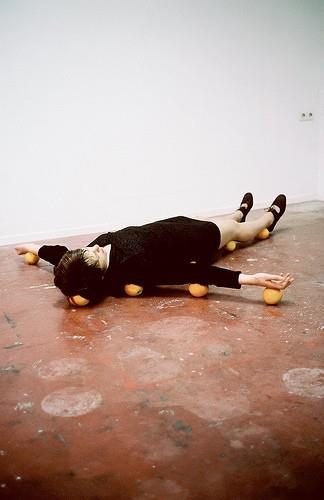
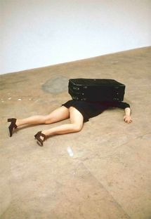
Erwin Wurm created all of these images by using whatever objects,backgrounds and people were around for him to use. He created images that were different and made his work unique from others. Many of these sculptures have a playful fun side however some of his work reflects darker meaning. Many of his images are also sculptures he spent time developing.
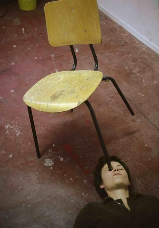
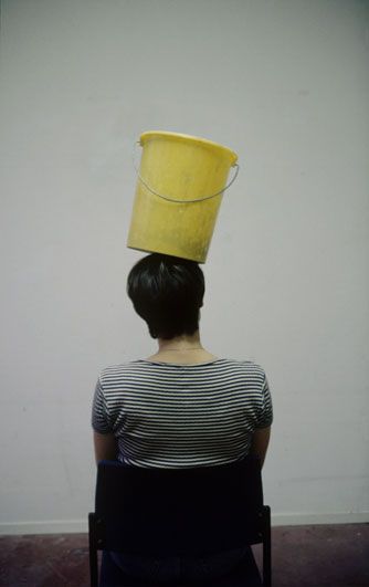
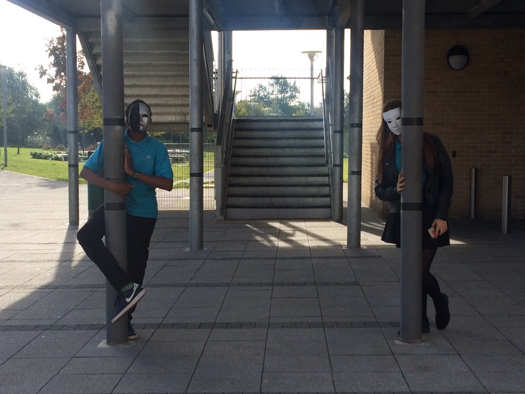
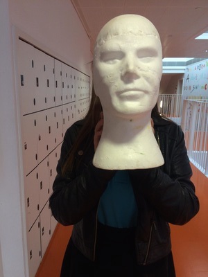
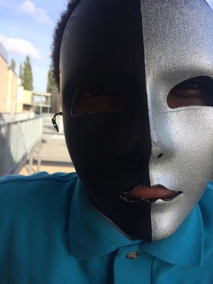
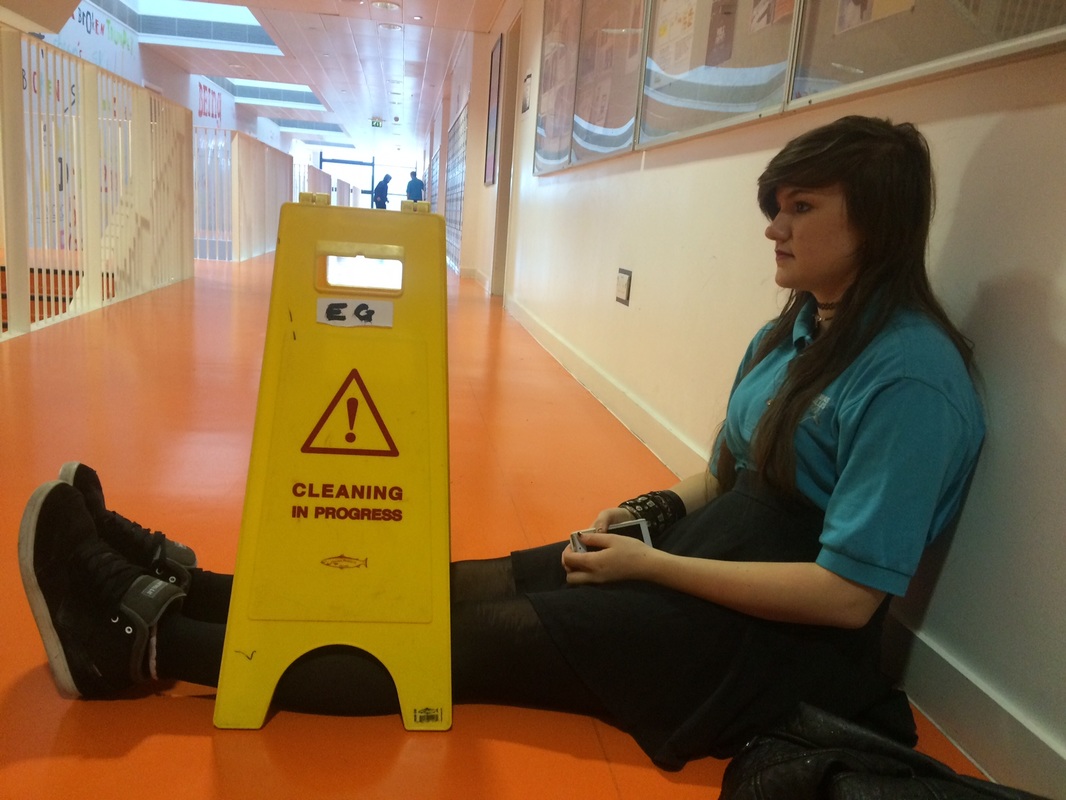
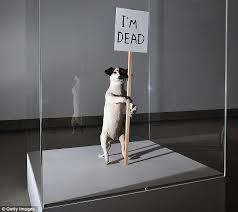
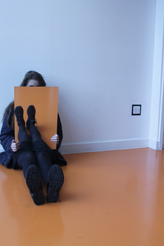
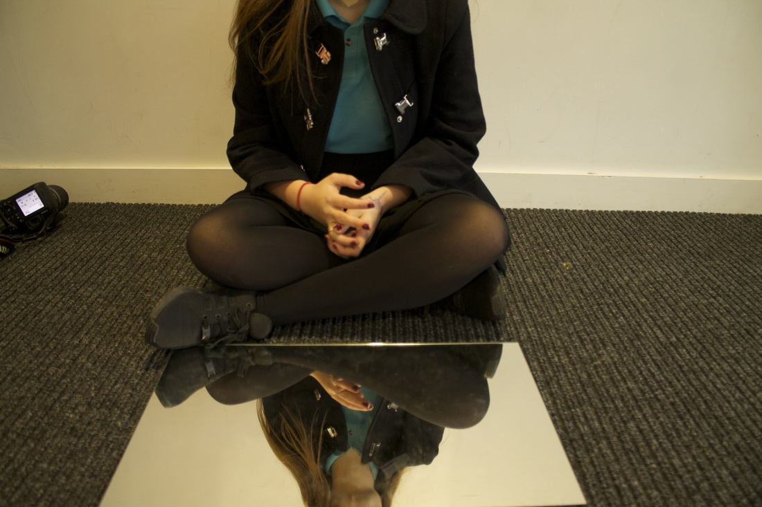
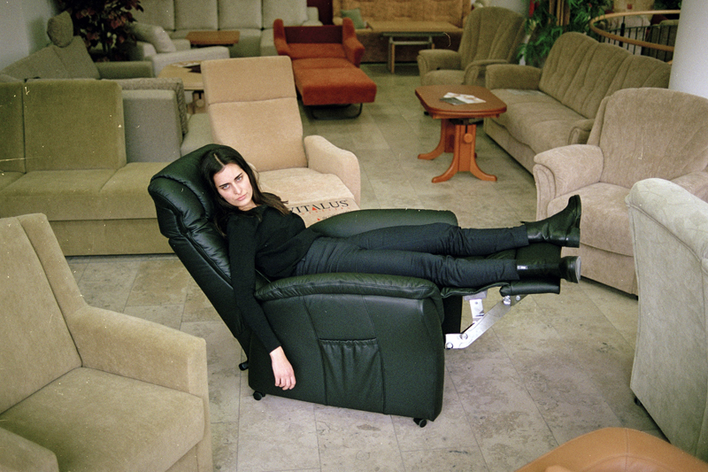
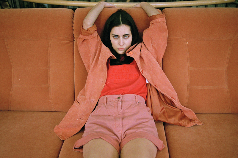
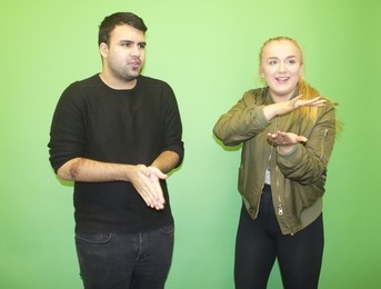
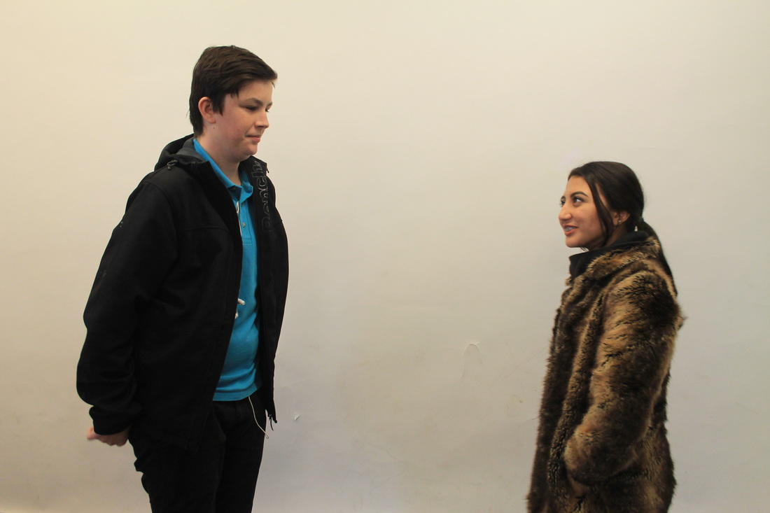
This image is one of Erwin Wurm's One Minute Sculptures the image is a very well framed it has plain backgrounds and lots of space around the edges of the image. The woman is in the centre the image making her the first thing you see. Erwin Wurm also uses very dull colours like whites and black with the off white beige floor as black is the boldest colour it stands out making you look at the woman first.
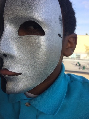
This image is one of Erwin Wurm's One Minute Sculptures the image is a very well framed it has plain backgrounds and lots of space around the edges of the image. The woman is in the centre the image making her the first thing you see. Erwin Wurm also uses very dull colours like whites and black with the off white beige floor as black is the boldest colour it stands out making you look at the woman first.
Experiment 1

|
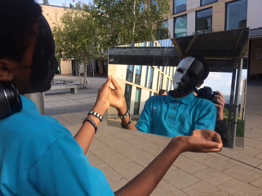
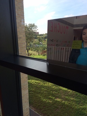
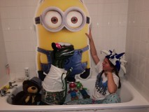
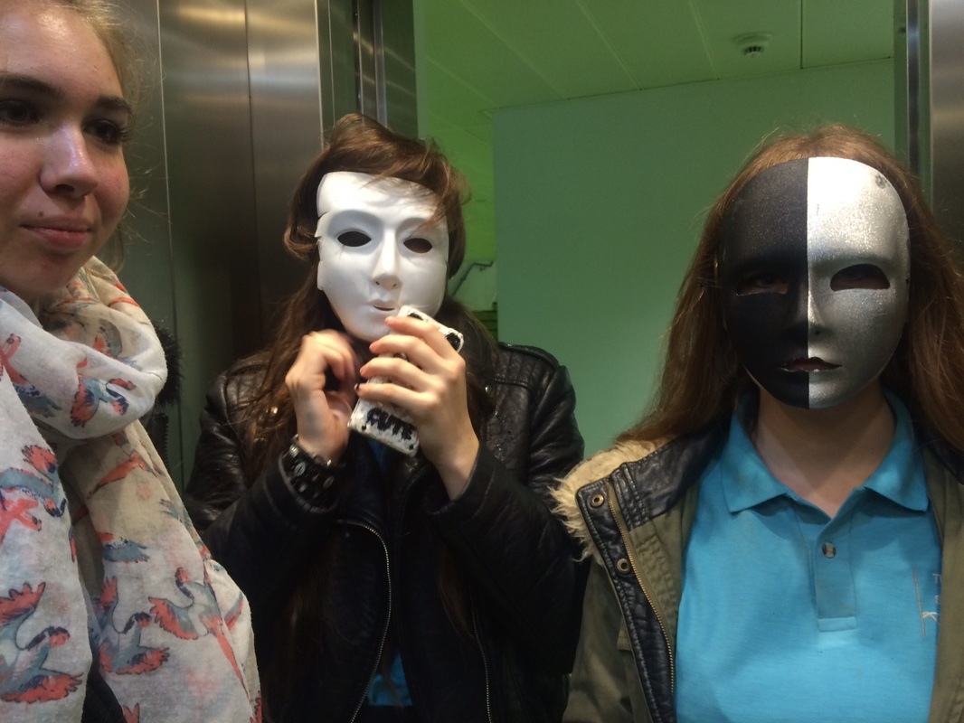
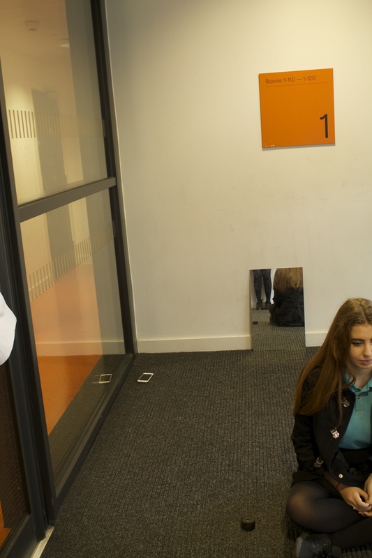
This image of Promise is the most successful because the picture was taken at a different angle making it stand out from all the others, this image also is framed a lot better than the others all you can see in the frame is Promise and his reflection in the mirror but in the background you can see somebody so in other images I would make sure no one else was in the frame. This image is also a reflection image when you see it it looks as if theres a frame already.
PROMISE ANGLES COMPOSITION. Different because mirror, angle, frame reflection foreground/background |
Experiment 2

|
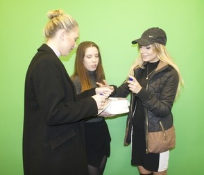
This image was the most successful as its the most simple it doesn't have a lot going on. However, in the background you can see that its clearly in a shop and it would look better if the image had a better background maybe on the street or a plain background so all the focus is on her. The colours are also really bright which really goes with the long
|
Experiment 3

|
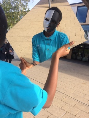
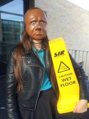
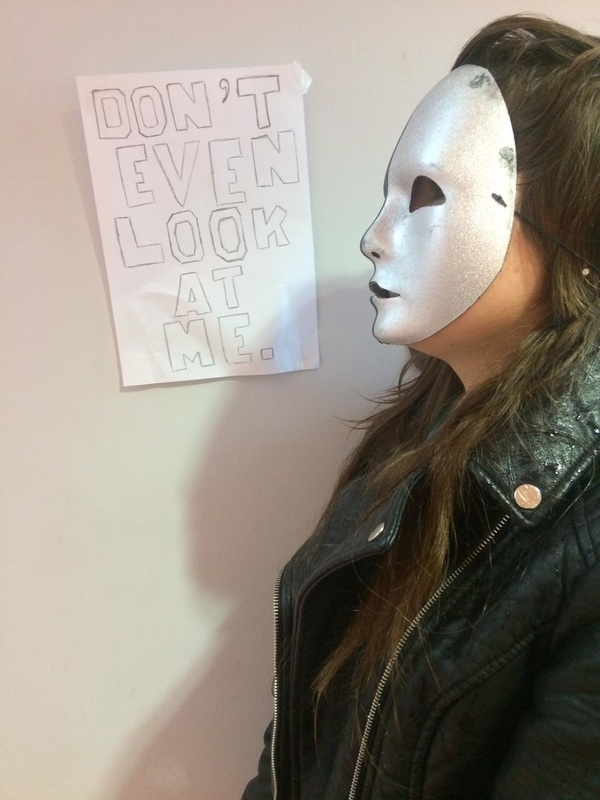
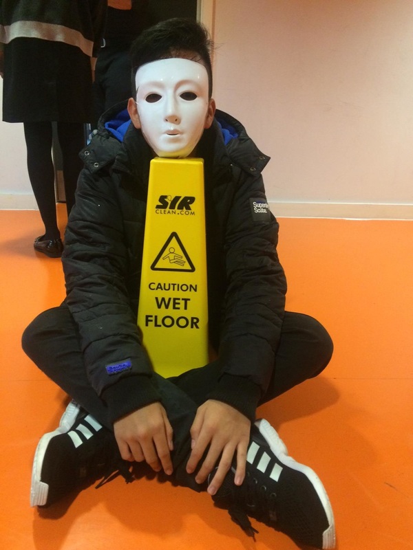
I think this is the most successful image as it has a plain background and uses a sign which could of been a bit darker so it was more noticeable. But I think this image is well framed you can clearly see everything in the foreground you can see Alex with a mask on. However, I don't like that theres a shadow on the wall also the image isn't perfectly focussed so it makes it harder to see the sign.
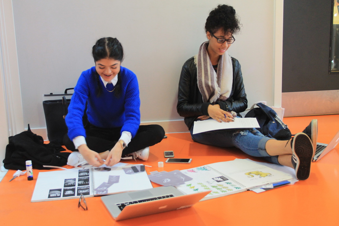
Within these images I used more natural light a couple of the images are a bit dark but most have the right amount of light. They were all taken quite quickly and I think I could of spent more time making the framing a lot better making sure everything was right about the background and everything in the foreground was the main focus of the image. |
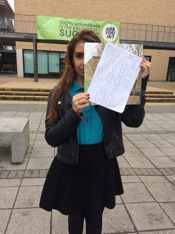
David Shrigley
David Shrigley is mainly known for his unique drawing style but also for his use of humour within his signs. He uses typical everyday situations and makes fun of widely used signs. His images are very unique not something you see often. David Shrigley's images use mainly black and white he always has plain backgrounds so theres no distractions from the signs. He also uses shapes in the form of the signs he uses the typical shapes of already existing signs and makes them his own. He use of space is good he always has a bit of space around the outside of the image.
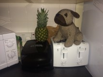
Experiment 4
The light within these images is quite poor in some of the images the light is reflecting from the signs also some images are quite difficult to see what is going on in the image. Also in most of them you can't really see the signs and know what they say i should have tried to make them a lot clearer. But I do like the way the images are composed they are all fairly central and have a lot of colour and busy backgrounds. For these images I could have used templates to make the signs to make it look better. These images are also not all framed very well they aren't all clear and some of the sings can't be seen.
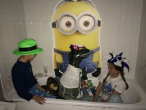
Experiment 6
Within these images I used signs to create these situations. I like these images because they all show signs and absurd situations all of these images are quite central and focussed I wanted to make sure the signs and the people or objects were the first thing you saw so I tried to have plain backgrounds and nothing else in the frame to distract. These images I also used a template for the signs.
I think this is the best set of sign images I took as I used templates and framed the images properly to make sure that you only had a few things to focus on.
I think this is the best set of sign images I took as I used templates and framed the images properly to make sure that you only had a few things to focus on.
Experiment 7
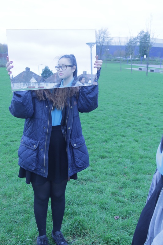
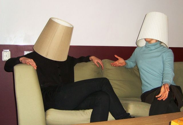
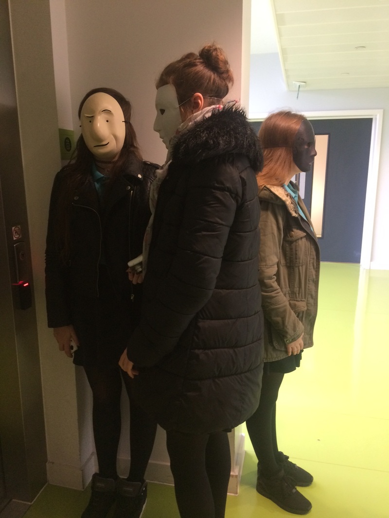
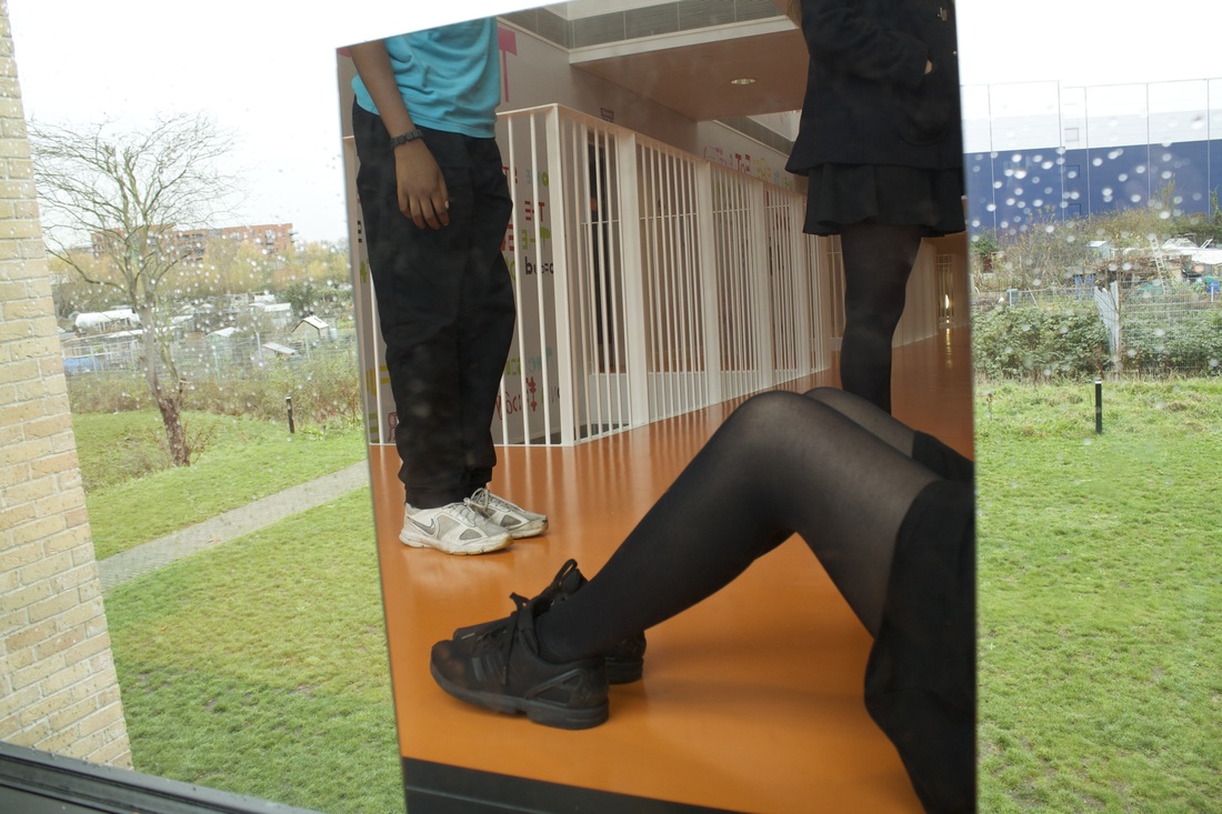
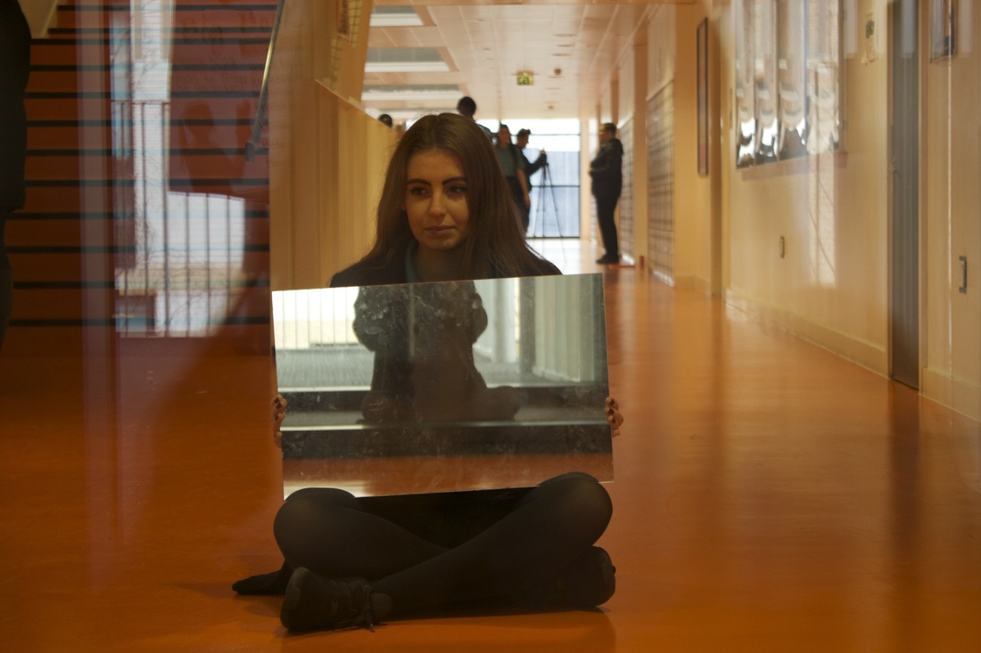
Within these images I used a mirror to create different parts of the body appear in a different way or to replace a person body part. It could of been better if I'd taken more images.I also could have had less space behind the person. But I think that these images have quite a lot of natural light they look very bright all the colours stand out quite a bit and they all have quite a lot of space around the edges that just distracts from the main object within the images.
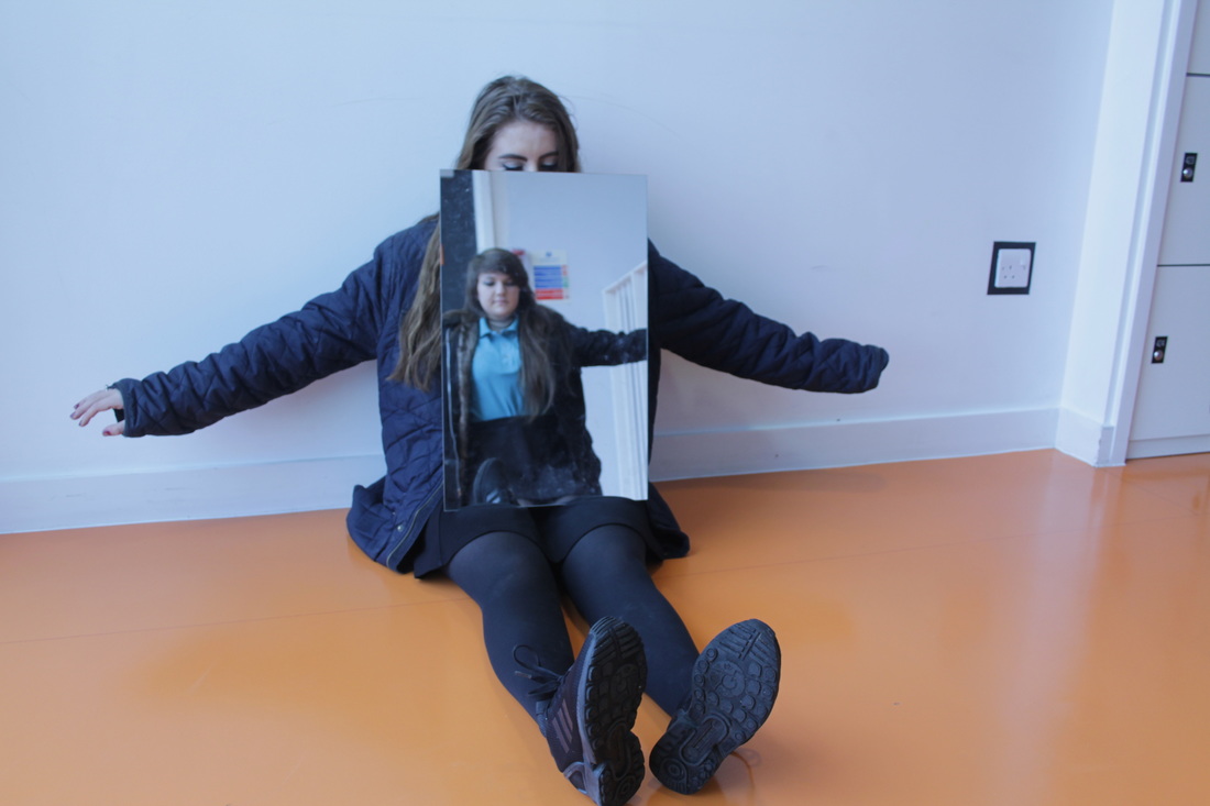
I think these images worked quite well especially the last 3 because the way I used the mirror to make people look different like having Jess with the mirror covering some of her body and then having Alex's body fill the space of Jess'. I think these images worked well because they look different from other images I've taken I tried to use signs within these images as well but only find one that I could use a sign with.
I think these images worked quite well especially the last 3 because the way I used the mirror to make people look different like having Jess with the mirror covering some of her body and then having Alex's body fill the space of Jess'. I think these images worked well because they look different from other images I've taken I tried to use signs within these images as well but only find one that I could use a sign with.
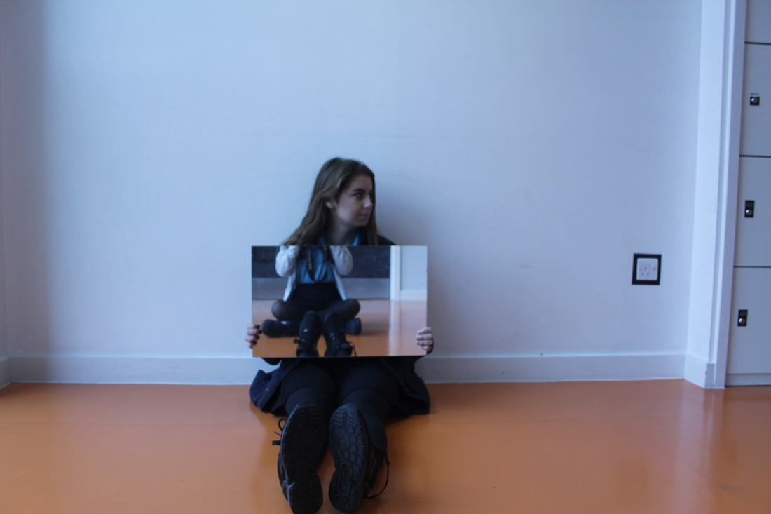
Experiment 8
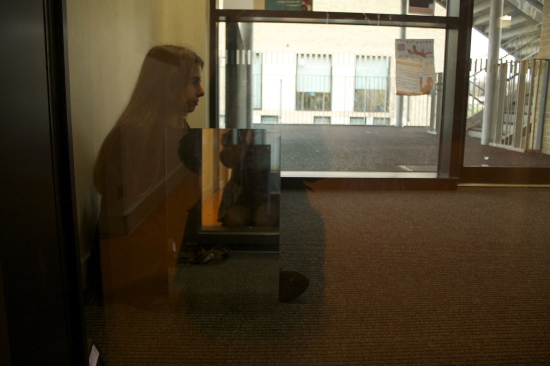
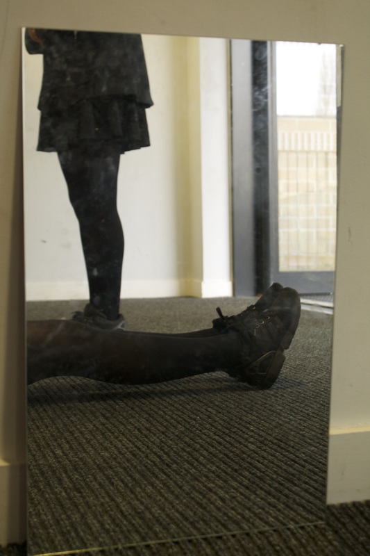
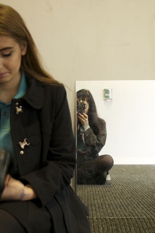
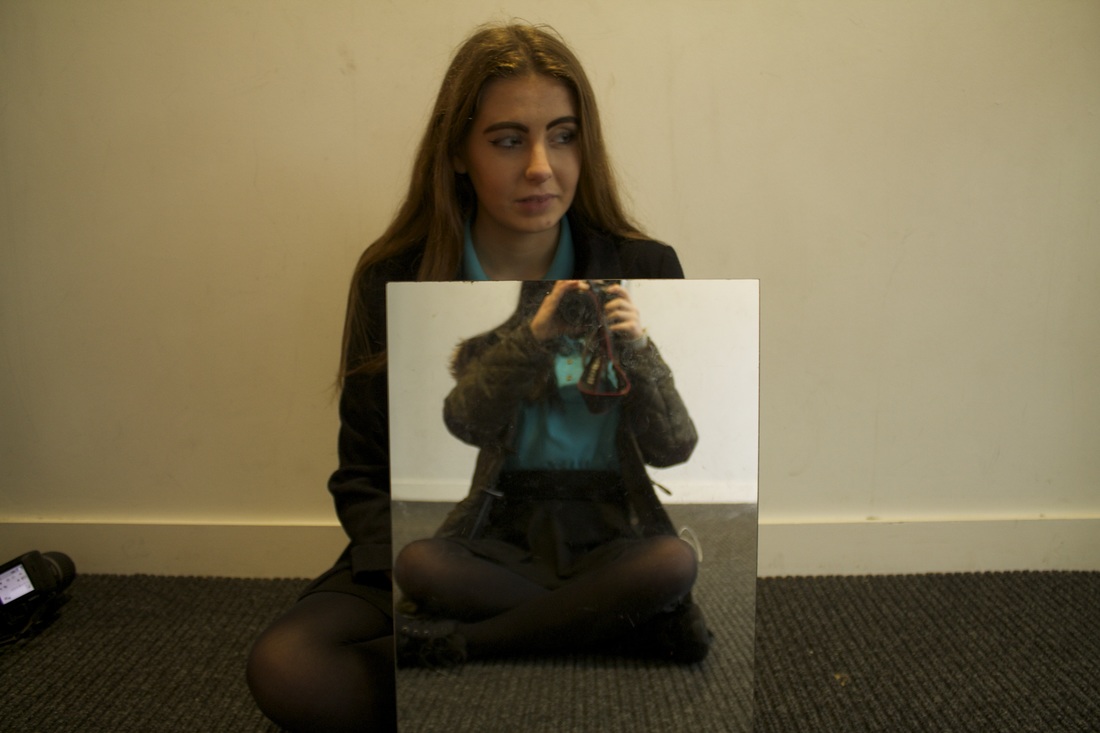
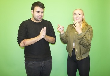
These are some of my favourite images I really like the use of the mirror within them. I also like the amount of light in them there isn't too much that the images look too bright but the light is good amount to light the image well enough. To make these images better I would like there to be less space in the them like around the edges and and in the background.
These images are more refined versions of the images I took before I looked at what went well about the last experiment and made sure I included it in this set of images for example I really liked the use of the mirror to hide the body parts or to slightly alter the way somebody looks
These images are more refined versions of the images I took before I looked at what went well about the last experiment and made sure I included it in this set of images for example I really liked the use of the mirror to hide the body parts or to slightly alter the way somebody looks
Jasmine Deporta
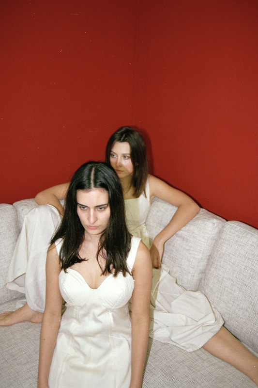
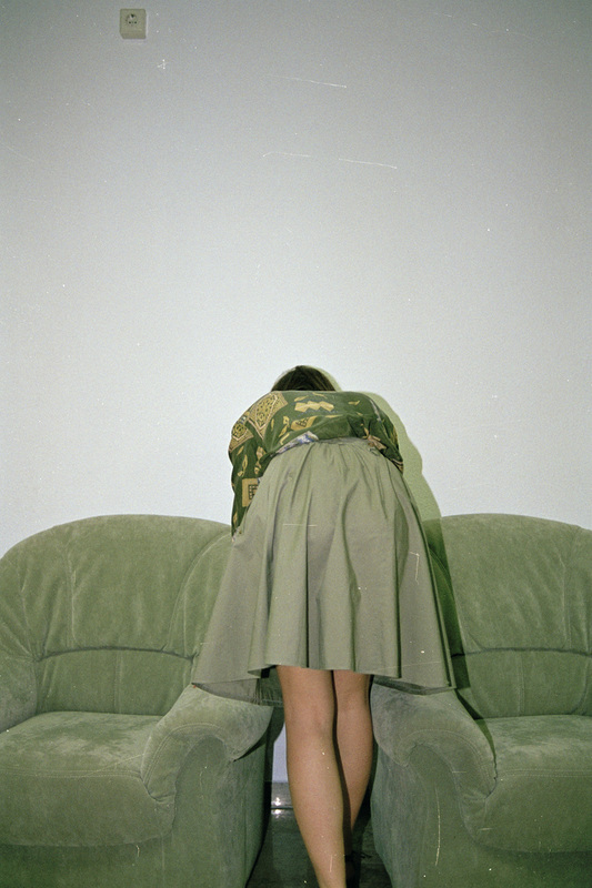
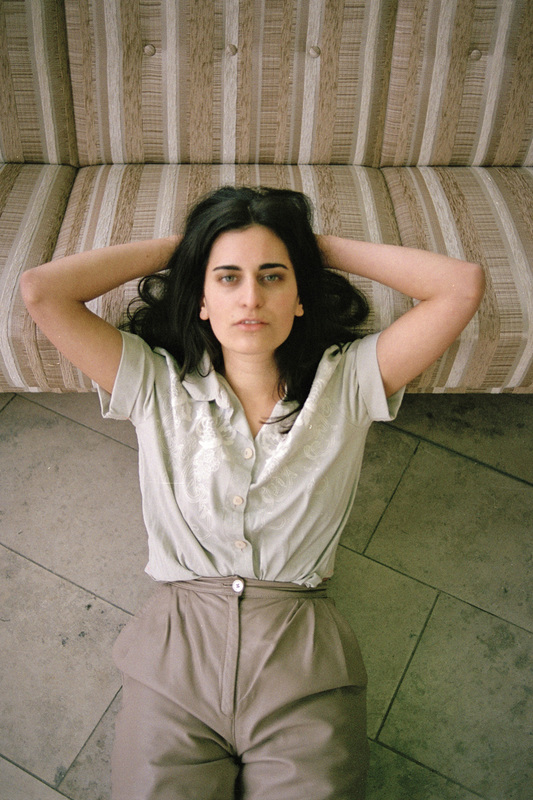
Jasmine Deporta in these images has blended the people within her image with the sofa she used as a background. Within her images she uses a lot of muted colours. Her images also look more vintage with the slight mis matched colouring of the clothing and the editing on her photos. The use of the plain backgrounds in most of her images are making the focus about the models however, she has an image that has a red wall as her background but as the models are all in white it contrasts to them and looks quite interesting. In a lot of her 'Sofa Safari' images Jamine Deporta used the same woman who has very dark hair which in most of the images really contrasted to the colour of her clothes and sofa. All of her images are framed very carefully she only has the sofa and model in the frame.
Experiment 9
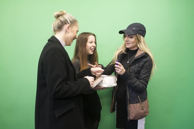
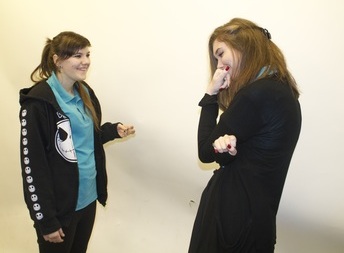
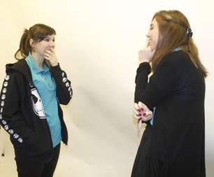
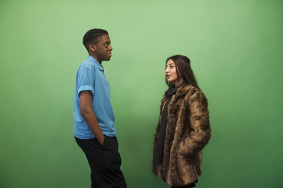
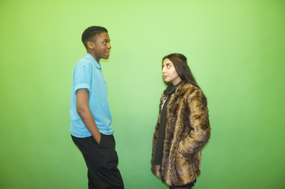
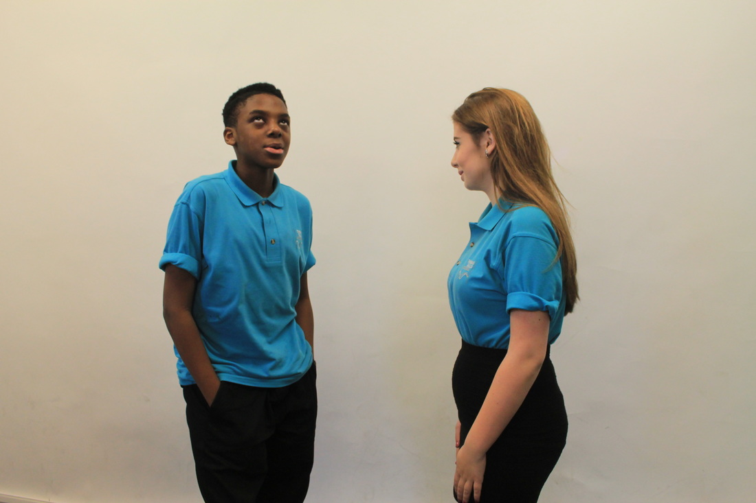
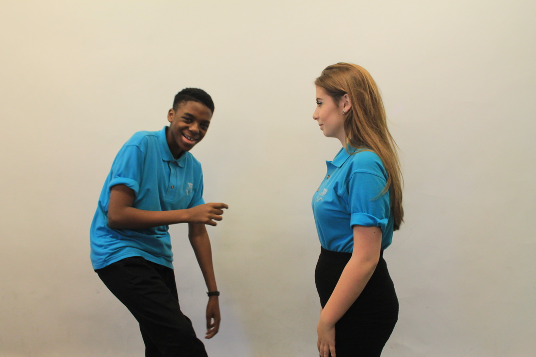
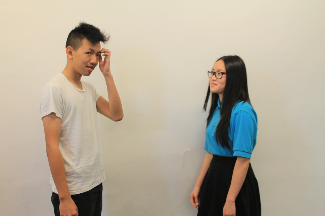
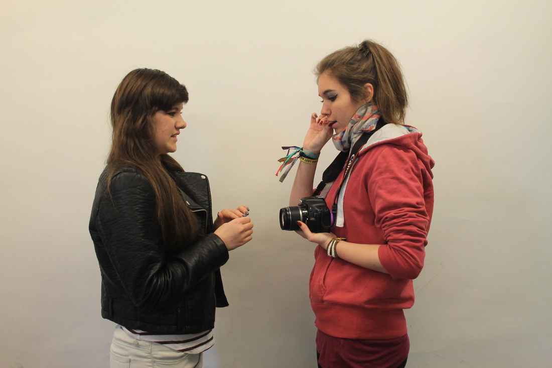
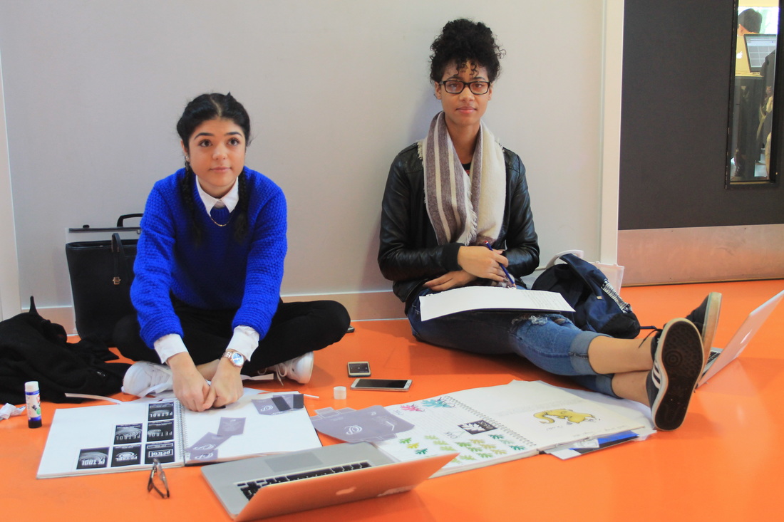
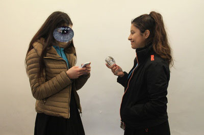
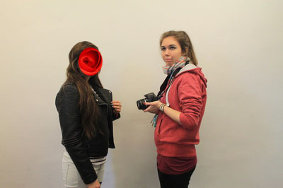
Most of these images are slightly out of focus they all have too much space around the edges. The actual images themselves are all quite different things going on within them with all the different people and different props they have things they're talking about. I could have made sure they were all in focus and framed properly before taking them so that I wouldn't have needed to re-take them. A lot of the images are also quite dark some are brighter but most are fairly dark. I wanted these images to look like people having a conversation with something different going on within the image like having a weird facial expression or even having something covering part of their face making it look difficult to have a conversation.
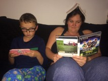
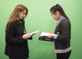
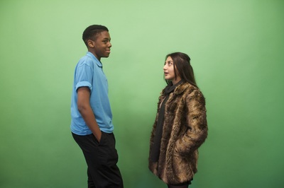
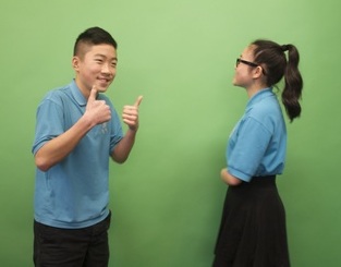
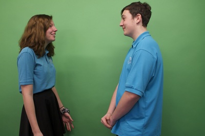
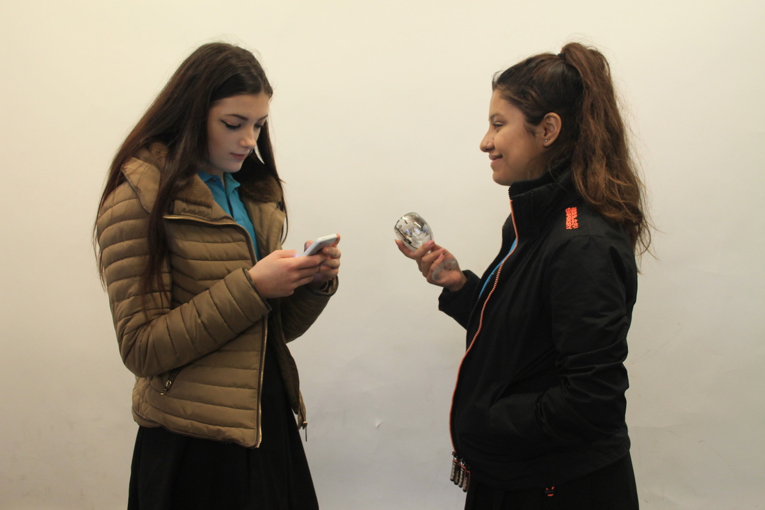
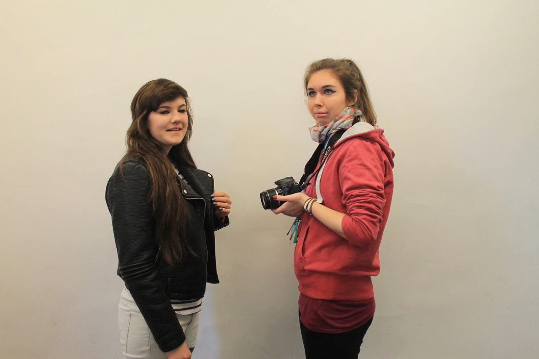
Experiment 10
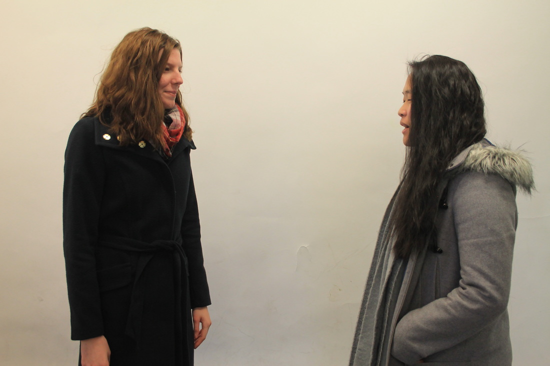
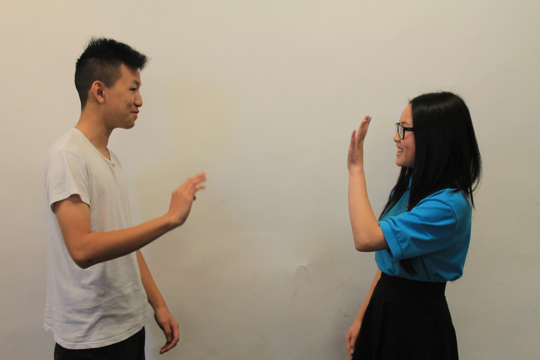
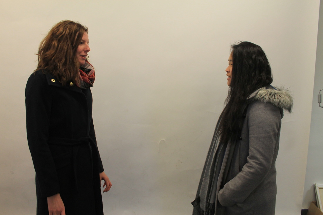
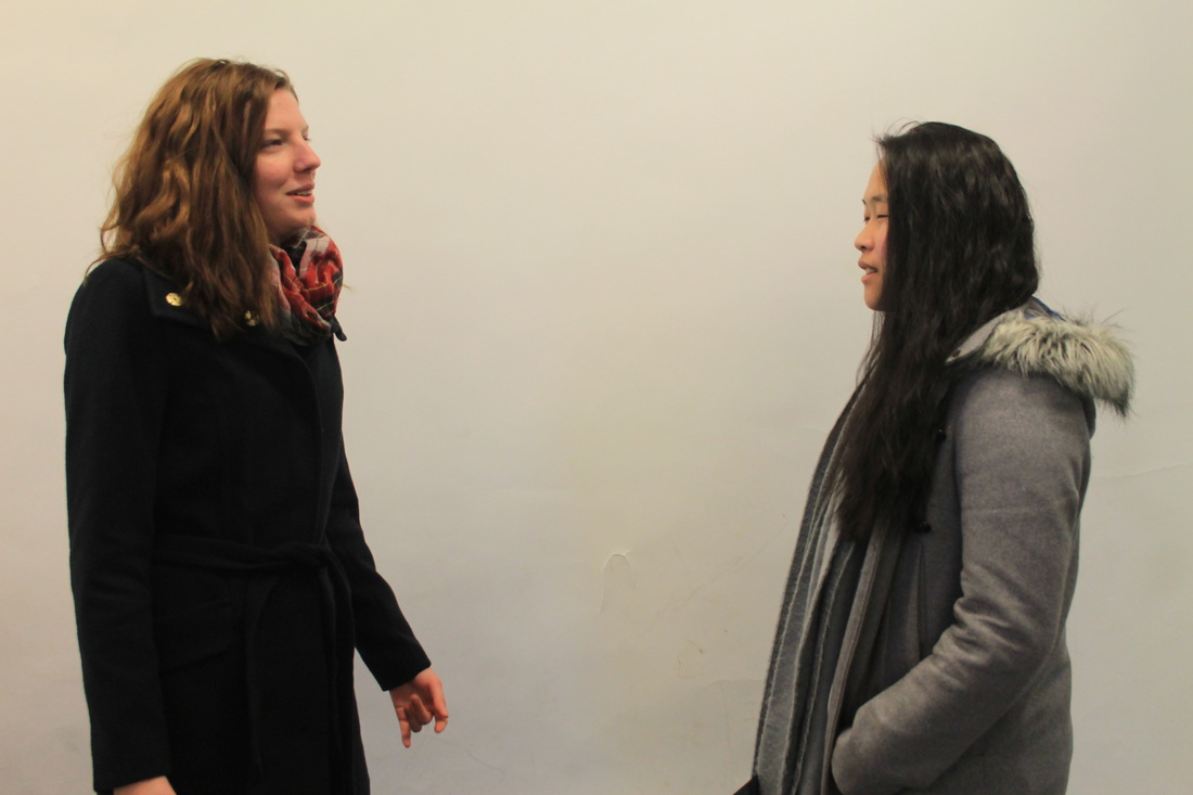
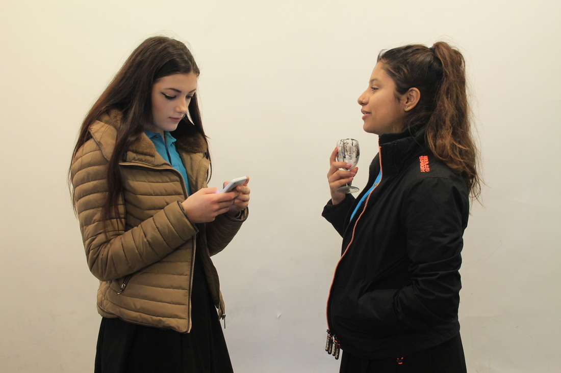
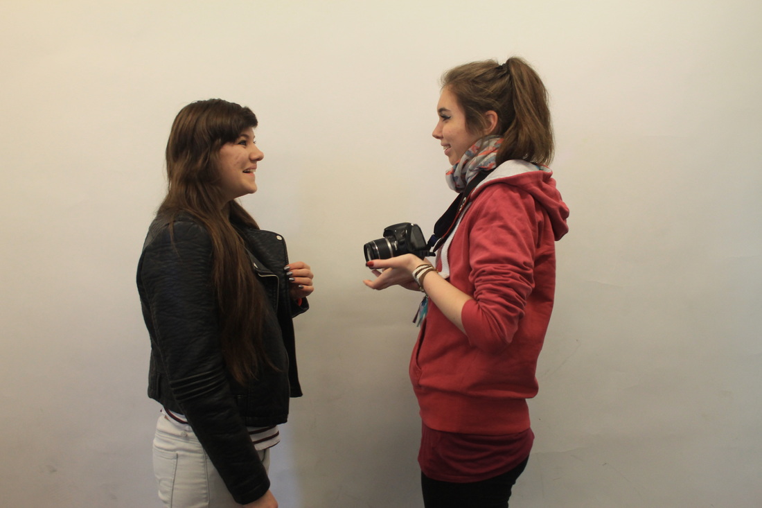
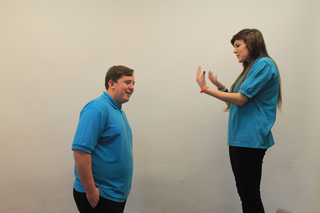

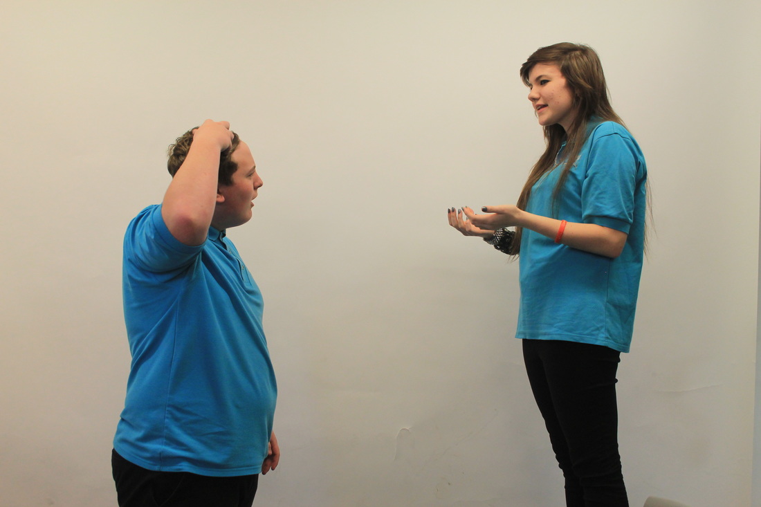
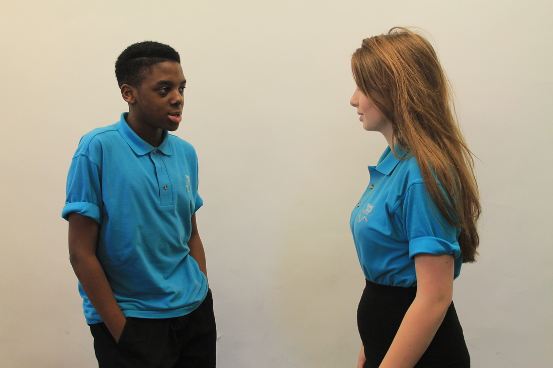
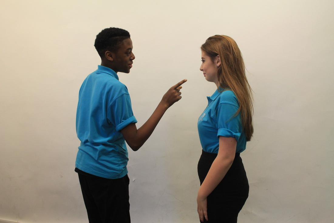
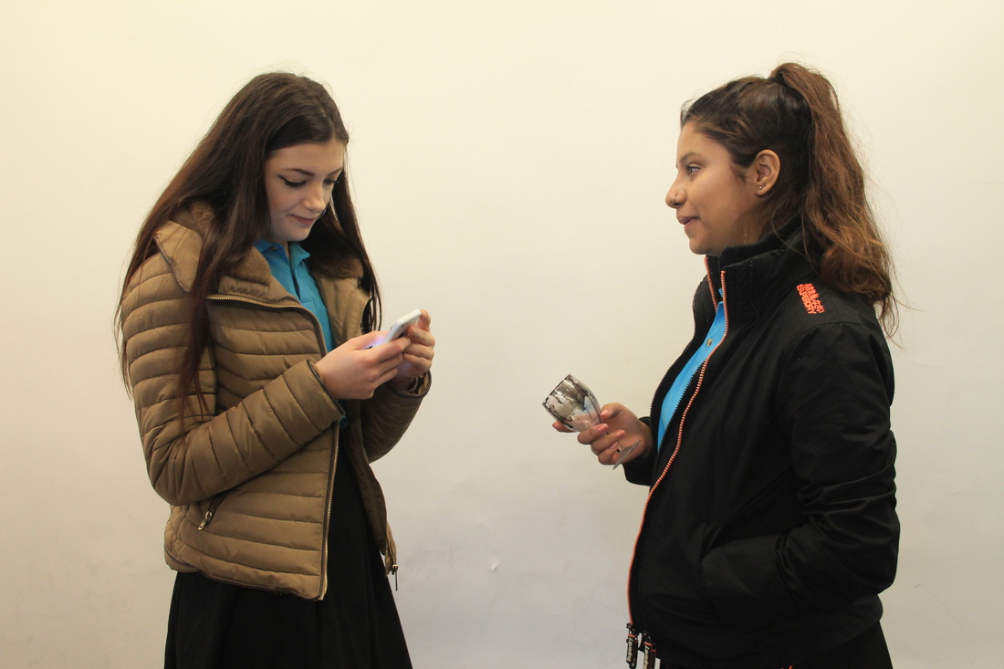
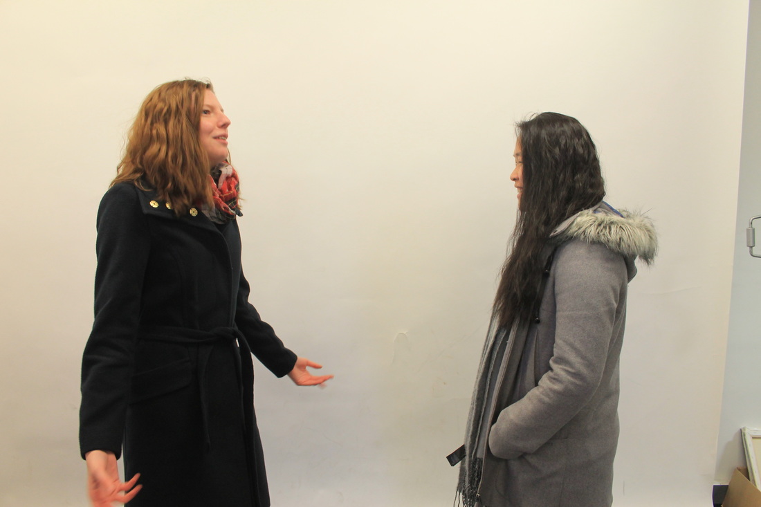
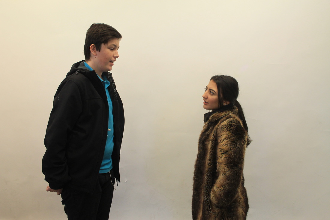
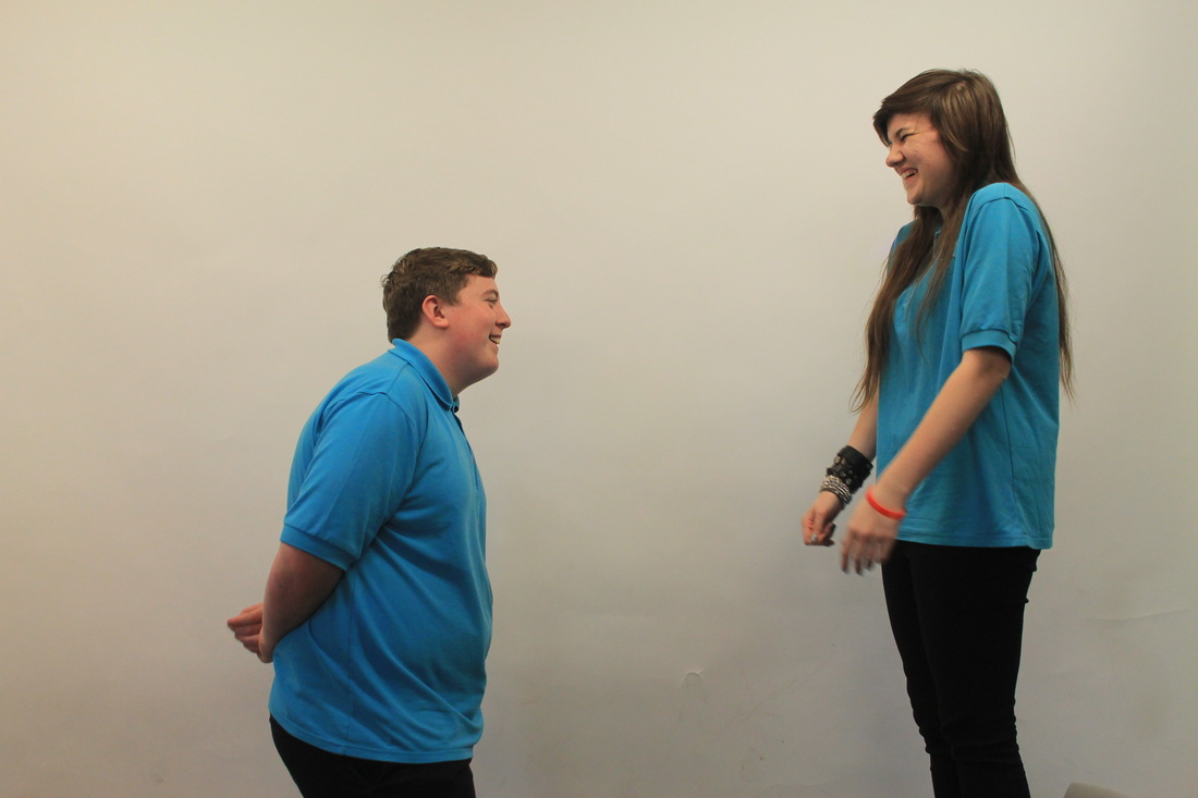
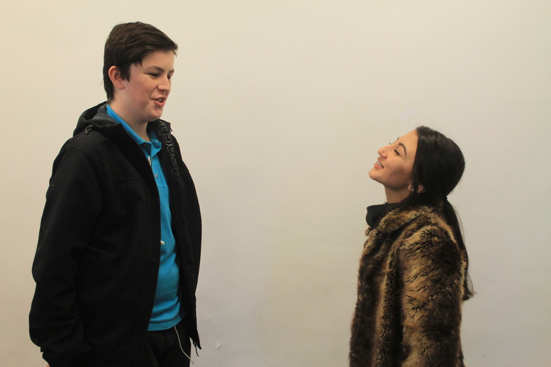
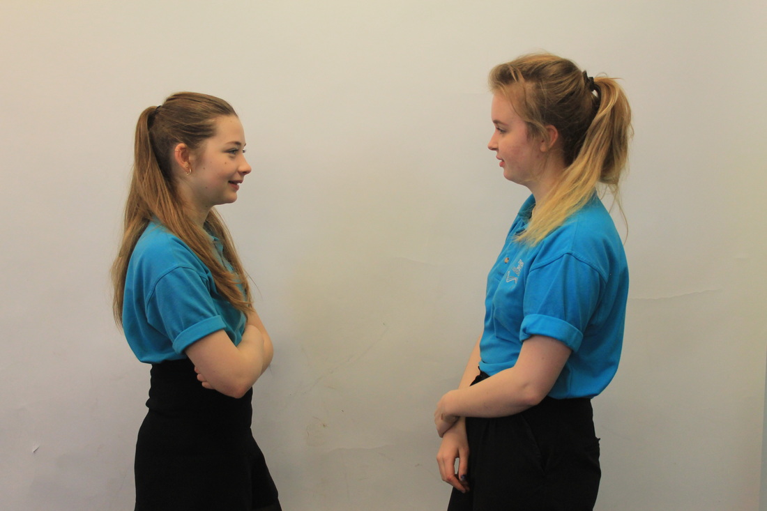
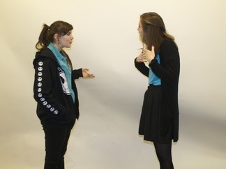
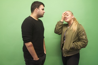
These images are the seconds set of images I took in this style I think these images are a lot better then the first set they are all in focus and framed properly and the lightning is much better the images are much brighter its easier to see the people within the images. Within these images most people don't have many props unlike the first set. I think I could of made the images slightly more interesting and bit more natural. I also think that these images look more natural than the first set as most people actually were having conversations unlike in the first set also these images people are doing facial expressions and laughing at one another. Theres also the one of Ellie on her phone and Anouksha is clearly trying to talk to her and she's finding it difficult as Ellie's more interested in her phone.
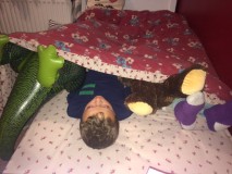
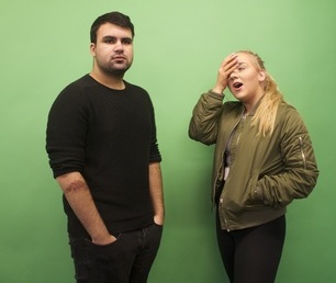
Final Piece


This is my first final piece for absurd. First I did a lot of looking at all kinds of absurd things I could do on Pinterest I then made a board of my favourite things and based my first few experiments off of those. I then began using signs which I really enjoyed doing I got inspiration from David Shirgley who uses signs to create unique situations. I then was really interested in the idea of using the mirror as something to cover a part of someone and replace that with someone else's body part. I then became really interested in the work of Jasmine Deporta in her set of images called sofa safari the way that she made all the models and sofas match. I didn't take any images inspired by her. I then took my conversation images kind if inspired by an idea from Erwin Wurm as he used objects to obscure peoples faces when they were speaking to one another. However, the first set I took didn't come out as well as I had hoped they were mostly out of focus or had parts of the background showing, when they didn't go as planned I decided to take a second set which were much more successful. My final piece was not hard to choose i chose the best images then took some more mainly looking at the facial expressions. These images were used to cover one person within the conversation to present an absurd situation. I chose those three images because the person who was being covered up was a bit out of focus so I thought they would be the best ones to cover and I also chose these images because of the facial expression the other person was pulling I thought they would look better after they were covered. Another reason I chose these images were that I think that the images look the most natural which was best for what I wanted to use them for. These images are the most in focus images and look the best together as all the people are different in each one making them all really different having three of the same person would be quite boring. I spent the most time making sure all these images were framed properly making sure they had plain backgrounds I gave Ellie and Lauren props to make the images slightly more interesting.
